Cominar


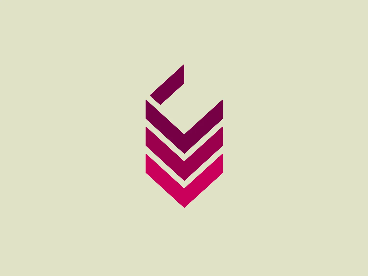
What catches our eye is the modern, abstract design with geometric shapes forming a stylized letter "V," creating depth and movement.
Letter
Type
Color
Style
The Cominar logo is a modern, abstract design featuring geometric shapes that come together to form a stylized letter "V" or chevron pattern. It comprises three angular elements with varying widths that layer on top of one another, creating depth and movement. The color gradient transitions from a deep magenta at the top to a brighter pink hue at the bottom, adding dynamism to the design. The overall aesthetic is sleek and contemporary, suitable for a brand aiming for a sharp and innovative image.
Cominar is a leading diversified real estate investment fund in Canada, renowned as the largest owner and manager of commercial buildings in Quebec.
Similar logos
NEW

The Lazada logo features a stylized three-dimensional shape reminiscent of a cube with a portion of its structure removed or invisible, creating an open corner perspective. It consists of two visible faces, with the left face in a vibrant orange and the right face in a hot pink, employing a gradient that combines the two colors seamlessly at the edge where they meet. The use of color and shading gives the logo a luminous, dynamic look, evoking a sense of innovation and modernity. There are subtle highlights and shadows on the faces that suggest depth and dimensionality. The overall design aesthetic is minimalist, bold, and contemporary, with a playful twist on geometric representation.
NEW

The Kelloggs logo is a stylized letter "K," rendered in a vibrant, solid pink/magenta color. Its design is fluid and modern, with smooth, flowing lines and tapered ends that suggest speed and dynamism. The "K" seems calligraphic, with characteristics reminiscent of a brush stroke or a signature. The design aesthetic is sleek and minimalist, appealing to contemporary sensibilities while maintaining a sense of individuality and flair. Given its color and design, a contrasting yet subtle background color would complement it well.
NEW

The Boonli logo features a stylized, continuous loop resembling an abstract figure-eight or infinity symbol. It consists of two intertwined segments with a gradient color transition, starting from a rich magenta on one end, blending into a deep violet, and finishing with a vibrant orange on the other extremity. The colors give it a dynamic and modern feel, while the smooth curves suggest fluidity and connection. This design is sleek and minimalistic, with no additional embellishments, making it versatile and easily recognizable.
NEW

The Marcha FM logo features a modern, abstract design with a flowing, ribbon-like shape. It combines two tones of color: a vibrant, deep magenta transitioning into a darker, purple shade, contributing to its dynamic and smooth appearance. The curves of the logo suggest motion and fluidity, while the tapering ends of the shape add a sense of finesse and precision. The minimalist style and the absence of any text or additional elements focus all attention on the wavelike form, making it versatile for various applications. Given its colorful nature, a neutral background would complement it well.
NEW

The Reckitt logo showcases a modern, stylized letter "Q" with a design that suggests dynamism and fluidity. The predominant shapes are a thick swirl and a tapered tail that conveys motion, creating an almost optical illusion as if the letter is spinning. The color gradient transitions smoothly from a vibrant pink at the top to a deep orange at the bottom, giving the logo a warm and energetic feel. The simplicity and the color gradient make the Reckitt logo appear contemporary and approachable.
NEW

The Prosper Finance logo features a modern and geometric design comprising two quarter-circle shapes that form a stylized letter 'D'. The right quarter-circle is a deep and vivid red (#FF0000), while the left one features a lighter pinkish hue (#FFC0CB), against a crisp white background. The logo's clean lines and bold colors give it a dynamic and contemporary feel, suitable for a brand looking to convey innovation and energy. Hexcode: #F8DED9
NEW

The Astro Framework logo showcases a bold and abstract design with a modern appeal. It is composed of two primary elements: an upper black shape resembling an inverted 'V' or a stylized 'A' without a crossbar, and a lower magenta element that curves upwards, hinting at motion or a smile. The striking contrast between stark black and vibrant magenta adds visual impact while the smooth curves soften the angularity. The logo's simplicity gives it a versatile and easily recognizable appearance.
NEW

The Airbnb logo is a stylized "A," featuring a continuous line that forms an upside-down teardrop shape and a loop resembling an infinity symbol. The design is modern, simplistic, and conveys a sense of fluidity and continuity. The soft, salmon pink color offers a warm and inviting feeling.
NEW

The logo displayed is a stylized, abstract figure resembling an exclamation mark inside a rounded square. The primary element, which looks to be a combination of a splash and an exclamation point, is white and centered within a vibrant, solid pink background. The figure's top part is bulbous, much like a traditional exclamation point, but the stem is replaced with a splash-like shape, creating a dynamic, playful impression. This design suggests energy and excitement, and its simplicity aligns with modern minimalist aesthetics. Considering the palette of the Koreaboo logo, a subtle and light background color would complement it well without overpowering the vibrant pink.
NEW

The Kimchi Lee logo is a stylized monogram melding the letters 'K' and 'C' into an elegant and cohesive design. The color is a soft, muted pink with a subtle gradient that adds depth and gives the logo a gentle, sophisticated aesthetic. It features curvaceous lines with swirls and loops, reminiscent of calligraphy, reflecting a sense of luxury and attention to detail. The absence of a solid fill within the lines and the ample use of negative space lends the design an airy and modern feel, making it versatile for a variety of backgrounds.