Official Charts

15
We like the dynamic interaction of the two arrows/houses in the Official Charts logo, symbolizing progress and change through vibrant colors.

Letter

No items found.

Color

Official Charts Logo

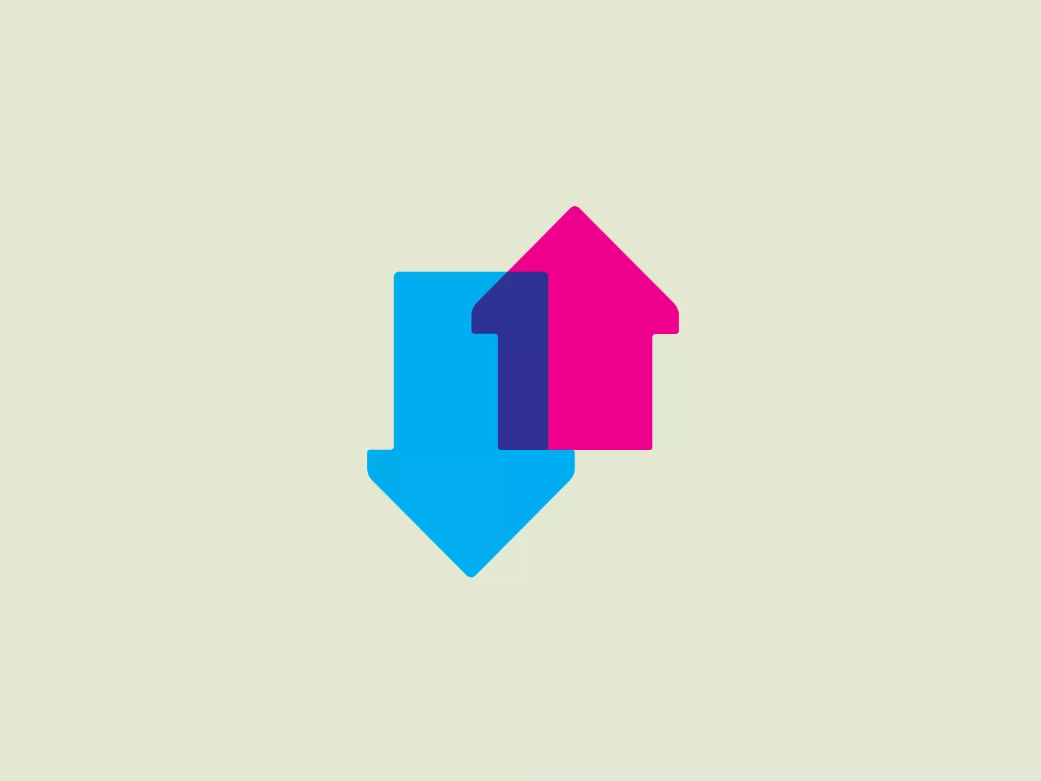
The Official Charts logo features a stylized depiction of two arrows or house shapes interacting, one pointing upwards and the other downwards. The upward arrow or house overlay partially onto the downward one. The design uses a vibrant color palette: the upward shape is filled with a striking magenta, and the downward shape is colored with a bold blue, with the point of intersection revealing a blending of the two colors. The shapes are simple but convey a sense of motion or change. The overall aesthetic is modern and dynamic, suggesting progress or exchange.

About Official Charts

The Official Charts Company is a well-established organization in British popular culture, responsible for maintaining and safeguarding the UK's Official Charts for music and video. The company reveals the Official Top 40 weekly on BBC Radio 1, playing a vital role in monitoring and publicizing the most popular music and video trends in the UK.

Similar logos

The Mobileye logo features a stylized letter 'n' with a distinct geometric design. It is comprised of bold, straight lines with sharp angles, creating a modern and minimalist aesthetic. The main component of the logo is a deep blue color, giving it a professional and trustworthy feel. The design is simple yet striking, with the use of negative space on the left side that could be interpreted as an abstract arrow or a partial square bracket, which adds an element of dynamism and forward-thinking to the overall design.
The image depicts the Akku Vertrieb logo with a bold, geometric design primarily using a bright blue color. The logo resembles an abstract depiction of an uppercase 'A' without the crossbar. It consists of three parallelogram shapes that form a stylized 'A' with white lines creating separation between them, adding a dynamic and layered effect. The design is sharp, modern, and conveys a sense of stability and professionalism. The simplicity and use of negative space give it a clean and versatile look, suitable for various applications.
The Unilever logo appears to consist of intricate and stylized illustrations forming a shield-like shape. The design features a collection of floral and organic patterns, ranging from leaves and flowers to abstract swirls, all densely packed to create a cohesive emblem. It is monochromatic, using a deep blue color which gives it a classic and professional appearance. The contrast between the negative space and the blue areas creates an engaging and dynamic visual effect, suggesting detail and craftsmanship. The logo has a symmetrical layout that adds to its balanced and harmonious look.
The Basis London logo presents a modern and minimalist stylized combination of geometric shapes that form the letter 'B'. The design consists of intersecting straight lines and curves in a dark blue or navy color, creating an illusion of three-dimensional layering. The negative space within the circular element adds to the overall balance and visual interest of the design.
The Commodore logo features a large, bold, blue letter "C" that encircles a smaller red shape resembling a right-pointing arrow or a play button symbol. The stark contrast between the blue and red hues creates a striking and modern aesthetic. The absence of additional elements or embellishments underscores a commitment to clarity and efficiency in the design, striking a balance between visual impact and straightforward symbolism.
The Telstra logo features a stylized uppercase letter "T" in bold, sans-serif font, and an abstract oval-like shape underneath. The vivid blue of the "T" exudes professionalism and trust, while the warm coral red of the shape adds a dynamic and energetic feel. The modern, simplistic aesthetic is characterized by clean lines and curves suggesting movement or stability. The red shape resembles a swoosh or pathway, implying progress or a journey.
The Yatirim Finansman logo depicts a stylized, abstract design that looks like a combination of geometric shapes creating an optical illusion. The shape recalls a three-dimensional cube or box, with elements appearing to interlock. The logo uses two tones of a dark blue palette that give it depth and contrast. The design is modern, clean, and appears dynamic due to its contrasting planes that suggest movement or rotation. It would stand out crisply against a light background that doesn't compete with its color intensity.
The Very Dairy logo showcases a modern and minimalist heart shape with smooth, rounded contours. The bold and saturated shade of blue creates a strong visual impression that conveys trust, loyalty, and affection. Its simplicity and versatility make it ideal for branding, while evoking feelings of professionalism and reliability.
The Netapp logo is a bold, blue square with a white lowercase "n" at the center, which interrupts the blue square to create a symmetrical negative space. The sharp angles of the "n" contrast with the solid background, making the letter pop and giving the logo a modern and clean appearance. The blue is a strong and vibrant hue, suggesting professionalism and reliability.
The WildBrain logo features three stylized, abstract figures in various shades of blue, resembling a trio of birds or perhaps aquatic creatures, positioned side by side with their body shapes converging at the base. The figures have a minimalist look, with a smooth, rounded top edge that tapers down to a point. Each figure also contains a simple, circular black eye, adding a touch of character and life to the design. The shapes are devoid of intricate details, favoring a clean and modern aesthetic. Considering the cool blue tones, a soft, contrasting background color would complement the logo without overpowering it.