Fifth Harvest
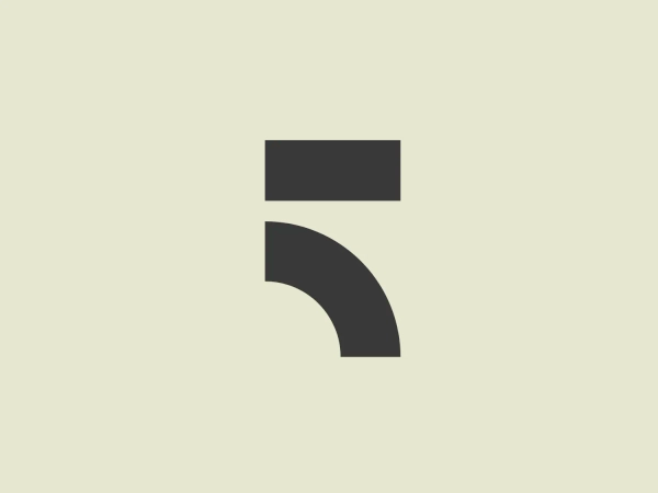


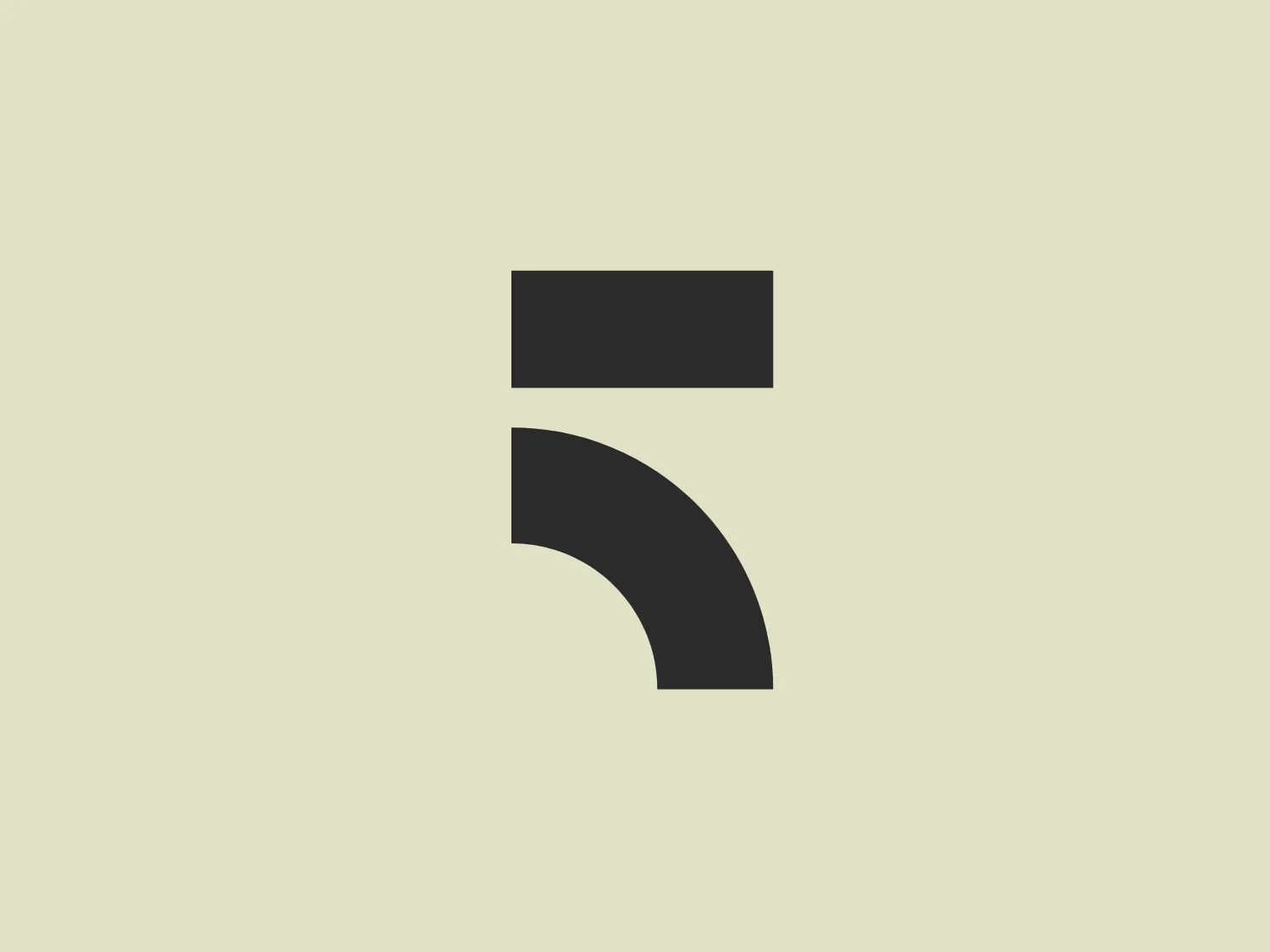
What captivates us is the modern and minimalist design of the "F" logo for Fifth Harvest, showcasing bold color and clean lines.
Letter
Type
Color
Style
The Fifth Harvest logo showcases a stylized letter "F" formed by a vibrant magenta horizontal rectangle and a sweeping, curved shape. Incorporating a modern and minimalist aesthetic with clean lines and bold color, the design conveys innovation and simplicity. The arrangement of shapes suggests motion or transformation, reflecting the dynamic nature of the Fifth Harvest brand.
Fifth Harvest is a company that specializes in vertical farming, a method that requires minimal land and water compared to traditional agricultural practices. By growing food in urban indoor facilities, they aim to reduce emissions, shorten the supply chain, and offer fresh produce year-round.
Similar logos
NEW

The Boonli logo features a stylized, continuous loop resembling an abstract figure-eight or infinity symbol. It consists of two intertwined segments with a gradient color transition, starting from a rich magenta on one end, blending into a deep violet, and finishing with a vibrant orange on the other extremity. The colors give it a dynamic and modern feel, while the smooth curves suggest fluidity and connection. This design is sleek and minimalistic, with no additional embellishments, making it versatile and easily recognizable.
NEW

The Marcha FM logo features a modern, abstract design with a flowing, ribbon-like shape. It combines two tones of color: a vibrant, deep magenta transitioning into a darker, purple shade, contributing to its dynamic and smooth appearance. The curves of the logo suggest motion and fluidity, while the tapering ends of the shape add a sense of finesse and precision. The minimalist style and the absence of any text or additional elements focus all attention on the wavelike form, making it versatile for various applications. Given its colorful nature, a neutral background would complement it well.
NEW

The Astro Framework logo showcases a bold and abstract design with a modern appeal. It is composed of two primary elements: an upper black shape resembling an inverted 'V' or a stylized 'A' without a crossbar, and a lower magenta element that curves upwards, hinting at motion or a smile. The striking contrast between stark black and vibrant magenta adds visual impact while the smooth curves soften the angularity. The logo's simplicity gives it a versatile and easily recognizable appearance.
NEW

The logo presented here is a minimalist and modern design composed of three parallelogram shapes, each with a varying shade of bright purple and magenta. The parallelograms are arranged in a dynamic, leaning position, giving the impression of forward motion or progression. The largest parallelogram is on the right and is the darkest in color; the middle one is of medium size and a mid-tone purple; and the smallest is the brightest, on the left. The sharp angles and bold saturation of the design convey an energetic and contemporary feel. The clean lines and absence of additional embellishments highlight the logo's sleek and straightforward aesthetic. Given the vibrancy of these colors, a background that complements without overwhelming would be ideal.
NEW

The Trivago logo features a stylized, geometric design with a modern aesthetic. It consists of three shapes resembling an abstract formation of a letter or symbol. The first shape is a vertical rectangle in a bold magenta (#E91E63), the second is an angled orange (#FF9800) rectangle conveying motion or change, and the third is a semi-circular shape in a deep sky blue (#03A9F4), anchoring the design with a sense of stability. The shapes are arranged to create a sense of interconnectivity and dynamic balance. The vibrant color palette is eye-catching and evokes a sense of creativity and innovation.
NEW

The Shannon Airport logo showcases an abstract, ribbon-like design with a flowing and dynamic shape, featuring three interwoven strands transitioning smoothly from warm yellow at the top, through orange, to a deep magenta at the base, creating a gradient effect. The overall aesthetic is modern and sleek, suggesting transformation, connectivity, and adaptability, making it suitable for a brand seeking to convey innovation and fluidity.
NEW

The Xinja logo is showcased in a bold, magenta-toned pink color with a modern and dynamic design. It consists of an abstract mark formed by a combination of geometric shapes: an elongated, rounded rectangle, diagonally bisected, paired with two droplet-like shapes that create a sense of motion or transformation. The overall aesthetic is minimalist and contemporary, with a sense of fluidity and innovation. The design is simplistic, relying on the impactful use of color and form rather than intricate detail, making it versatile and easily recognizable.
NEW

The Quanttus logo features a stylized letter 'Q' with a heart shape seamlessly integrated into its tail. The overall design is simple yet elegant, employing a minimalistic approach with clean lines and curves. The logo is rendered in a rich magenta color, providing a vibrant and inviting feel. The aesthetic leans towards modern and playful, making it approachable and memorable. It would likely represent a brand or service associated with passion, care, or love.
NEW

The Hamilton Philharmonic Orchestra logo displayed is a modern, abstract design consisting of concentric shapes that form a stylized letter "O". The shapes are reminiscent of topographic lines on a map or the grooves of a vinyl record, suggesting depth and movement. The color gradient transitions smoothly from magenta at the bottom to a deep violet at the top, creating a sense of vibrancy and energy. The lines vary in thickness, and their undulating pattern gives the logo a dynamic and rhythmic quality. The white space in the center emphasizes the geometric precision of the design. Given the vibrant hues of the Hamilton Philharmonic Orchestra logo, a more understated background would complement it well.
NEW

The Richmond logo appears to be a stylized letter "Q" with a fluid, dynamic design that evokes a sense of movement and modernity. It transitions smoothly from a deep purple at the top to a vibrant magenta towards the bottom, creating a gradient effect. The shape of the logo is smooth and rounded, with a tail that curves inward and under the circular body of the letter, suggesting a loop or an infinite cycle. The gradient creates depth and dimension, and the overall design is sleek and contemporary.