Banke

15
What we like: The modern, minimalist design of the Banke logo with a striking letter 'B' and bold yet clean font.

Banke Logo

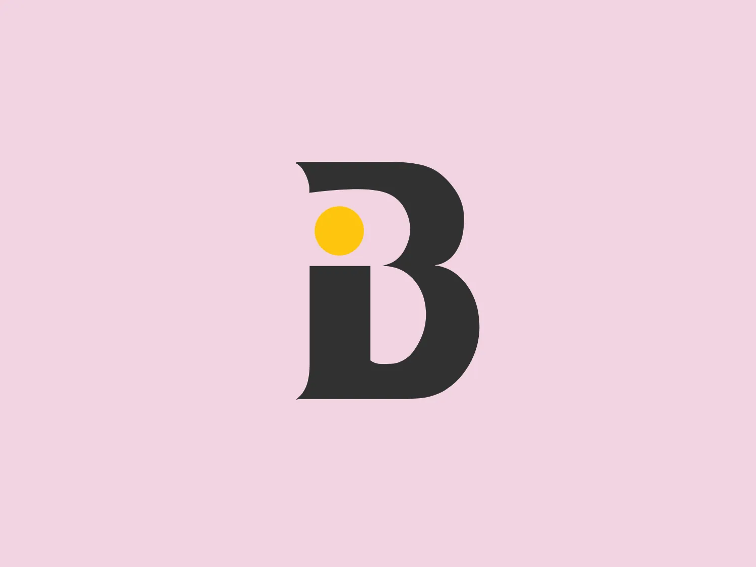
The Banke logo features a modern, minimalist design with a stylized letter 'B'. The main body of the letter is dark gray, and there's a striking contrast with a bright yellow dot placed near the top inner curve, suggesting the letter 'i' or providing a visual accent. The 'B' is bold with a clean sans-serif font, which gives it a contemporary and professional appearance. The letter has smooth curves and straight lines that balance well together, creating a visually appealing and easily recognizable brand mark.

About Banke

Banke International is recognized as a leading boutique real estate firm in Dubai, specializing in the identification and procurement of prime properties for sale or rent. The company focuses on delivering tailored real estate solutions to meet the diverse needs of its clientele.

Similar logos

The Breitling logo depicts a stylized, fluid letter "B" with elongated, curved strokes, giving it an elegant and dynamic appearance. The design is minimalist, using a bold golden yellow color that suggests luxury, quality, and sophistication. The overall aesthetic is modern and sleek, with a sense of movement and possibly creativity, hinted by the smooth lines that evoke a sense of continuity. Given the vibrancy of the golden hue, a subtle and light background would complement it well without competing for attention.
The Nationale Nederlanden logo exhibits a modern and dynamic design, featuring a stylized letter "N" enclosed within a circular shape. The minimalist "N" showcases sharp angles and a bold presence, with a gradient color scheme transitioning from vibrant orange to deep yellow, evoking energy and innovation. The circular background lends a sense of inclusivity or a global perspective, while the clean lines and digital feel make it suitable for a brand associated with technology, creativity, or communication.
The Subway logo features two bold, interlocking arrows forming an 'S' shape, with the top arrow colored in a striking green and the bottom in a vibrant yellow. The design is clean and modern, with a dynamic sense of movement implied by the arrows pointing in opposite directions. This creates a sense of exchange, circulation, or progression, which might suggest a company involved in logistics, technology, or finance. The flat color treatment and lack of additional embellishments give it a contemporary and straightforward aesthetic.
The Gearbest logo features a bold, black, stylized smile at its center, with the ends of the smile tapering to points. This simplistic and cheerful smile is prominently positioned against a vibrant yellow square background with rounded corners. The overall design aesthetic is modern and minimalistic, suggesting friendliness and positivity. The design's high contrast and simplicity would stand out well against a variety of backgrounds but would be particularly striking on a light, muted color to maintain its vibrancy without overwhelming its simplicity.
The Le Monde logo features a stylized, abstract design that appears to be a representation of three vertical bars or pillars, with curvatures suggesting movement or fluidity. The design is monochromatic, utilizing varying shades of black and gray to create dimension and a sense of depth through shading and highlights. Its aesthetic leans towards modern and sleek, with clean lines and a minimalist approach that avoids any superfluous details. The use of negative space between the elements is cleverly managed to maintain the structure and integrity of each bar while imparting a dynamic and slightly futuristic look.
The eTactica logo showcases a simple and geometric design composed of four differently colored quarter-circle sectors arranged in a circular pattern, resembling a spinning wheel or pie chart. The transition from vibrant red to yellow, green, and blue creates a smooth and balanced look. The use of primary and secondary colors gives the logo an energetic and optimistic feel. The white negative space in the center subtly forms a 'C' shape, possibly representing the initial of the company or brand.
The Varta logo is a stylized representation of an envelope formed by simple geometric shapes. It features a large blue rectangle as the base of the envelope and an inverted yellow triangle as the flap. The design is minimalist with bold color contrast, using flat colors without gradient or shadow for a modern and clean aesthetic. The rectangular shape conveys stability and reliability, while the bright yellow triangle adds a dynamic element, suggesting movement or opening, in a universally recognized motif associated with mail and communication.
The logo for Zenith Bank is a stylized representation of the letter 'Z.' It features two main components with contrasting colors: a dark gray plane that forms the upper part of the 'Z' and a bold red plane creating the lower part. The logo has a sharp, modern look, characterized by its angular design and the use of negative space to enhance the division between the upper and lower sections. The absence of curves and the choice of a sans-serif style typeface give the design a strong, industrial feel. Its overall aesthetic is dynamic and suggests a sense of forward motion or progress.
The Standex logo features a stylized letter "E" created with three-dimensional rectangular blocks arranged at a slanted angle, effectively forming the shape of the letter. The solid dark gray color exudes a sleek and professional aura, while the minimalist and abstract design with clean lines and edges conveys stability and strength. The strategic use of negative space enhances its three-dimensional quality.
The Windesheim logo features a bold, modern design of a stylized letter "W" with sharp angles and a two-dimensional appearance. It is a vibrant, solid yellow color, creating a strong visual presence that is immediately eye-catching. The minimalist aesthetic and contemporary feel are accentuated by the use of a single bright color. The logo's angles convey a sense of movement and dynamism, resonating well with brands seeking to convey innovation or energy.