Roshfrans

15
Here's what we like: The Roshfrans logo has a dynamic, fluid design with seamless color transitions, conveying energy and a modern aesthetic.

Roshfrans Logo

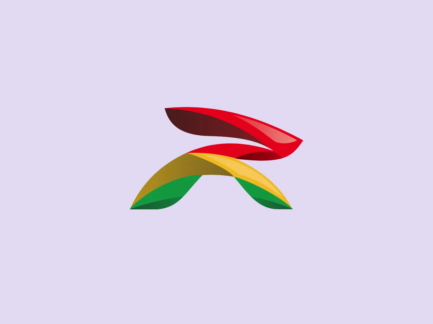
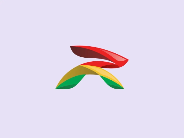
The Roshfrans logo features an abstract, dynamic design composed of three overlapping elements that give the impression of motion and fluidity. The shape resembles a stylized propeller or a set of leaves, with each segment smoothly transitioning in color and form. Starting from the top, the first element is a deep red (#E63946), transitioning into a vibrant green (#2A9D8F) at the lowest segment. Between them, a warm yellow (#F4A261) segment acts as a bridge, creating a harmonious gradient. The design's fluid lines and gradient effect convey a sense of energy and natural flow. The overall aesthetic is modern, organic, and energetic, suggesting innovation and growth.

About Roshfrans

Roshfrans is a Mexican company that focuses on formulating, producing, and selling a range of automotive products, including antifreeze, additives, specialty products, oils, and lubricating greases.

Similar logos

The Matsuura logo features a stylized depiction of three overlapping, rounded shapes in a vibrant green color. The design exudes a modern and minimalist aesthetic with a nod to nature or growth themes, implying movement and connectivity. The shapes suggest leaves, pebbles, or abstract representations of increasing value/momentum.
The Delivery Hero logo features a dynamic red comet shape with a stylized white star centered on its body. The comet tail metaphorically conveys speed, progress, or possibly a shooting star suggesting dreams and aspirations. The sharp edges of the star contrast with the smooth, curved form of the comet, giving the design a sense of forward motion. Its design is simple yet effective, easily scalable, and memorable. Considering the vibrancy of the red, a muted background that complements without competing would be ideal.
The Cornerstone logo features a simplistic and modern design, consisting of a stylized, abstract shape that somewhat resembles a flower or starburst within a circle. The primary element is a brilliant, solid red-orange color that gives the logo a vibrant and energetic feel. The inner white shape has softened edges which contrast smoothly with the circular boundary. Its symmetry and clean lines convey a sense of balance and professionalism. Considering the color palette of the logo, a soft, neutral background color would complement it well without competing for attention.
The Rossignol logo showcases a stylized white letter 'R' in the center of a bright red circular background. The 'R' includes a clean design with a striking slash through its stem, adding a modern flair. Smooth curves create a sleek look, and the red and white color scheme offers a bold and attention-grabbing contrast. The overall design aesthetic is minimalist and contemporary, making it versatile for various applications.
The ICICI Bank logo features a stylized, abstract design with a fluid, organic shape. The central element resembles a lowercase "i" with a dot hovering above what could be interpreted as an abstract human figure or a dynamic swirl. Its bold lines curve to create a sense of movement. The color scheme consists of a gradient transition from a deep, warm red to a rich, golden orange, giving the logo an energetic and inviting appearance. Noteworthy is the way the white space between the "i" and its dot creates a pathway, emphasizing the motion and adding an element of negative space to the design.
The logo for New Zealand Post showcases a stylized image integrated into a circular shape. The primary element resembles a path or a route with curves and lines that suggest motion or a journey. The design features white lines creating a single continuous path against a vibrant solid red background. The overall aesthetic is modern, minimalistic, and dynamic, enabling easy recognition and versatile application across various media. The smooth and rounded shapes contribute to a friendly and approachable feel.
The Commodore logo features a large, bold, blue letter "C" that encircles a smaller red shape resembling a right-pointing arrow or a play button symbol. The stark contrast between the blue and red hues creates a striking and modern aesthetic. The absence of additional elements or embellishments underscores a commitment to clarity and efficiency in the design, striking a balance between visual impact and straightforward symbolism.
The Hero logo features an abstract design with a modern and minimalistic aesthetic. It consists of three geometric shapes: a solid red rectangle on the left, and two black right-angled triangles on the right, positioned to suggest movement or transformation. The color contrast between the red and black is striking, giving the Hero logo a bold and dynamic feel. The clean lines and absence of additional embellishment lend the design a sleek and contemporary look that would work well in a tech or innovative business sector.
The GoPlay logo is a bold and simple design consisting of a striking red letter "P". It features a modern sans-serif font with clean and smooth curvature, and the vertical line of the "P" extends below the baseline, giving it a unique and dynamic look. The minimalist design is versatile and contemporary, making it suitable for various branding contexts.
The BitX Capital logo showcases a stylized, abstract design with a dynamic feel. It comprises interlocking shapes resembling a three-dimensional impossible loop. The main elements consist of two intertwined ribbons with a gradation of green shades that provide a sense of depth and movement. The contrast between the lighter and darker greens enhances the interweaving effect. Overall, the logo presents a modern and clean appearance, suggesting innovation and connectivity.