Elmwood Living

15
Here's what we like: The minimalist and modern design aesthetic of the stylized leaves in different shades of green, cleverly alluding to growth and nature.

Elmwood Living Logo

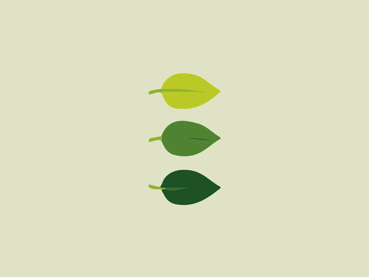
The business logo for Elmwood Living features three stylized leaves arranged vertically, each showcasing a different shade of green. The top leaf is a lively lime green, the middle leaf is a medium green, and the bottom leaf is a deeper forest green. The leaves are simple and flat in shape, with subtle pointed tips and prominent central stems. The gradient of hues from light to dark evokes a sense of depth and natural progression, embodying a minimalist and modern design aesthetic while subtly alluding to themes of growth, sustainability, and nature.

About Elmwood Living

Elmwood Living is an integrated housing development company in Australia, spearheaded by prominent builder Brendon Collins. The company specializes in creating high-quality residential properties that offer a rich urban lifestyle within a tranquil country setting, with convenient proximity to various attractions.

Similar logos

The Matsuura logo features a stylized depiction of three overlapping, rounded shapes in a vibrant green color. The design exudes a modern and minimalist aesthetic with a nod to nature or growth themes, implying movement and connectivity. The shapes suggest leaves, pebbles, or abstract representations of increasing value/momentum.
The Frontier Airlines logo is a modern, sleek design comprised of three bold, dark green, horizontal stripes that form an abstract letter "E". The upper and lower stripes are longer and angled slightly downward towards the right, while the center stripe is shorter, creating a sense of movement and dynamism. The negative space between the stripes reinforces the "E" shape. The color has a professional and serious tone, and the logo's simplicity gives it a timeless and versatile feel. It has a clean, geometric quality, and there are no additional embellishments, making it highly adaptable for various applications.
The logo for Eldorado Gold features an abstract, circular design with three green curved shapes or leaves converging to suggest dynamic motion and organic growth. The curves are elegantly separated by white negative space giving the impression of a spinning globe or a plant in motion. The design evokes themes of nature, sustainability, and renewal, with the deep green color symbolizing growth, harmony, and freshness.
The Waymo logo depicts a stylized letter "W" with a modern and dynamic design. It is composed of three overlapping, geometric shapes that are rounded at the ends, suggesting fluidity and movement. The color palette includes a gradient ranging from a bright teal to a deeper blue-green, creating a sense of depth and vibrancy. The overall design aesthetic is clean, contemporary, and would likely appeal to a tech-savvy or forward-thinking audience. The fluid form and gradient give the Waymo logo a sense of innovation and approachability.
The Heco Chain logo features a stylized representation of two interacting shapes, resembling puzzle pieces. The design includes two bold, curving forms with rounded edges, mirroring each other for a sleek and modern appearance. The rich, deep green color signifies professionalism and growth, while the white lines create a crisp contrast and a three-dimensional illusion. This logo has a clean, contemporary feel suitable for technology, environmental fields, or innovative services.
The BitX Capital logo showcases a stylized, abstract design with a dynamic feel. It comprises interlocking shapes resembling a three-dimensional impossible loop. The main elements consist of two intertwined ribbons with a gradation of green shades that provide a sense of depth and movement. The contrast between the lighter and darker greens enhances the interweaving effect. Overall, the logo presents a modern and clean appearance, suggesting innovation and connectivity.
The Holiday Inn logo features a stylized, abstract design that appears to be a pair of overlapping, slanted letter H's or a hash symbol (#) with a modern twist. It's composed of four bold, green lines with soft curves and slightly varied lengths, giving it a dynamic and contemporary feel. The use of negative space between the elements of the logo adds to its visual interest. The green color is vibrant and would stand well against a soft, pale background providing a contrast that is not too harsh.
The Nedbank logo features a stylized, abstract design formed by a combination of geometric shapes, creating the impression of a letter or symbol. The use of dark green gives it a professional and sleek appearance. The design is characterized by sharp angles and overlaps that create depth, with negative space playing a critical role in defining its three-dimensional look. The overall aesthetic is modern and clean, suggesting innovation and strength.
The Subway logo features two bold, interlocking arrows forming an 'S' shape, with the top arrow colored in a striking green and the bottom in a vibrant yellow. The design is clean and modern, with a dynamic sense of movement implied by the arrows pointing in opposite directions. This creates a sense of exchange, circulation, or progression, which might suggest a company involved in logistics, technology, or finance. The flat color treatment and lack of additional embellishments give it a contemporary and straightforward aesthetic.
The Deliveroo logo features a stylized, geometric representation of a lowercase letter 'v' with rounded terminals and a playful, cut-in contour on the right side. This creates a sense of motion or a smiling face with two dots representing eyes. The bright, aqua-green color gives the logo a modern, minimalist, and friendly vibe, suggesting creativity and innovation.