Venezia FC


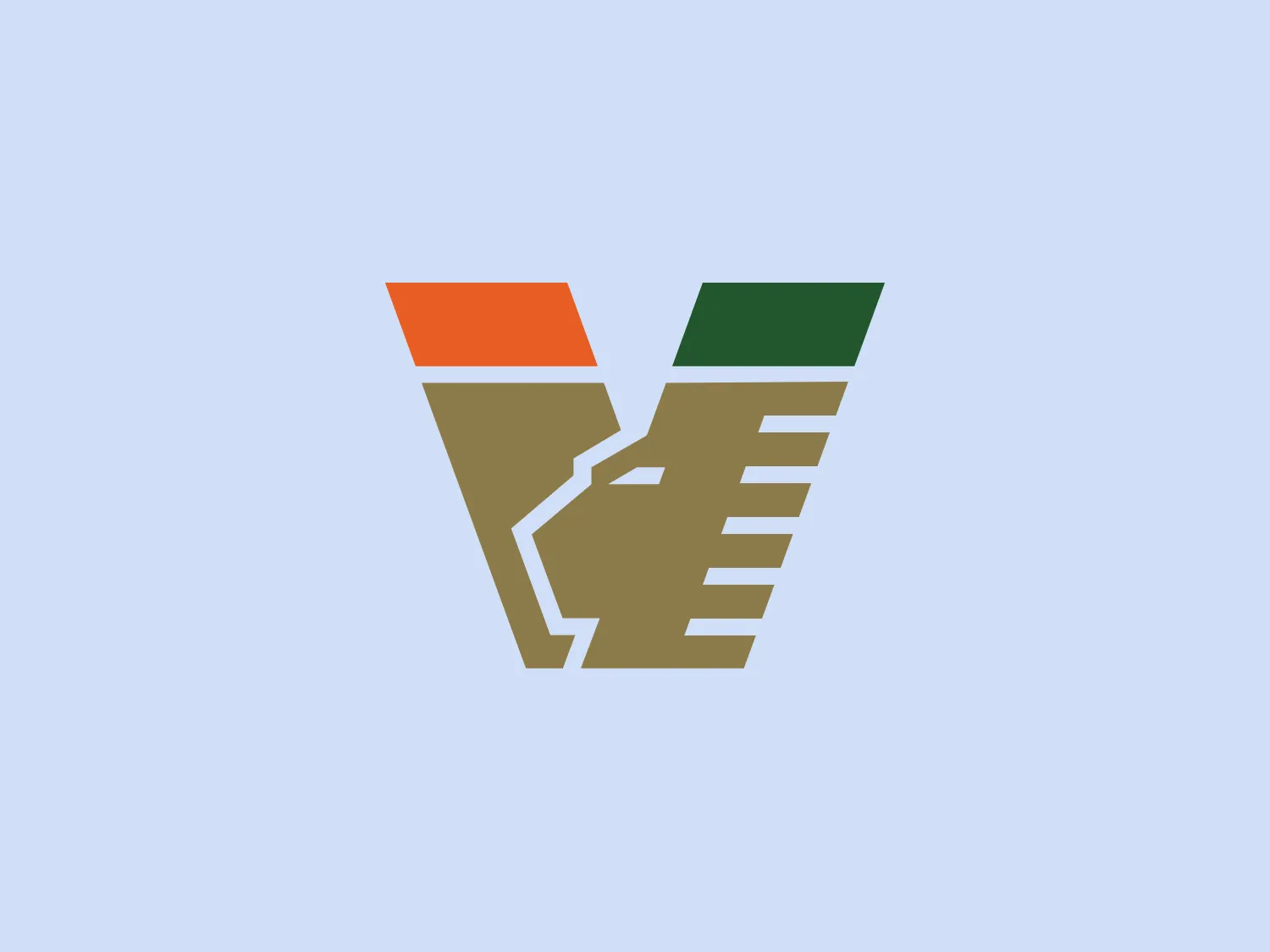
Here's what we like: The Venezia FC logo's modern and strong geometric design with a sleek color palette reflects innovation and stability.
Letter
Type
Color
Style
The Venezia FC logo features an abstract, geometric design consisting of three stylized elements that appear like angular letterforms or shapes, possibly indicative of a 'V' and 'F' merged together. The color palette is comprised of a muted orange (#C46200), an olive green (#587d35), and a taupe-like brown (#8d7249). Each colored section is bordered by thin lines, emphasizing the segmentation within the design. The aesthetic is modern, with a slight industrial feel, likely representing strength or stability. The overall appearance is sharp and structured, possibly suggesting precision or innovation.
Venezia Football Club, commonly known as Venezia, is a professional football club located in Venice, Italy.
Similar logos
NEW

The Lazada logo features a stylized three-dimensional shape reminiscent of a cube with a portion of its structure removed or invisible, creating an open corner perspective. It consists of two visible faces, with the left face in a vibrant orange and the right face in a hot pink, employing a gradient that combines the two colors seamlessly at the edge where they meet. The use of color and shading gives the logo a luminous, dynamic look, evoking a sense of innovation and modernity. There are subtle highlights and shadows on the faces that suggest depth and dimensionality. The overall design aesthetic is minimalist, bold, and contemporary, with a playful twist on geometric representation.
NEW

The Matsuura logo features a stylized depiction of three overlapping, rounded shapes in a vibrant green color. The design exudes a modern and minimalist aesthetic with a nod to nature or growth themes, implying movement and connectivity. The shapes suggest leaves, pebbles, or abstract representations of increasing value/momentum.
NEW

The Cornerstone logo features a simplistic and modern design, consisting of a stylized, abstract shape that somewhat resembles a flower or starburst within a circle. The primary element is a brilliant, solid red-orange color that gives the logo a vibrant and energetic feel. The inner white shape has softened edges which contrast smoothly with the circular boundary. Its symmetry and clean lines convey a sense of balance and professionalism. Considering the color palette of the logo, a soft, neutral background color would complement it well without competing for attention.
NEW

The Prodigy logo showcases a contemporary, fluid lowercase 'p' in a striking orange color. The design features soft curves and a dynamic loop, along with a sharp cut in the descender, creating a modern and slightly abstract appearance. This clean and minimalistic logo exudes energy and approachability while the vibrant orange color conveys creativity and enthusiasm.
NEW

The BitX Capital logo showcases a stylized, abstract design with a dynamic feel. It comprises interlocking shapes resembling a three-dimensional impossible loop. The main elements consist of two intertwined ribbons with a gradation of green shades that provide a sense of depth and movement. The contrast between the lighter and darker greens enhances the interweaving effect. Overall, the logo presents a modern and clean appearance, suggesting innovation and connectivity.
NEW

The Meralco logo features a stylized, angular lightning bolt in white, cutting dynamically across a vibrant, solid orange circle. The bolt itself has sharp edges and points, conveying a sense of energy and power. The simplicity of the design gives it a modern and impactful aesthetic, as the high-contrast color scheme makes the logo stand out boldly. The circular shape envelops the bolt, suggesting completeness and a global or universal aspect to the brand identity.
NEW

The Subway logo features two bold, interlocking arrows forming an 'S' shape, with the top arrow colored in a striking green and the bottom in a vibrant yellow. The design is clean and modern, with a dynamic sense of movement implied by the arrows pointing in opposite directions. This creates a sense of exchange, circulation, or progression, which might suggest a company involved in logistics, technology, or finance. The flat color treatment and lack of additional embellishments give it a contemporary and straightforward aesthetic.
NEW

The Holiday Inn logo features a stylized, abstract design that appears to be a pair of overlapping, slanted letter H's or a hash symbol (#) with a modern twist. It's composed of four bold, green lines with soft curves and slightly varied lengths, giving it a dynamic and contemporary feel. The use of negative space between the elements of the logo adds to its visual interest. The green color is vibrant and would stand well against a soft, pale background providing a contrast that is not too harsh.
NEW

The Chainalysis logo features a bold, minimalistic design with interlocking shapes. The primary shape is a circle, within which three curved elements intertwine in a trefoil knot-like configuration, suggesting motion and connectivity. The logo is a vibrant, solid orange color, conveying energy and creativity. The thick lines and smooth curves contribute to a modern and dynamic aesthetic, appearing abstract yet conveying a sense of unity and continuity.
NEW

The Mensa International logo features a bold, white capital letter 'M' centered within a circular badge. Above the letter 'M', a stylized white globe icon emphasizes international presence. The letter rests against a vibrant orange background, creating a striking contrast that accentuates the white elements. The modern and concise design utilizes simple geometric shapes and clear iconography, suggesting a professional and global brand identity.