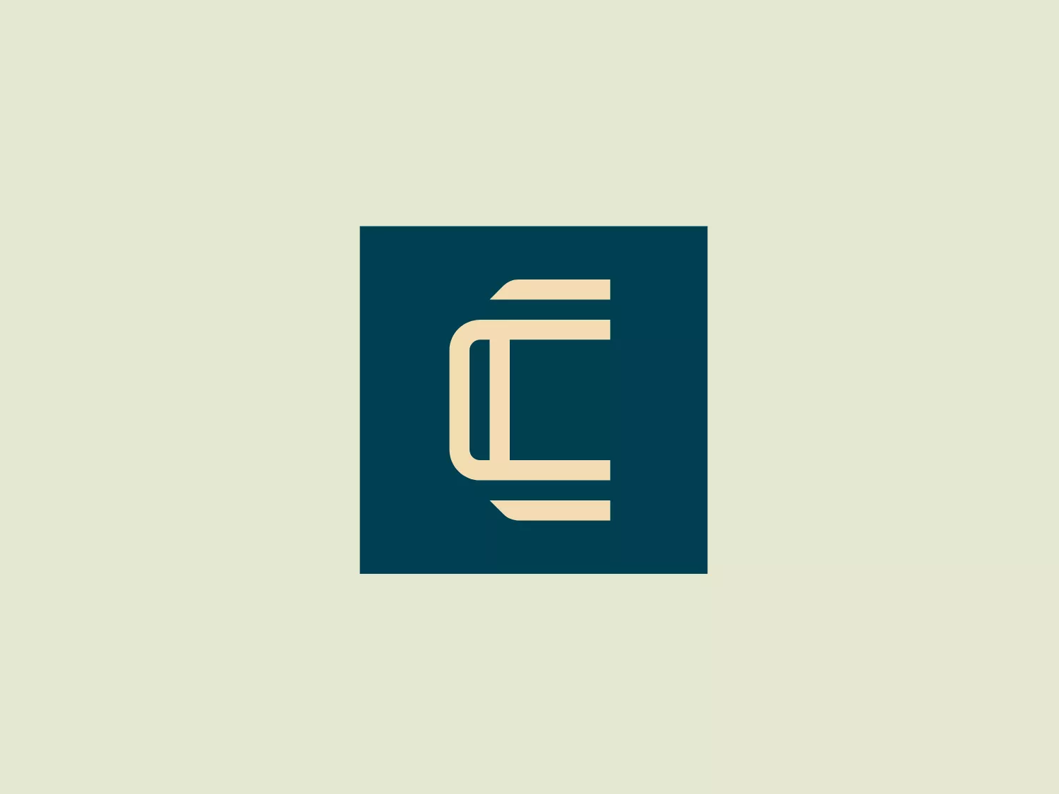
Cresnia


What we like: The sleek, modern design and compact combination of letters create a luxurious and professional aesthetic.
Letter
Type
Color
Style
The Cresnia logo showcases a sleek, modern design with a compact and stylized combination of a lowercase 'e' merging with a capital 'L'. The bold, geometric lines and gold color against a deep teal background create a luxurious and professional aesthetic, conveying stability and strength. The logo's minimalistic and sophisticated feel makes it suitable for a variety of applications, and it would stand out on a light background that complements its colors.
Cresnia operates independently from other real estate operators to provide the best possible solutions for commercial tenants. The company takes full responsibility for the entire process.
Similar logos
NEW

The ICICI Bank logo features a stylized, abstract design with a fluid, organic shape. The central element resembles a lowercase "i" with a dot hovering above what could be interpreted as an abstract human figure or a dynamic swirl. Its bold lines curve to create a sense of movement. The color scheme consists of a gradient transition from a deep, warm red to a rich, golden orange, giving the logo an energetic and inviting appearance. Noteworthy is the way the white space between the "i" and its dot creates a pathway, emphasizing the motion and adding an element of negative space to the design.
NEW

The Washington Commanders logo features three interconnected diamond shapes forming a stylized letter "W." The primary color is a deep maroon with a thick golden yellow border, creating a sharp contrast and a dynamic feel. The use of geometric shapes and bold colors conveys strength and modernity.
NEW

The business logo for Glow Bar is a stylized, modern design portraying the lowercase letter 'g'. The design is fluid and continuous, with a bold, looping structure. The logo is a warm, pale gold color, conveying luxury and elegance, with a glossy finish for a premium feel. A small, five-pointed star sits above the upper curve of the 'g,' suggesting excellence or a premium grade.
NEW

The Waymo logo depicts a stylized letter "W" with a modern and dynamic design. It is composed of three overlapping, geometric shapes that are rounded at the ends, suggesting fluidity and movement. The color palette includes a gradient ranging from a bright teal to a deeper blue-green, creating a sense of depth and vibrancy. The overall design aesthetic is clean, contemporary, and would likely appeal to a tech-savvy or forward-thinking audience. The fluid form and gradient give the Waymo logo a sense of innovation and approachability.
NEW

The Shangri-La Group logo features a stylized, abstract design consisting of smooth, curvilinear shapes. It is composed of golden yellow lines that form a central symbol reminiscent of a bird in flight or a leaf, enclosed within a perfect circle. The lines are bold and flowing, creating a sense of movement and harmony. The overall aesthetic is modern, minimalistic, and organic, suggesting elegance, freedom, or growth. The simplicity of the design allows for versatile use across various media.
NEW

The Vanderbilt University logo is a stylized letter "V" with a modern and sleek design. It features sharp angles converging towards the bottom to form a precise and cutting-edge base. The logo is gold-toned, with a gradient transitioning from lighter to darker, giving it a luxurious and refined appearance.
NEW

The Farah logo features a cursive, stylized letter "f" that exudes elegance and sophistication. The solid, golden yellow color communicates warmth, optimism, and creativity while the balance between thick and thin strokes creates a dynamic contrast. The cohesive shape represents continuity and possibly unity, making it well-suited for brands aiming to convey luxury, artistry, or innovation.
NEW

The logo presented for Photopea is a simplistic and modern design consisting of a single white spiral shape set against a flat teal square background. The spiral starts from the border near the lower-left corner and curves inward towards the center of the square, resembling a stylized letter "P" or a nautilus shell. The white spiral on the teal creates a striking contrast, making the logo memorable and visually impactful. Overall, the design is clean with a balance between organic curves and geometric form.
NEW

The Calgary Flames logo features a stylized letter "C" in a bold red color with gold and white trim, giving it a three-dimensional appearance. Embedded into the form of the "C" is the profile of a fiery figure, suggestive of a flame with wispy edges in shades of red and orange that evoke a sense of dynamic movement and energy. The flame's outline doubles as the inner stroke of the letter, with small accents of white, enhancing the contrast and detail within the design. This logo exudes a bold and energetic aesthetic, appropriate for a dynamic and spirited brand or team. It has a modern and sleek look with a distinct sense of motion and liveliness.
NEW

The DMarket logo features an abstract, stylized design resembling a forward-pointing arrow within a hexagon. A single, continuous ribbon twists to form the arrow and hexagon perimeter, conveying motion and direction. The gradient color creates a 3D effect, ranging from deep turquoise to lighter teal. This modern, sleek aesthetic suggests dynamism and innovation, with a subtle shadow adding to the sense of movement.