Assurex Global


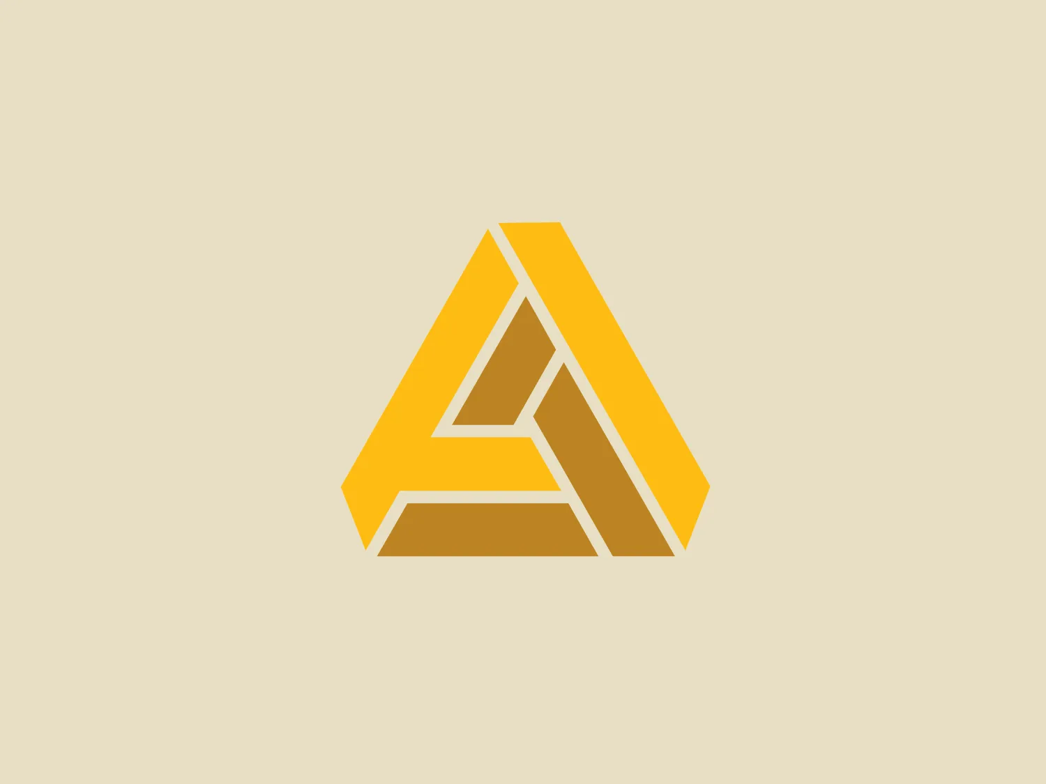
One thing we like about the Assurex Global logo is its modern, dynamic, and professional design with abstract geometric formations in two shades of yellow outlined with a thin, light grey border.
Letter
Type
Color
Style
The Assurex Global logo features an abstract, geometric design composed of triangular formations in two shades of yellow—bright and gold— outlined with a thin, light grey border. The sharp angles and contrast give it a modern, dynamic, and professional look.
Assurex Global is a leading privately-held brokerage group specializing in commercial insurance, risk management, and employee benefits. The company operates on a global scale, providing a comprehensive range of services to businesses of varying sizes and industries.
No items found.
Similar logos
NEW

The ICICI Bank logo features a stylized, abstract design with a fluid, organic shape. The central element resembles a lowercase "i" with a dot hovering above what could be interpreted as an abstract human figure or a dynamic swirl. Its bold lines curve to create a sense of movement. The color scheme consists of a gradient transition from a deep, warm red to a rich, golden orange, giving the logo an energetic and inviting appearance. Noteworthy is the way the white space between the "i" and its dot creates a pathway, emphasizing the motion and adding an element of negative space to the design.
NEW

The Breitling logo depicts a stylized, fluid letter "B" with elongated, curved strokes, giving it an elegant and dynamic appearance. The design is minimalist, using a bold golden yellow color that suggests luxury, quality, and sophistication. The overall aesthetic is modern and sleek, with a sense of movement and possibly creativity, hinted by the smooth lines that evoke a sense of continuity. Given the vibrancy of the golden hue, a subtle and light background would complement it well without competing for attention.
NEW

The Subway logo features two bold, interlocking arrows forming an 'S' shape, with the top arrow colored in a striking green and the bottom in a vibrant yellow. The design is clean and modern, with a dynamic sense of movement implied by the arrows pointing in opposite directions. This creates a sense of exchange, circulation, or progression, which might suggest a company involved in logistics, technology, or finance. The flat color treatment and lack of additional embellishments give it a contemporary and straightforward aesthetic.
NEW

The Washington Commanders logo features three interconnected diamond shapes forming a stylized letter "W." The primary color is a deep maroon with a thick golden yellow border, creating a sharp contrast and a dynamic feel. The use of geometric shapes and bold colors conveys strength and modernity.
NEW

The business logo for Glow Bar is a stylized, modern design portraying the lowercase letter 'g'. The design is fluid and continuous, with a bold, looping structure. The logo is a warm, pale gold color, conveying luxury and elegance, with a glossy finish for a premium feel. A small, five-pointed star sits above the upper curve of the 'g,' suggesting excellence or a premium grade.
NEW

The Nationale Nederlanden logo exhibits a modern and dynamic design, featuring a stylized letter "N" enclosed within a circular shape. The minimalist "N" showcases sharp angles and a bold presence, with a gradient color scheme transitioning from vibrant orange to deep yellow, evoking energy and innovation. The circular background lends a sense of inclusivity or a global perspective, while the clean lines and digital feel make it suitable for a brand associated with technology, creativity, or communication.
NEW

The Banreservas logo showcases a capitalized letter "R" in a dark grey tone using a modern, bold sans-serif typeface. Below the "R," three curved swooshes flow to the left, colored in gradients of light blue, blue, and orange, creating a dynamic contrast. The design presents a clean, contemporary look that suggests energy, speed, or growth.
NEW

The logo for Zenith Bank is a stylized representation of the letter 'Z.' It features two main components with contrasting colors: a dark gray plane that forms the upper part of the 'Z' and a bold red plane creating the lower part. The logo has a sharp, modern look, characterized by its angular design and the use of negative space to enhance the division between the upper and lower sections. The absence of curves and the choice of a sans-serif style typeface give the design a strong, industrial feel. Its overall aesthetic is dynamic and suggests a sense of forward motion or progress.
NEW

The Windesheim logo features a bold, modern design of a stylized letter "W" with sharp angles and a two-dimensional appearance. It is a vibrant, solid yellow color, creating a strong visual presence that is immediately eye-catching. The minimalist aesthetic and contemporary feel are accentuated by the use of a single bright color. The logo's angles convey a sense of movement and dynamism, resonating well with brands seeking to convey innovation or energy.
NEW

The Shangri-La Group logo features a stylized, abstract design consisting of smooth, curvilinear shapes. It is composed of golden yellow lines that form a central symbol reminiscent of a bird in flight or a leaf, enclosed within a perfect circle. The lines are bold and flowing, creating a sense of movement and harmony. The overall aesthetic is modern, minimalistic, and organic, suggesting elegance, freedom, or growth. The simplicity of the design allows for versatile use across various media.