Merimee

15
What we like is the sophisticated, minimalist design with interlocking lines creating a fluid pattern for Mérimée, conveying a modern and luxurious aesthetic.

Merimee Logo

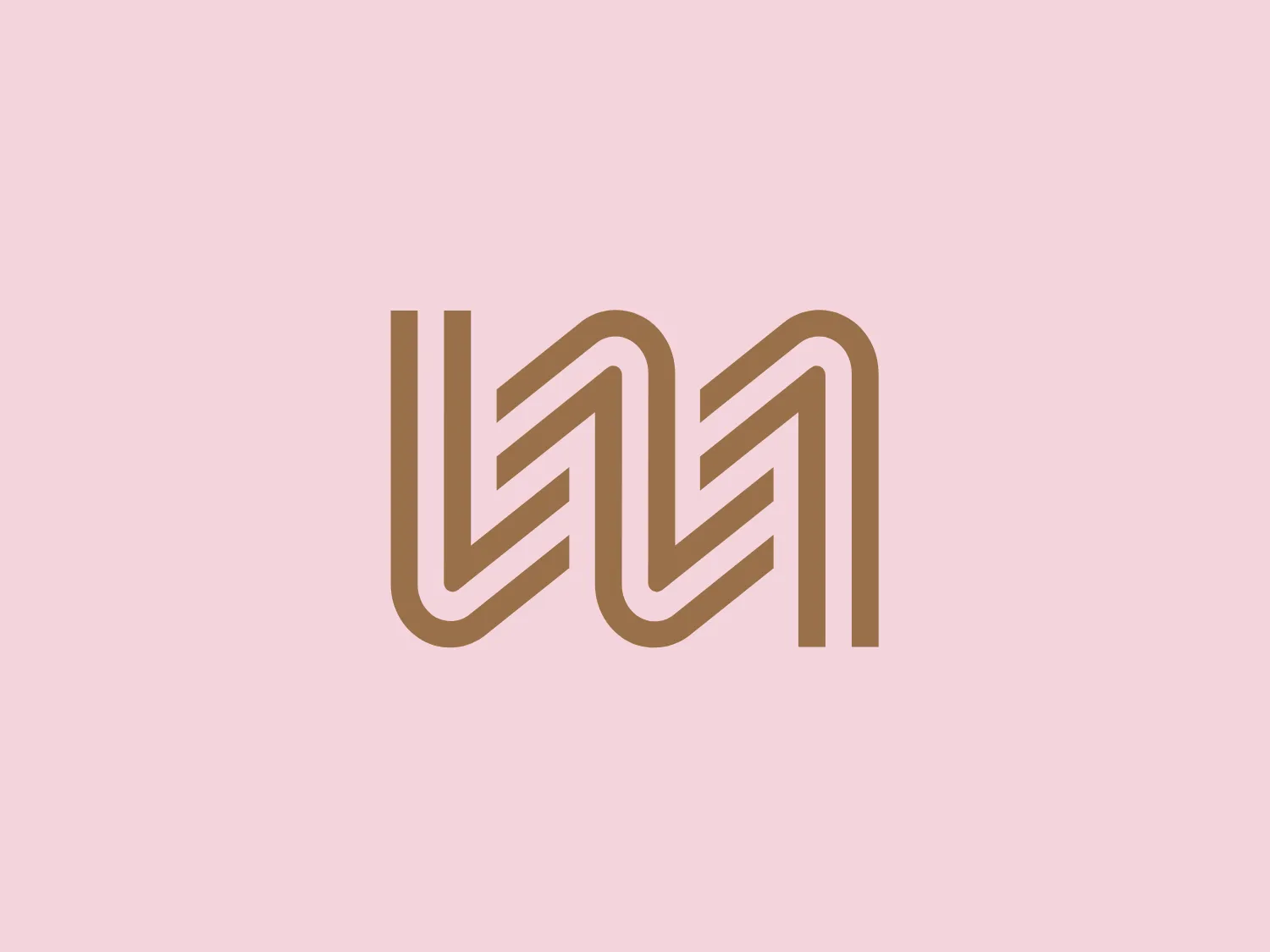
The image depicts a stylized, abstract logo comprised of continuous, interlocking lines that create a fluid, geometric pattern for Mérimée. The design has a clean, modern aesthetic with a three-dimensional effect, achieved by the use of shading and overlapping elements. The color palette is minimal, featuring varying tones of a muted gold or beige color that impart a sense of sophistication and luxury. The lines form what could be interpreted as a series of 'M' shapes or zigzag patterns that seamlessly merge into one another, giving the logo a dynamic and interconnected feel. The use of negative space is also noteworthy, adding to the emblem's visual interest.

About Merimee

Mérimée Gestion Privée is a well-established company with a widespread presence across France. They specialize in providing comprehensive support to their clients for the preservation, growth, and transfer of their assets.

Similar logos

The ICICI Bank logo features a stylized, abstract design with a fluid, organic shape. The central element resembles a lowercase "i" with a dot hovering above what could be interpreted as an abstract human figure or a dynamic swirl. Its bold lines curve to create a sense of movement. The color scheme consists of a gradient transition from a deep, warm red to a rich, golden orange, giving the logo an energetic and inviting appearance. Noteworthy is the way the white space between the "i" and its dot creates a pathway, emphasizing the motion and adding an element of negative space to the design.
The Washington Commanders logo features three interconnected diamond shapes forming a stylized letter "W." The primary color is a deep maroon with a thick golden yellow border, creating a sharp contrast and a dynamic feel. The use of geometric shapes and bold colors conveys strength and modernity.
The Vanderbilt University logo is a stylized letter "V" with a modern and sleek design. It features sharp angles converging towards the bottom to form a precise and cutting-edge base. The logo is gold-toned, with a gradient transitioning from lighter to darker, giving it a luxurious and refined appearance.
The Oberoi logo features a stylized bloom or sunburst, with a multitude of pointed petals or rays emanating from a central point. It utilizes a two-tone color scheme with shades of gold, giving it a warm, inviting look. The design is symmetrical, suggesting balance and harmony. The overall aesthetic is clean and modern, with a touch of elegance due to the refined curves of each petal and the gradient effect that provides a sense of depth. The simplicity of the design allows for versatility in its application.
The Lorenz Corp. logo showcases a stylized letter "L," designed with dark navy blue lines and edges, creating a bold and pronounced appearance. Intertwined with the "L" is a golden yellow laurel wreath, adding a touch of prestige and victory symbolism. The overall design aesthetic is clean, professional, and evokes a sense of tradition and excellence. The interplay of navy blue and golden yellow creates a strong contrast that is both eye-catching and elegant.
The logo for Marvelous Designer features a simplistic and bold design of two identical, thick, golden-yellow bars arranged diagonally to form an abstract letter 'M'. The negative space between them accentuates the shape of the 'M', while the lack of embellishments gives the logo a modern and minimalistic feel. The bright and attention-grabbing color suggests energy and innovation.
The business logo for Glow Bar is a stylized, modern design portraying the lowercase letter 'g'. The design is fluid and continuous, with a bold, looping structure. The logo is a warm, pale gold color, conveying luxury and elegance, with a glossy finish for a premium feel. A small, five-pointed star sits above the upper curve of the 'g,' suggesting excellence or a premium grade.
The King School logo showcases a dark blue shield with a golden border, exuding a classic and regal aura. A stylized golden kettle with a bold letter "K" at the center represents a possible initial or emblematic symbol of the school. Below the kettle, three five-pointed stars line up horizontally, accompanied by two wavy lines suggesting steam or heat. The prominent display of the year "1865" at the bottom signifies an important founding date or historical reference. The elegant contrast between the golden elements and dark blue background, along with the traditional serif font used for the date, adds to the logo's timeless appeal.
The Hasibat logo showcases a symmetrical, geometric design with four navy blue right-angled, L-shaped elements converging towards the center, complemented by a muted beige central square. The minimalist and modern aesthetic, featuring clean lines and block colors, conveys stability and professionalism, while the strategic use of negative space accentuates the organized, grid-like pattern.
The Calgary Flames logo features a stylized letter "C" in a bold red color with gold and white trim, giving it a three-dimensional appearance. Embedded into the form of the "C" is the profile of a fiery figure, suggestive of a flame with wispy edges in shades of red and orange that evoke a sense of dynamic movement and energy. The flame's outline doubles as the inner stroke of the letter, with small accents of white, enhancing the contrast and detail within the design. This logo exudes a bold and energetic aesthetic, appropriate for a dynamic and spirited brand or team. It has a modern and sleek look with a distinct sense of motion and liveliness.