Minh Tien Coffee

15
This logo for Minh Tien Coffee features a modern, sleek, and minimalist monochromatic "M" design that exudes sophistication and timeless elegance.

Minh Tien Coffee Logo

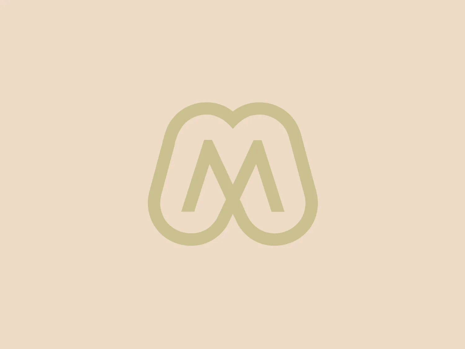
The logo for Minh Tien Coffee is a stylized letter "M" composed of two arches that join in the middle. The design is modern and sleek with soft, rounded edges, giving an overall organic and smooth feel. It is monochromatic, using a muted gold or beige tone that evokes a sense of sophistication and elegance. It’s a minimalist design, devoid of any additional embellishments, which contributes to its versatility and timeless appeal. The simplicity of the design suggests that it could belong to a brand that values elegance, clarity, and luxury.

About Minh Tien Coffee

Minh Tien Group, founded in 2000, specializes in the production of authentic coffee sourced from indigenous farmlands in Vietnam's Central Highlands. The company is recognized for its closed-loop production system, which effectively recycles coffee by-products to reduce waste and maximize the value of the coffee tree.

Similar logos

The ICICI Bank logo features a stylized, abstract design with a fluid, organic shape. The central element resembles a lowercase "i" with a dot hovering above what could be interpreted as an abstract human figure or a dynamic swirl. Its bold lines curve to create a sense of movement. The color scheme consists of a gradient transition from a deep, warm red to a rich, golden orange, giving the logo an energetic and inviting appearance. Noteworthy is the way the white space between the "i" and its dot creates a pathway, emphasizing the motion and adding an element of negative space to the design.
The Washington Commanders logo features three interconnected diamond shapes forming a stylized letter "W." The primary color is a deep maroon with a thick golden yellow border, creating a sharp contrast and a dynamic feel. The use of geometric shapes and bold colors conveys strength and modernity.
The business logo for Glow Bar is a stylized, modern design portraying the lowercase letter 'g'. The design is fluid and continuous, with a bold, looping structure. The logo is a warm, pale gold color, conveying luxury and elegance, with a glossy finish for a premium feel. A small, five-pointed star sits above the upper curve of the 'g,' suggesting excellence or a premium grade.
The King School logo showcases a dark blue shield with a golden border, exuding a classic and regal aura. A stylized golden kettle with a bold letter "K" at the center represents a possible initial or emblematic symbol of the school. Below the kettle, three five-pointed stars line up horizontally, accompanied by two wavy lines suggesting steam or heat. The prominent display of the year "1865" at the bottom signifies an important founding date or historical reference. The elegant contrast between the golden elements and dark blue background, along with the traditional serif font used for the date, adds to the logo's timeless appeal.
The Vanderbilt University logo is a stylized letter "V" with a modern and sleek design. It features sharp angles converging towards the bottom to form a precise and cutting-edge base. The logo is gold-toned, with a gradient transitioning from lighter to darker, giving it a luxurious and refined appearance.
The Calgary Flames logo features a stylized letter "C" in a bold red color with gold and white trim, giving it a three-dimensional appearance. Embedded into the form of the "C" is the profile of a fiery figure, suggestive of a flame with wispy edges in shades of red and orange that evoke a sense of dynamic movement and energy. The flame's outline doubles as the inner stroke of the letter, with small accents of white, enhancing the contrast and detail within the design. This logo exudes a bold and energetic aesthetic, appropriate for a dynamic and spirited brand or team. It has a modern and sleek look with a distinct sense of motion and liveliness.
The Oberoi logo features a stylized bloom or sunburst, with a multitude of pointed petals or rays emanating from a central point. It utilizes a two-tone color scheme with shades of gold, giving it a warm, inviting look. The design is symmetrical, suggesting balance and harmony. The overall aesthetic is clean and modern, with a touch of elegance due to the refined curves of each petal and the gradient effect that provides a sense of depth. The simplicity of the design allows for versatility in its application.
The Wake Forest University logo is a modern and minimalist stylized shield with abstract, geometric shapes suggesting strength and protection. Three symmetrical shapes within the shield resemble leaves or flames, converging at the center. The color palette is simple and sophisticated with deep black shapes and a metallic gold outline. The overall aesthetic is clean, sharp, and conveys a feeling of luxury or high-end branding.
The Farah logo features a cursive, stylized letter "f" that exudes elegance and sophistication. The solid, golden yellow color communicates warmth, optimism, and creativity while the balance between thick and thin strokes creates a dynamic contrast. The cohesive shape represents continuity and possibly unity, making it well-suited for brands aiming to convey luxury, artistry, or innovation.
The Shangri-La Group logo features a stylized, abstract design consisting of smooth, curvilinear shapes. It is composed of golden yellow lines that form a central symbol reminiscent of a bird in flight or a leaf, enclosed within a perfect circle. The lines are bold and flowing, creating a sense of movement and harmony. The overall aesthetic is modern, minimalistic, and organic, suggesting elegance, freedom, or growth. The simplicity of the design allows for versatile use across various media.