Music Business Association

15
What we like: The Music Business Association logo's stylized "M" with geometric abstraction in a modern color scheme exudes forward-thinking energy and sleek aesthetic.

Music Business Association Logo

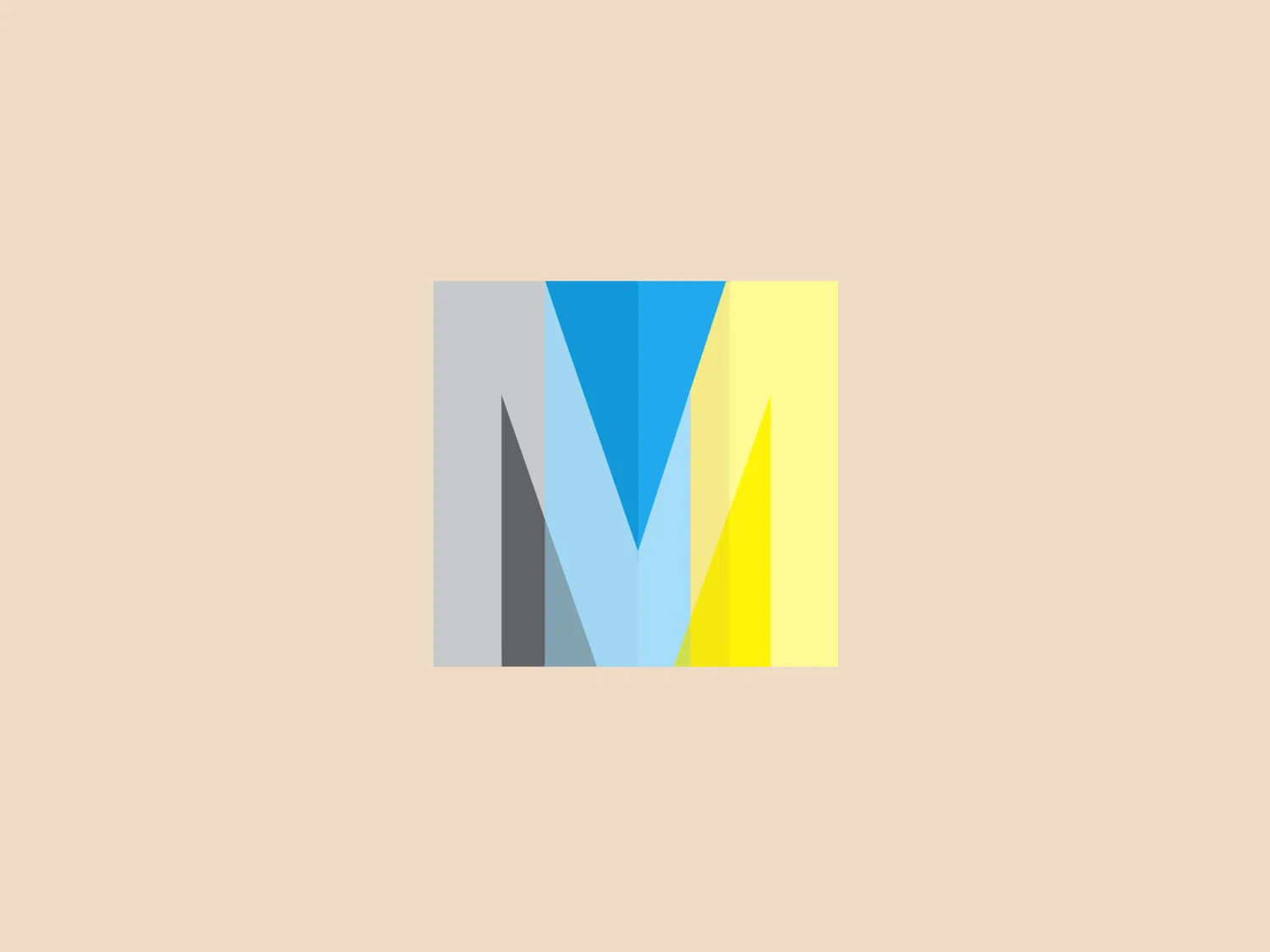
The Music Business Association logo showcases a stylized letter "M" with geometric abstraction. It is comprised of four angular sections that converge to form the letter "M." The color palette transitions from a cool dark gray to a bright cyan, then to light gray, and concludes with a vibrant yellow from left to right. The overall design exudes a modern and sleek aesthetic, featuring flat colors and sharp angles to emphasize forward-thinking and dynamic energy. The clean lines and contemporary style suggest a connection to technology, finance, or innovation-focused companies.

About Music Business Association

The Music Business Association is a non-profit membership organization dedicated to advancing and promoting music commerce. It serves as a community committed to the full spectrum of monetization models within the industry.

Similar logos

The Nationale Nederlanden logo exhibits a modern and dynamic design, featuring a stylized letter "N" enclosed within a circular shape. The minimalist "N" showcases sharp angles and a bold presence, with a gradient color scheme transitioning from vibrant orange to deep yellow, evoking energy and innovation. The circular background lends a sense of inclusivity or a global perspective, while the clean lines and digital feel make it suitable for a brand associated with technology, creativity, or communication.
The Breitling logo depicts a stylized, fluid letter "B" with elongated, curved strokes, giving it an elegant and dynamic appearance. The design is minimalist, using a bold golden yellow color that suggests luxury, quality, and sophistication. The overall aesthetic is modern and sleek, with a sense of movement and possibly creativity, hinted by the smooth lines that evoke a sense of continuity. Given the vibrancy of the golden hue, a subtle and light background would complement it well without competing for attention.
The Banreservas logo showcases a capitalized letter "R" in a dark grey tone using a modern, bold sans-serif typeface. Below the "R," three curved swooshes flow to the left, colored in gradients of light blue, blue, and orange, creating a dynamic contrast. The design presents a clean, contemporary look that suggests energy, speed, or growth.
The logo for Zenith Bank is a stylized representation of the letter 'Z.' It features two main components with contrasting colors: a dark gray plane that forms the upper part of the 'Z' and a bold red plane creating the lower part. The logo has a sharp, modern look, characterized by its angular design and the use of negative space to enhance the division between the upper and lower sections. The absence of curves and the choice of a sans-serif style typeface give the design a strong, industrial feel. Its overall aesthetic is dynamic and suggests a sense of forward motion or progress.
The Le Monde logo features a stylized, abstract design that appears to be a representation of three vertical bars or pillars, with curvatures suggesting movement or fluidity. The design is monochromatic, utilizing varying shades of black and gray to create dimension and a sense of depth through shading and highlights. Its aesthetic leans towards modern and sleek, with clean lines and a minimalist approach that avoids any superfluous details. The use of negative space between the elements is cleverly managed to maintain the structure and integrity of each bar while imparting a dynamic and slightly futuristic look.
The logo for Luma AI showcases a stylized, geometric design with two overlapping planes. The primary shape resembles a three-dimensional rhombus or skewed cube, creating depth and perspective. A vibrant cyan transitions smoothly to a rich, deep blue, suggesting movement and energy. The overall aesthetic is modern and dynamic, with clean lines and a minimalist approach, conveying a sleek, professional image.
The logo presents a dynamic swirl with a gradient transition from a deep orange to a bright yellow, representing movement or energy. The design resembles a stylized sun or a spinning object with rounded triangular shapes emanating outward, simulating rays or rotation. The overall design aesthetic is modern and vibrant, invoking feelings of creativity, warmth, and motion. The smooth transition of colors gives it a sleek, gradient look that could imply heat, speed, or innovation. The Logo for Grafana Labs.
The Subway logo features two bold, interlocking arrows forming an 'S' shape, with the top arrow colored in a striking green and the bottom in a vibrant yellow. The design is clean and modern, with a dynamic sense of movement implied by the arrows pointing in opposite directions. This creates a sense of exchange, circulation, or progression, which might suggest a company involved in logistics, technology, or finance. The flat color treatment and lack of additional embellishments give it a contemporary and straightforward aesthetic.
The Webster Bank logo features a stylized letter "W" composed of two overlapping chevron shapes in a bold yellow color, set against a white background enclosed within a thick blue circular border. The design aesthetic is modern and minimalistic, with the use of sharp angles and clean lines conveying a sense of dynamism and forward movement. The simplicity and contrast between the yellow and blue make the logo stand out and easily recognizable. The design effectively balances negative space within the "W" to create a sense of depth and layering.
The eTactica logo showcases a simple and geometric design composed of four differently colored quarter-circle sectors arranged in a circular pattern, resembling a spinning wheel or pie chart. The transition from vibrant red to yellow, green, and blue creates a smooth and balanced look. The use of primary and secondary colors gives the logo an energetic and optimistic feel. The white negative space in the center subtly forms a 'C' shape, possibly representing the initial of the company or brand.