Angelic Bakehouse

15
What we like is the gentle and elegant lowercase 'a' with organic leaf-like figures, conveying a warm and modern vibe.

Angelic Bakehouse Logo

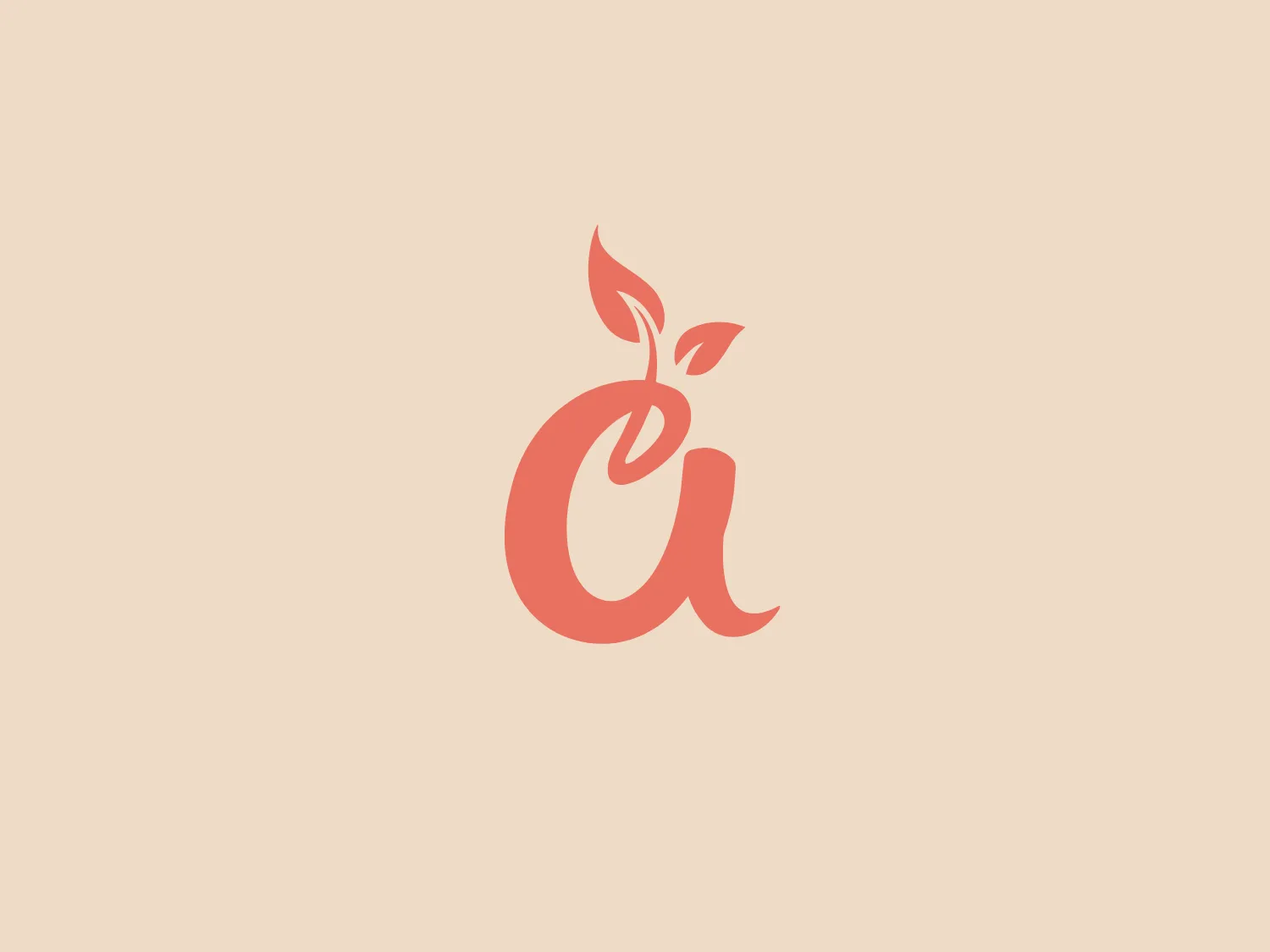
The Angelic Bakehouse logo features a stylized lowercase letter 'a' with an organic design element. The 'a' has a flowing right leg, giving it a gentle and elegant appearance. Above it, two leaf-like figures sprout seamlessly from the letter, suggesting growth or a natural essence. The logo's warm, soft coral shade conveys a welcoming and vibrant energy. This color choice is modern and could be associated with creativity or a health-conscious brand, perhaps one related to nature or organic products. The logo is minimalist and uses negative space effectively to enhance its design.

About Angelic Bakehouse

Angelic Bakehouse specializes in producing nutritious and delicious sprouted grain products. Their bread, rolls, buns, and pizza items are crafted with natural ingredients, showcasing the harmonious blend of taste and healthiness.

Similar logos

The Telstra logo features a stylized uppercase letter "T" in bold, sans-serif font, and an abstract oval-like shape underneath. The vivid blue of the "T" exudes professionalism and trust, while the warm coral red of the shape adds a dynamic and energetic feel. The modern, simplistic aesthetic is characterized by clean lines and curves suggesting movement or stability. The red shape resembles a swoosh or pathway, implying progress or a journey.
The Angi logo showcases a sleek "A" in a vibrant coral red color. Its modern and minimalistic design includes a flowing curve that creates an engaging loop at the base, imparting a friendly and professional look. The bold typeface with smooth edges balances thick and thin strokes, exuding both weight and elegance. The logo's style and color suggest a preference for a complementary background that doesn't overshadow it.
The image is of a stylized logo featuring the letter "B" for Bendigo Bank. It consists of two main shapes: the larger one is a deep burgundy or maroon color, forming the straight edge and the decisive curve of the letter, while the smaller shape is a vibrant coral or salmon pink, completing the inner loop and infusing the design with a dynamic, playful contrast. The overall design aesthetic is modern and minimalistic, with the use of negative space and the interaction between the two shapes giving the logo a three-dimensional feel. It's an abstract, contemporary take on a classic letter form.
The Azerbaijan logo showcases an elegant, contemporary design with two overlapping geometric shapes. A full, bright purple circle on the left overlaps with a vivid coral pink semi-circle on the right, creating a sense of depth and interaction. The bold and contrasting yet harmonious color scheme makes for an eye-catching and memorable logo. The minimalist design emphasizes pure form and color interplay, without the inclusion of any text or additional elements.
The SpeedPPC logo features a stylized, geometric shape resembling a confluence of two fold-over paper or ribbon elements. One segment is a deep coral pink similar to salmon, the other a strong royal blue. Both segments are parallelograms with their longer sides oriented horizontally, conveying movement and dynamism. The flat colors without gradient create a clean, modern aesthetic, while their overlap creates a darker shade, providing depth and an interlocking feel. The design leans towards minimalism with a 3D effect.
The Fintonic logo features an abstract design consisting of three bold shapes. Two similar elongated, rounded shapes are arranged vertically with a slight angle, creating a sense of movement or balance. Below these two forms is a smaller, perfectly rounded circle, centrally aligned with the space between the shapes above it. The design uses a striking coral red color that stands out with its energetic hue. The overall aesthetic is modern and minimalist, with a playful yet sophisticated feel. The shapes might suggest connectivity or interaction, appropriate for a company focused on communication, technology, or health and wellness due to the resemblance to cells or links in a chain.
The Jonathan Vickers Fine Art Award logo features a modern, minimalist stylized letter "V" in a coral red color. The negative space within the V creates a sleek flame or droplet shape, symbolizing motion or transformation. The design aesthetic is characterized by geometric simplicity and elegance, balanced with sharp angular lines and curved cutouts to convey precision and fluidity.
The Baseline Protocol logo features a stylized, geometric design consisting of three hexagons stacked vertically with a slight rightward offset, creating a sense of depth. The topmost hexagon is filled with a solid black, while the two beneath it have a thick black outline and are filled with white, enhancing the contrast. A diagonal slash in a bright coral color intersects the bottom two hexagons, adding a dynamic element to the composition. The overall design is modern and minimalistic, evoking a sense of precision and innovation.
The QVC logo is a modern, minimalist design that features a stylized letter "Q". The navy blue Q stands out against its surroundings, creating a striking contrast. It is complemented by a thin, coral-colored square border, adding a pop of color and enhancing its visual appeal. The overall aesthetic is sleek and contemporary, suitable for various branding applications. The simplicity and elegance convey a brand that values sophistication and clarity.
The logo presents a predominantly cool color palette with shades of dark and lighter blue that suggest motion or fluidity. The lines create an impression of a dynamic shape, almost like a stylized "S" or a river with waves, with an additional touch of warmth introduced by a small, understated accent in coral red at the base. The overall design has a modern and sleek feel, with a sense of elegance and movement encapsulated within its minimalist aesthetic.