De Compagnons

15
What we like about the De Compagnons logo is its modern, minimalistic feel and the seamless integration of the monogram letters with a subtle leaf motif, creating a harmonious and elegant design.

De Compagnons Logo

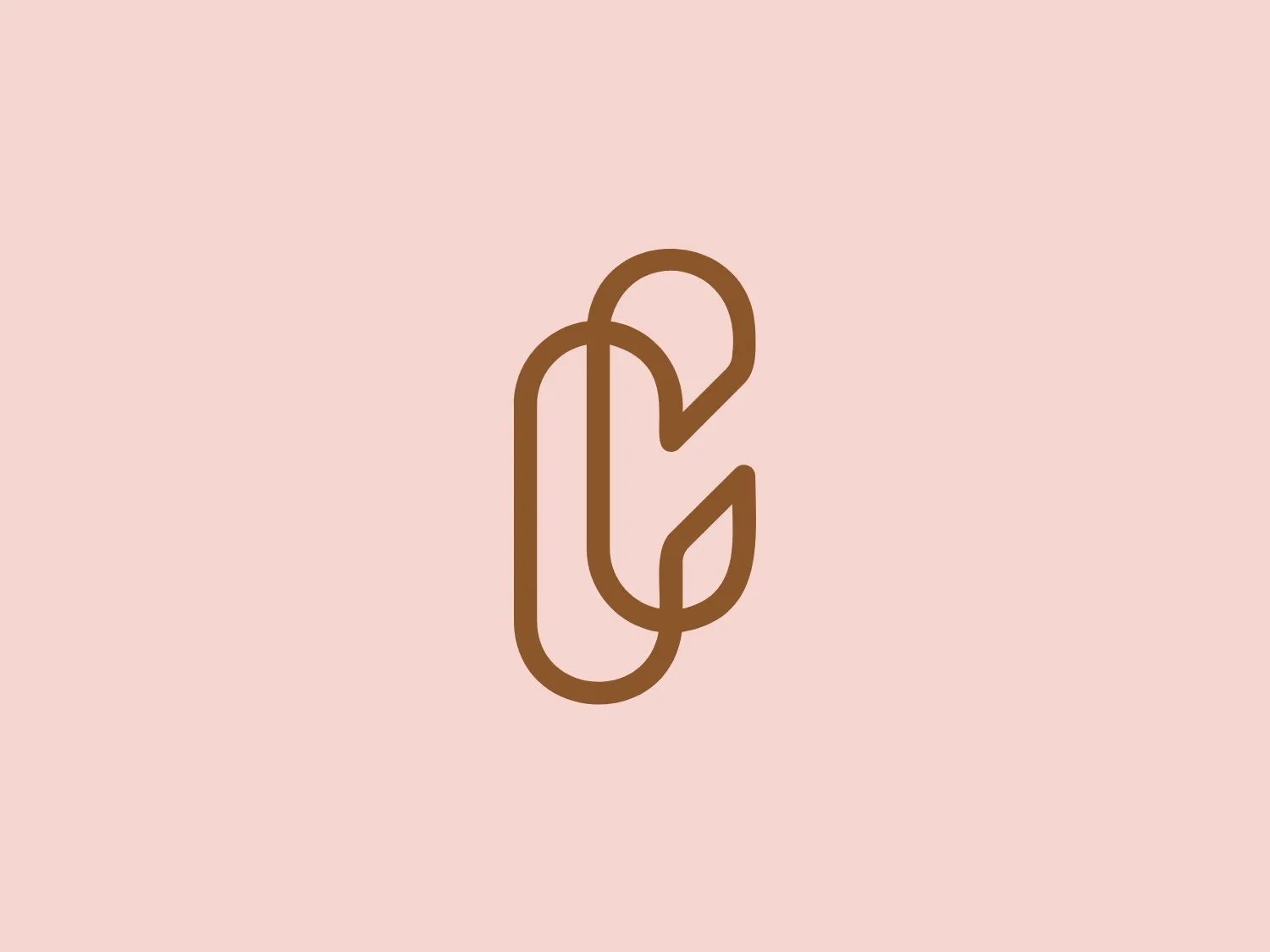
The De Compagnons logo features a stylized monogram with a juxtaposition of two letters, reminiscent of a lowercase 'c' and an uppercase 'G'. The design has a modern and minimalistic feel, with clean lines and curves creating a harmonious balance. The letterforms are intertwined, suggesting connectivity or unity, and are colored in a warm, muted shade of brown, adding an organic elegance to the design. One of the letters incorporates a leaf motif, which gently suggests a focus on nature, growth, or eco-friendliness. The use of negative space within the forms contributes to its sophisticated and contemporary aesthetic.

About De Compagnons

De Compagnons operates as a versatile establishment, functioning as a cafe during the day and transforming into a lively bar at night. The venue provides a cozy ambiance for customers to enjoy meals, beverages, and social interactions. Additionally, it organizes a range of events and tastings on evenings and weekends, delivering a multifaceted experience for its clientele.

Similar logos

The Motorola logo features a stylized letter 'M' in bright white, set against a circular vibrant blue backdrop. The 'M' has a modern geometric design with pointed vertices at the top and a wave-like link between the two legs of the letter at the bottom, resembling mountain peaks. The contrast and simplicity of the design give it a clean, crisp, and easily recognizable aesthetic. A light, neutral shade such as pale pinkish-tan is a suitable background color that complements its vibrant tone while ensuring the white 'M' stands out.
The Sincol logo features an abstract, three-dimensional geometric figure that resembles a stylized, incomplete cube constructed from separate parallelogram shapes. The design has a modern and minimalistic aesthetic with only three colors: a rich brown, a vibrant red, and a clean white background that highlights the figure. The shapes are arranged in a way that creates a sense of depth and motion, as if the parts of the cube are either assembling or disassembling. The outer square boundary, in a subtle red, frames the design neatly. Given the current color scheme of the Sincol logo, a light but slightly contrasting background would complement it well.
The logo presented is a simple, stylish design consisting of two mirrored shapes that resemble the letter "M". The design is abstract and minimalistic, with no additional embellishments or text. Its color is a solid, warm shade of brown, giving it a modern and professional look. The overall aesthetic is clean and sophisticated, likely to appeal to contemporary businesses seeking an elegant visual identity.
The Orfeu logo is a stylized, abstract representation of a nature-inspired theme. It features two symmetrical halves arranged vertically, with three curved, horizontal stripes on each side suggesting movement or organic growth. The design is simple and modern, using a single warm brown color, denoting natural origins and earthiness. The smooth, rounded shape of the logo gives it a friendly and approachable look.
The image displays the Jacu logo, featuring a symmetrical, abstract shape resembling a blooming flower or a stylized letterform. It consists of two dark brown curved elements that mirror each other, tapering down to a rounded point at the bottom, with negative space creating a separation or central line. The design combines organic and modern aesthetics, with smooth curves and a minimalist approach, resulting in a sophisticated and elegant visual symbol. The simplicity and absence of additional embellishments provide a clean and versatile appearance suitable for varied branding applications.
The Urbane Coffee logo showcases a stylized cup or mug viewed from the top, with the letter 'U' seamlessly integrated into its design. The main shape resembles a 'U' or a horseshoe, drawn with smooth, symmetrical curves. The color palette includes dark brown, mint green, and a lighter shade of green, creating a modern and clean aesthetic. The bold dark outline contrasts with the soft green tones, accentuating the iconic shape and lending an organic, comforting feel. The logo strikes a balance between simplicity and a creative twist, embodying a contemporary look while remaining approachable.
The Polish Translators Association logo features an abstract design that seamlessly integrates the letter "T" with a book-like structure. The solid, dark brown color scheme exudes professionalism and scholarly sophistication. The top part of the "T" extends horizontally on both sides, creating an open book cover effect, while also clearly representing the letter "T". The logo's clean and modern lines, characterized by right angles and no extraneous elements, contribute to its robust and streamlined aesthetic.
The Air Astana logo is a stylized, abstract design with a dynamic triangular form pointing towards the right, suggesting forward motion or progress. The main body of the triangle is a solid, earthy brown color, while the negative space within it features intricate, swirling shapes that resemble a pair of stylized "S" letters or perhaps a custom ornamental design. The design has a modern yet timeless feel, balancing simplicity with decorative elements seamlessly within its geometric boundaries.
The Bazar Posnanski logo showcases a bold, capitalized letter 'B' in a serif font, set within a circular border. The border has two concentric circles with a gap, creating depth. Four evenly spaced horizontal lines create a dynamic burst effect, drawing attention to the central letter. The logo's rich, dark brown color exudes tradition and reliability, while the overall design exudes classic sophistication with a touch of vintage charm.
The Danesi Caffè logo features a stylized, geometric representation of a lowercase letter 'b' composed of two distinct shapes: a vertical rectangle and a semicircle. The vertical bar is on the right, while the semicircle is on the left, neatly aligning with the bar to form the overall letter shape. The design is minimalist and modern with clean, sharp lines. There's a balance between the two shapes that gives it a sense of solidity and simplicity. The logo uses a solid, dark brown color, which adds a strong, sophisticated character to the design. Given the simplicity and the color of the logo, a neutral and light background would complement it well, enhancing its visibility and elegance.