Sincol

15

Letter

Color

Sincol Logo

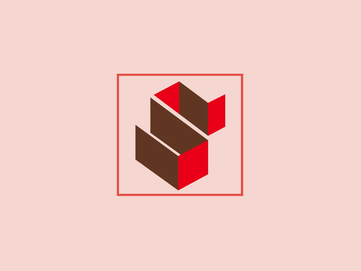
The Sincol logo features an abstract, three-dimensional geometric figure that resembles a stylized, incomplete cube constructed from separate parallelogram shapes. The design has a modern and minimalistic aesthetic with only three colors: a rich brown, a vibrant red, and a clean white background that highlights the figure. The shapes are arranged in a way that creates a sense of depth and motion, as if the parts of the cube are either assembling or disassembling. The outer square boundary, in a subtle red, frames the design neatly. Given the current color scheme of the Sincol logo, a light but slightly contrasting background would complement it well.

About Sincol

Sincol is Brazil's leading door manufacturer, recognized for its international presence in 37 countries. The company is esteemed for its trailblazing initiatives in forest management and reforestation.

No items found.

Similar logos

The Angi logo showcases a sleek "A" in a vibrant coral red color. Its modern and minimalistic design includes a flowing curve that creates an engaging loop at the base, imparting a friendly and professional look. The bold typeface with smooth edges balances thick and thin strokes, exuding both weight and elegance. The logo's style and color suggest a preference for a complementary background that doesn't overshadow it.
The Framer logo consists of a bold, abstract geometric design that features two black shapes on a white background. These shapes resemble stylized arrowheads or triangular segments arranged back-to-back with a right angle between them, creating a dynamic and forward-moving impression. The overall design aesthetic is minimalist, modern, and hints at movement or transition. The logo's sharp angles and contrasting colors give it a striking appearance.
The Generale Bank logo is a minimalist design featuring a bold and modern 'G' created with sharp lines and curves. The solid, white letter sits centrally against a vibrant, flat, coral red square background. The 'G' has a geometric quality with its upper case form and is designed with a cutout that cleverly contributes to reading the letter correctly. The contrast between the bright white and the bold red makes the logo pop, indicative of a brand that aims to be seen as energetic and confident.
The Qmedics logo showcases a stylized letter Q in a 3D ribbon-like form with smooth, flowing curves. It incorporates warm red and pink tones transitioning to cooler purples and blues on the interior, creating a vibrant and energetic look. The modern, playful design uses gradients to convey depth and movement, evoking an aesthetic of creativity and dynamism.
The Columbia SC logo features a vibrant, deep red rectangular background with rounded corners, creating a bold and attention-grabbing design. Centered on the background is a clean and modern white capital letter "H" with a contemporary aesthetic, featuring a slight gap between the vertical and horizontal strokes. The logo's balance of rounded edges and straight lines creates a dynamic and harmonious visual effect.
The Akon Hidrolik logo exhibits a bold and minimalist design with a black square background. Within the square, a white geometric shape forms a stylized letter "a" with a red circle at the base, evoking the imagery of a needle's eye or a focal point. The overall aesthetic is modern and contemporary, utilizing primary colors and strong contrast to enhance its visual impact. Its simplicity renders it highly recognizable and versatile.
The BETA Technologies logo features a bold, solid black letter "B" with a white lightning bolt cutting through its center, creating a modern and minimalist design. The stark contrast between the black and white elements emphasizes the strong visual impact of the logo. The lightning bolt infuses a sense of power and energy, suggesting dynamism and force. The classic, rounded attributes of the "B" combined with the edgy, contemporary feel of the lightning bolt create a striking visual identity for the business.
The Logo for Tender Greens consists of two solid circles stacked vertically. The top circle is slightly smaller and has a small, quarter-circle notch at the top right, reminiscent of a stemmed fruit such as a cherry or an apple. Both circles and the stem-like feature share a bold, saturated red color, offering a striking contrast that would stand out on a lighter background. The design is simplistic with a flat, two-dimensional appearance and lacks additional detailing, which contributes to its modern and minimalist aesthetic.
The logo for Olelo showcases a stylized white speech bubble enclosed within a rounded purple rectangle. The speech bubble aligns to the right side and creates a seamless contour with the edge of the rectangle. This design choice has a clean and modern aesthetic and hints at communication, conversation, or messaging services. The color palette of white and purple offers a strong contrast that enhances visibility and brand recognition.
The logo for Lifetime is a simple yet bold design consisting of variations of circular shapes with a modern twist. The primary color of the logo is a bright red, creating a striking visual impact. The design features a large, solid red circle, from which a smaller circle and a swoosh-like shape have been subtracted, giving the appearance of a stylized letter "Q" or an abstract representation of a person. The negative space within the Lifetime logo is particularly effective in creating a dynamic and unique figure, promoting a sense of elegance and fluidity in the overall aesthetic.