Voices of Youth

15
The Voices of Youth logo features a stylish 'V' and a speech bubble, representing modernity and communication in a vibrant blue color.

Voices of Youth Logo

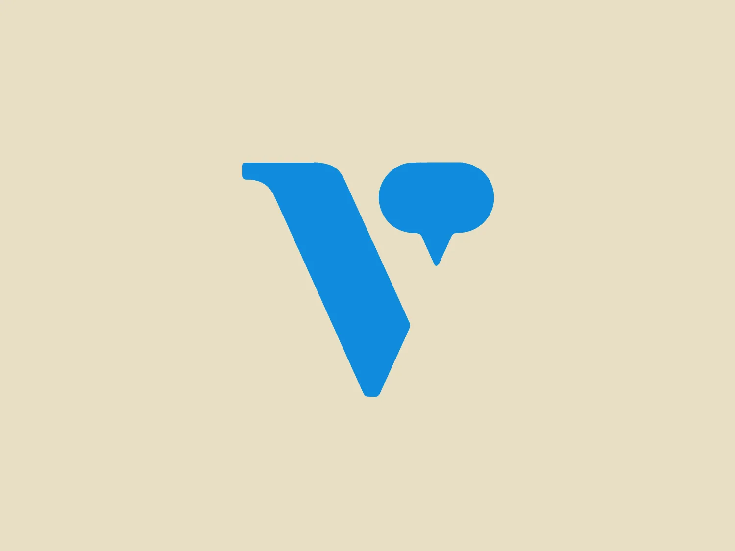
The Voices of Youth logo features a stylized blue uppercase 'V' adjacent to what appears to be a speech bubble symbol. The 'V' has a modern and minimalist design with a slightly italicized stance, suggesting forward motion or progression. The speech bubble is simplified, with a round main body and a tail that points toward the bottom right, indicative of conversation or communication. Both elements share a vibrant, consistent shade of blue, which provides a sense of trust and reliability. The logo gives off a sleek, contemporary vibe, associated with technology, communication, or digital services. Considering the blue elements in the logo, a background color that complements without overwhelming would be appropriate, such as a light, neutral background that allows the blue to stand out while maintaining a clean and unfussy look.

About Voices of Youth

Voices of Youth is an online platform supported by UNICEF, where young people can engage in discussions and explore global issues. It features youth bloggers from various countries, offering diverse perspectives and original insights on a range of topics. This platform provides a lively community for young individuals to express their opinions and share inspiring content.

Similar logos

The image depicts the Akku Vertrieb logo with a bold, geometric design primarily using a bright blue color. The logo resembles an abstract depiction of an uppercase 'A' without the crossbar. It consists of three parallelogram shapes that form a stylized 'A' with white lines creating separation between them, adding a dynamic and layered effect. The design is sharp, modern, and conveys a sense of stability and professionalism. The simplicity and use of negative space give it a clean and versatile look, suitable for various applications.
The Mobileye logo features a stylized letter 'n' with a distinct geometric design. It is comprised of bold, straight lines with sharp angles, creating a modern and minimalist aesthetic. The main component of the logo is a deep blue color, giving it a professional and trustworthy feel. The design is simple yet striking, with the use of negative space on the left side that could be interpreted as an abstract arrow or a partial square bracket, which adds an element of dynamism and forward-thinking to the overall design.
The Unilever logo appears to consist of intricate and stylized illustrations forming a shield-like shape. The design features a collection of floral and organic patterns, ranging from leaves and flowers to abstract swirls, all densely packed to create a cohesive emblem. It is monochromatic, using a deep blue color which gives it a classic and professional appearance. The contrast between the negative space and the blue areas creates an engaging and dynamic visual effect, suggesting detail and craftsmanship. The logo has a symmetrical layout that adds to its balanced and harmonious look.
The logo features a bold, uppercase letter 'T' centralized within an oval outline. The 'T' has a modern and sturdy design, presenting straight lines and squared edges that convey a sense of stability and strength. The color of both the 'T' and the oval border is a deep, navy blue, which adds to the professional and authoritative feel of the logo. The oval provides a sense of continuity and enclosure, framing the letter neatly and giving it prominence. There is an adequate amount of space between the 'T' and the oval border, highlighting the letter and making it the focal point. The simplicity of the design allows for versatility and clarity when displayed across various mediums.
The Commodore logo features a large, bold, blue letter "C" that encircles a smaller red shape resembling a right-pointing arrow or a play button symbol. The stark contrast between the blue and red hues creates a striking and modern aesthetic. The absence of additional elements or embellishments underscores a commitment to clarity and efficiency in the design, striking a balance between visual impact and straightforward symbolism.
The Shazam logo is a stylized representation of a dynamic and fluid shape reminiscent of a swirl or a spiral, contained within a circle. It consists of two interconnected, thick, curved lines creating a sense of motion and connectivity. The logo employs a duo-tone color scheme, with the main symbol in white standing out against a vibrant, deep blue background. The overall design aesthetic is modern, clean, and suggests either movement, digital technology, or a creative, abstract concept. Additionally, there is a gradient effect within the blue circle, giving it a more three-dimensional look and adding depth to the design.
The Norton Healthcare logo showcases a bold, uppercase 'N' in a deep, vivid blue color, comprised of four diagonal lines intersecting a vertical bar on the left. The design exudes a dynamic and modern aesthetic with sharp angles and clean lines, conveying speed, precision, and technological advancement. The intense blue color adds a professional and reliable feel to the overall appearance, while a neutral and light background would complement it well without detracting from its impact.
The Carrefour logo features an abstract design consisting of three distinct shapes that converge into a single, cohesive figure. The leftmost shape is a flat, pointed triangle in a bold red color, while the central shape resembles a stylized letter 'C' or a crescent, colored in a deep blue, with negative spaces creating a circular cut-out in the middle and an arrow-like impression pointing right. The rightmost shape mirrors the left one, but is also in blue, creating a sense of balance. The design has a modern and dynamic feel with a color palette that evokes trust, energy, and professionalism. The shapes are arranged in a way that they appear to be in motion, suggesting forward movement or progress.
The Basis London logo presents a modern and minimalist stylized combination of geometric shapes that form the letter 'B'. The design consists of intersecting straight lines and curves in a dark blue or navy color, creating an illusion of three-dimensional layering. The negative space within the circular element adds to the overall balance and visual interest of the design.
The Zimmer Biomet logo features a bold, stylized letter "Z" centered within a circle. Constructed from thick lines with sharp angles, the "Z" exudes a dynamic and modern feel. Using a single, bright blue color (#0057B8) for both the letter and the circle creates a striking contrast with the white negative space, highlighting the design. The circular boundary suggests inclusivity and continuity, while the slanted "Z" imparts a sense of forward motion or progress.