GrayGrids

15
Here is one thing we like: The modern and minimalist "G" logo with a three-dimensional grid-like square inside, suggesting a digital theme.

Letter

Color

Blue
1490

GrayGrids Logo

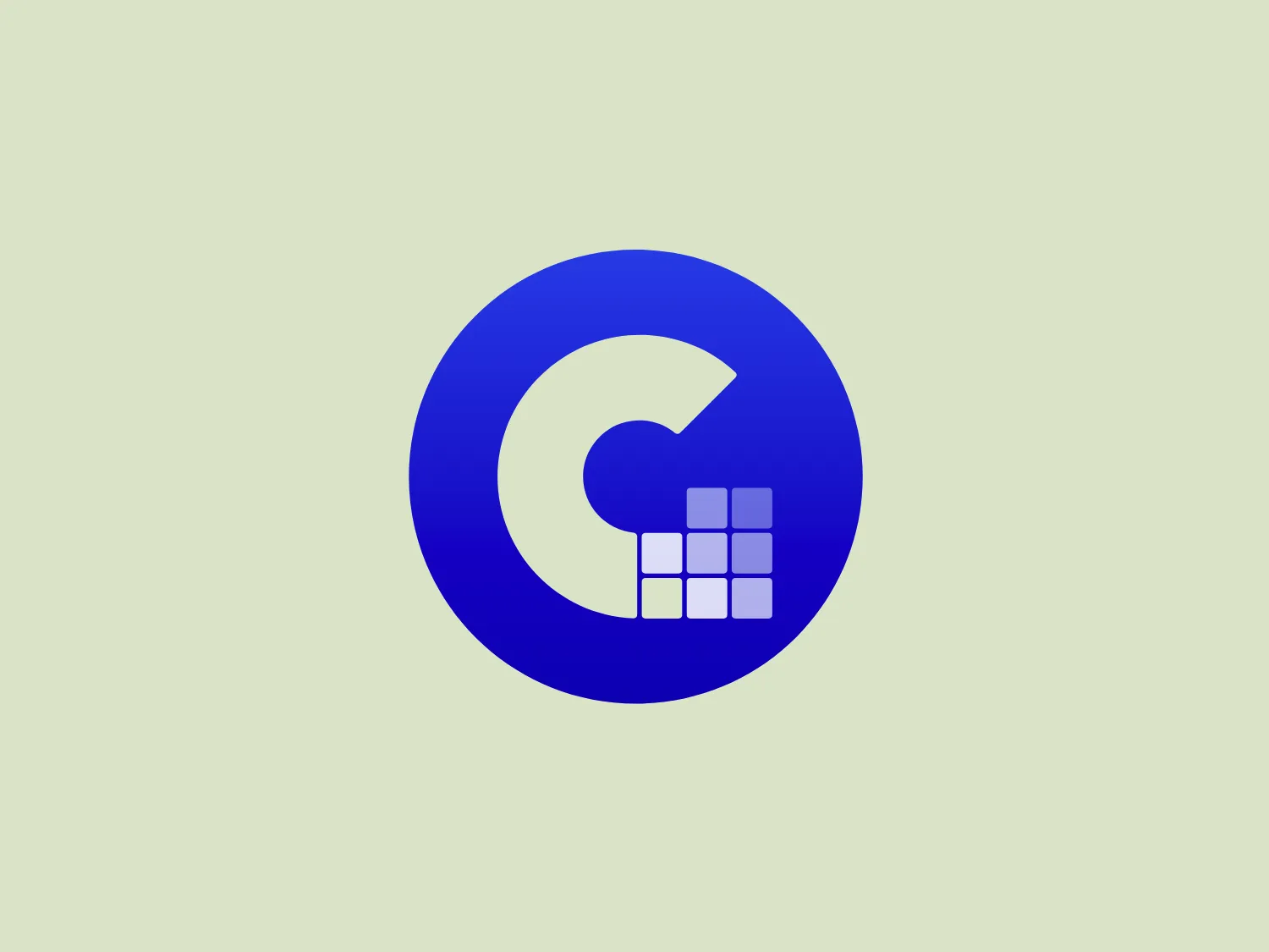
The image showcases a modern and minimalist logo with a central stylized letter "G." The "G" is constructed with thick, bold lines and curves, and has a three-dimensional grid-like square inside the lower part of its curve, suggesting a pixelated effect or digital theme. The design is enclosed within a perfect circle, giving it a sense of completeness and unity. The GrayGrids logo employs a monochromatic color scheme with a rich shade of blue that evokes professionalism and technological sophistication.

About GrayGrids

GrayGrids provides a wide selection of over 500 ready-to-use templates for various web design needs, such as business, landing pages, dashboards, and portfolios, offering both free and premium HTML, Bootstrap, and Tailwind options. The company aims to simplify web development processes for its users.

Similar logos

The image depicts the Akku Vertrieb logo with a bold, geometric design primarily using a bright blue color. The logo resembles an abstract depiction of an uppercase 'A' without the crossbar. It consists of three parallelogram shapes that form a stylized 'A' with white lines creating separation between them, adding a dynamic and layered effect. The design is sharp, modern, and conveys a sense of stability and professionalism. The simplicity and use of negative space give it a clean and versatile look, suitable for various applications.
The Mobileye logo features a stylized letter 'n' with a distinct geometric design. It is comprised of bold, straight lines with sharp angles, creating a modern and minimalist aesthetic. The main component of the logo is a deep blue color, giving it a professional and trustworthy feel. The design is simple yet striking, with the use of negative space on the left side that could be interpreted as an abstract arrow or a partial square bracket, which adds an element of dynamism and forward-thinking to the overall design.
The Commodore logo features a large, bold, blue letter "C" that encircles a smaller red shape resembling a right-pointing arrow or a play button symbol. The stark contrast between the blue and red hues creates a striking and modern aesthetic. The absence of additional elements or embellishments underscores a commitment to clarity and efficiency in the design, striking a balance between visual impact and straightforward symbolism.
The Unilever logo appears to consist of intricate and stylized illustrations forming a shield-like shape. The design features a collection of floral and organic patterns, ranging from leaves and flowers to abstract swirls, all densely packed to create a cohesive emblem. It is monochromatic, using a deep blue color which gives it a classic and professional appearance. The contrast between the negative space and the blue areas creates an engaging and dynamic visual effect, suggesting detail and craftsmanship. The logo has a symmetrical layout that adds to its balanced and harmonious look.
The Banreservas logo showcases a capitalized letter "R" in a dark grey tone using a modern, bold sans-serif typeface. Below the "R," three curved swooshes flow to the left, colored in gradients of light blue, blue, and orange, creating a dynamic contrast. The design presents a clean, contemporary look that suggests energy, speed, or growth.
The Valvoline logo features a stylized letter 'V' composed of two diagonally opposite chevrons. The left chevron is filled with a vibrant red color, while the right chevron sports a deep blue hue. Both chevrons are set against a plain white background, which makes the contrasting colors pop and adds to the visual impact of the design. The logo boasts a modern and minimalist aesthetic, employing sharp lines and a bold color scheme to convey dynamism and innovation.
The Ferrellgas logo is a minimalist, abstract design that features a single, fluid shape suggesting movement and dynamism. Resembling a stylized letter "F," the design has an elongated top arm sweeping forward and a shorter bottom arm curving underneath. Its bold, solid blue color exudes a strong, modern, and professional appearance, while the curvaceous lines convey a sense of flexibility and innovation. The simplicity and solid blue color make it adaptable for various applications without losing its visual impact.
The logo presented for Eredivisie is a modern and minimalist design, comprising two interlocking shapes - a circle and a stylized letter "e." Crafted with smooth, clean lines, the logo suggests continuity and connection, with a deep, elegant navy blue as the primary color, providing a professional and trustworthy feel to the design. The negative space within the "e" creates a dynamic effect, making the letter stand out distinctly against the circular outline. Overall, the aesthetic mixes a corporate sensibility with a fresh, contemporary look.
The Basis London logo presents a modern and minimalist stylized combination of geometric shapes that form the letter 'B'. The design consists of intersecting straight lines and curves in a dark blue or navy color, creating an illusion of three-dimensional layering. The negative space within the circular element adds to the overall balance and visual interest of the design.
The logo features a bold, uppercase letter 'T' centralized within an oval outline. The 'T' has a modern and sturdy design, presenting straight lines and squared edges that convey a sense of stability and strength. The color of both the 'T' and the oval border is a deep, navy blue, which adds to the professional and authoritative feel of the logo. The oval provides a sense of continuity and enclosure, framing the letter neatly and giving it prominence. There is an adequate amount of space between the 'T' and the oval border, highlighting the letter and making it the focal point. The simplicity of the design allows for versatility and clarity when displayed across various mediums.