TEXO

15
What catches our eye is the sleek and modern design of the TEXO logo, with its simple yet dynamic arrangement of three horizontal rectangles in varying shades of blue, conveying a sense of reliability and professionalism.

TEXO Logo

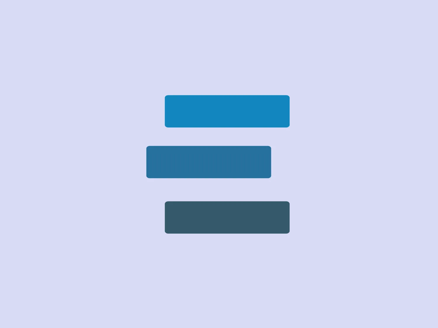
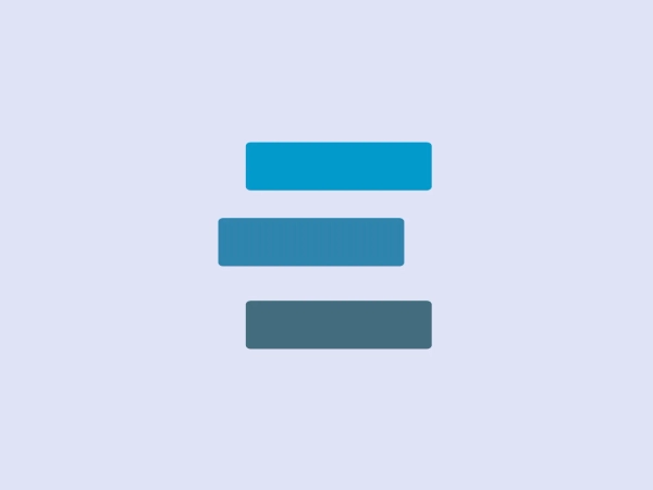
The TEXO logo consists of three horizontal rectangles of varying lengths and shades of blue, creating a sense of simplicity and modernity. The top rectangle is the shortest and has a vibrant cyan-like blue, the middle one is slightly longer and features a muted medium blue, while the bottom rectangle is the longest and sports a darker slate blue. This arrangement gives the impression of a stylized, abstracted stack or progression. The use of blue could suggest reliability and professionalism, and the differing shades add visual interest without being overwhelming.

About TEXO

TEXO provides intelligent home automation solutions that effortlessly control heating, lighting, multimedia, blinds, security, and more to cater to the lifestyle of its users. This concept of Smart Living in Smart Homes aims to save time and simplify daily routines.

Similar logos

The image depicts the Akku Vertrieb logo with a bold, geometric design primarily using a bright blue color. The logo resembles an abstract depiction of an uppercase 'A' without the crossbar. It consists of three parallelogram shapes that form a stylized 'A' with white lines creating separation between them, adding a dynamic and layered effect. The design is sharp, modern, and conveys a sense of stability and professionalism. The simplicity and use of negative space give it a clean and versatile look, suitable for various applications.
The Mobileye logo features a stylized letter 'n' with a distinct geometric design. It is comprised of bold, straight lines with sharp angles, creating a modern and minimalist aesthetic. The main component of the logo is a deep blue color, giving it a professional and trustworthy feel. The design is simple yet striking, with the use of negative space on the left side that could be interpreted as an abstract arrow or a partial square bracket, which adds an element of dynamism and forward-thinking to the overall design.
The Unilever logo appears to consist of intricate and stylized illustrations forming a shield-like shape. The design features a collection of floral and organic patterns, ranging from leaves and flowers to abstract swirls, all densely packed to create a cohesive emblem. It is monochromatic, using a deep blue color which gives it a classic and professional appearance. The contrast between the negative space and the blue areas creates an engaging and dynamic visual effect, suggesting detail and craftsmanship. The logo has a symmetrical layout that adds to its balanced and harmonious look.
The Commodore logo features a large, bold, blue letter "C" that encircles a smaller red shape resembling a right-pointing arrow or a play button symbol. The stark contrast between the blue and red hues creates a striking and modern aesthetic. The absence of additional elements or embellishments underscores a commitment to clarity and efficiency in the design, striking a balance between visual impact and straightforward symbolism.
The Norton Healthcare logo showcases a bold, uppercase 'N' in a deep, vivid blue color, comprised of four diagonal lines intersecting a vertical bar on the left. The design exudes a dynamic and modern aesthetic with sharp angles and clean lines, conveying speed, precision, and technological advancement. The intense blue color adds a professional and reliable feel to the overall appearance, while a neutral and light background would complement it well without detracting from its impact.
The Carrefour logo features an abstract design consisting of three distinct shapes that converge into a single, cohesive figure. The leftmost shape is a flat, pointed triangle in a bold red color, while the central shape resembles a stylized letter 'C' or a crescent, colored in a deep blue, with negative spaces creating a circular cut-out in the middle and an arrow-like impression pointing right. The rightmost shape mirrors the left one, but is also in blue, creating a sense of balance. The design has a modern and dynamic feel with a color palette that evokes trust, energy, and professionalism. The shapes are arranged in a way that they appear to be in motion, suggesting forward movement or progress.
The Basis London logo presents a modern and minimalist stylized combination of geometric shapes that form the letter 'B'. The design consists of intersecting straight lines and curves in a dark blue or navy color, creating an illusion of three-dimensional layering. The negative space within the circular element adds to the overall balance and visual interest of the design.
The Zimmer Biomet logo features a bold, stylized letter "Z" centered within a circle. Constructed from thick lines with sharp angles, the "Z" exudes a dynamic and modern feel. Using a single, bright blue color (#0057B8) for both the letter and the circle creates a striking contrast with the white negative space, highlighting the design. The circular boundary suggests inclusivity and continuity, while the slanted "Z" imparts a sense of forward motion or progress.
The Zurich Insurance logo presents a stylized white letter "Z" against a solid blue circular background. The elegant, modern design of the "Z" features a flowing line that suggests dynamic motion, while the lack of serifs and fluid curves add a sense of fluidity. The strong, saturated blue color conveys professionalism and reliability, with a light neutral background to complement the overall design.
The Telstra logo features a stylized uppercase letter "T" in bold, sans-serif font, and an abstract oval-like shape underneath. The vivid blue of the "T" exudes professionalism and trust, while the warm coral red of the shape adds a dynamic and energetic feel. The modern, simplistic aesthetic is characterized by clean lines and curves suggesting movement or stability. The red shape resembles a swoosh or pathway, implying progress or a journey.