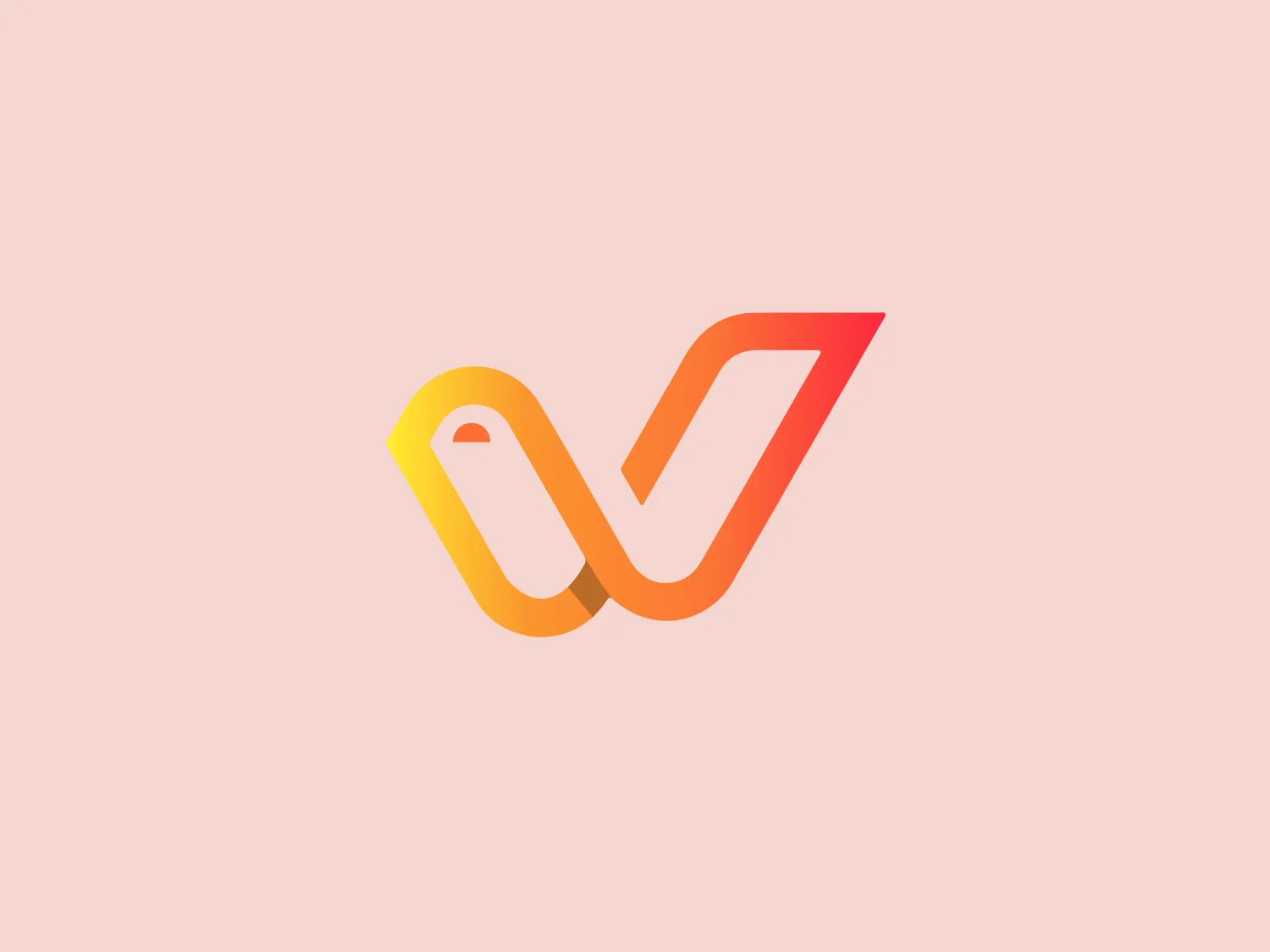
Wibe


Something we enjoy about the Wibe logo is its modern, minimalist stylized bird design with a dynamic gradient, conveying a sense of elegance and freedom.
Letter
Type
Color
Style
The Wibe logo consists of a modern, minimalist stylized bird resembling a lowercase 'v' with a wing lifting upwards. It uses a gradient of warm colors transitioning from bright yellow at the beak to deep red at the wing's tip, giving it a dynamic, flame-like appearance. The simplicity of the design makes it suitable for contemporary branding. The smooth curves suggest elegance and movement, implying freedom or flight.
Wibe offers high-quality courses in UI/UX Design and Graphic Design, catering to individuals with a passion for design who possess the ability to translate concepts and visions into tangible products.
Similar logos
NEW

The Rossignol logo showcases a stylized white letter 'R' in the center of a bright red circular background. The 'R' includes a clean design with a striking slash through its stem, adding a modern flair. Smooth curves create a sleek look, and the red and white color scheme offers a bold and attention-grabbing contrast. The overall design aesthetic is minimalist and contemporary, making it versatile for various applications.
NEW

The Delivery Hero logo features a dynamic red comet shape with a stylized white star centered on its body. The comet tail metaphorically conveys speed, progress, or possibly a shooting star suggesting dreams and aspirations. The sharp edges of the star contrast with the smooth, curved form of the comet, giving the design a sense of forward motion. Its design is simple yet effective, easily scalable, and memorable. Considering the vibrancy of the red, a muted background that complements without competing would be ideal.
NEW

The Cornerstone logo features a simplistic and modern design, consisting of a stylized, abstract shape that somewhat resembles a flower or starburst within a circle. The primary element is a brilliant, solid red-orange color that gives the logo a vibrant and energetic feel. The inner white shape has softened edges which contrast smoothly with the circular boundary. Its symmetry and clean lines convey a sense of balance and professionalism. Considering the color palette of the logo, a soft, neutral background color would complement it well without competing for attention.
NEW

The ICICI Bank logo features a stylized, abstract design with a fluid, organic shape. The central element resembles a lowercase "i" with a dot hovering above what could be interpreted as an abstract human figure or a dynamic swirl. Its bold lines curve to create a sense of movement. The color scheme consists of a gradient transition from a deep, warm red to a rich, golden orange, giving the logo an energetic and inviting appearance. Noteworthy is the way the white space between the "i" and its dot creates a pathway, emphasizing the motion and adding an element of negative space to the design.
NEW

The logo for New Zealand Post showcases a stylized image integrated into a circular shape. The primary element resembles a path or a route with curves and lines that suggest motion or a journey. The design features white lines creating a single continuous path against a vibrant solid red background. The overall aesthetic is modern, minimalistic, and dynamic, enabling easy recognition and versatile application across various media. The smooth and rounded shapes contribute to a friendly and approachable feel.
NEW

The Haas F1 Team logo features a circular shape with a diagonal cut that adds a sense of dynamism and forward motion. Inside the circle, there is a stylized lightning bolt that also signifies energy and speed, set against a clean white background, creating a stark contrast that makes the design stand out. The bold red color for the icon and the modern design aesthetic suggest that the brand represents power, technology, or high-speed services.
NEW

The Commodore logo features a large, bold, blue letter "C" that encircles a smaller red shape resembling a right-pointing arrow or a play button symbol. The stark contrast between the blue and red hues creates a striking and modern aesthetic. The absence of additional elements or embellishments underscores a commitment to clarity and efficiency in the design, striking a balance between visual impact and straightforward symbolism.
NEW

The Beats logo showcases a stylized lowercase 'b' enclosed within a striking red circle. The modern, smooth curvature of the 'b' and its alignment with the outer circle convey a balanced and thoughtful design. This minimalist and contemporary logo emphasizes simplicity and recognizability, exuding a sleek and professional appearance.
NEW

The Breitling logo depicts a stylized, fluid letter "B" with elongated, curved strokes, giving it an elegant and dynamic appearance. The design is minimalist, using a bold golden yellow color that suggests luxury, quality, and sophistication. The overall aesthetic is modern and sleek, with a sense of movement and possibly creativity, hinted by the smooth lines that evoke a sense of continuity. Given the vibrancy of the golden hue, a subtle and light background would complement it well without competing for attention.
NEW

The Subway logo features two bold, interlocking arrows forming an 'S' shape, with the top arrow colored in a striking green and the bottom in a vibrant yellow. The design is clean and modern, with a dynamic sense of movement implied by the arrows pointing in opposite directions. This creates a sense of exchange, circulation, or progression, which might suggest a company involved in logistics, technology, or finance. The flat color treatment and lack of additional embellishments give it a contemporary and straightforward aesthetic.