Gifted
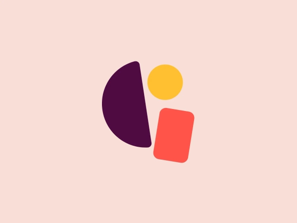


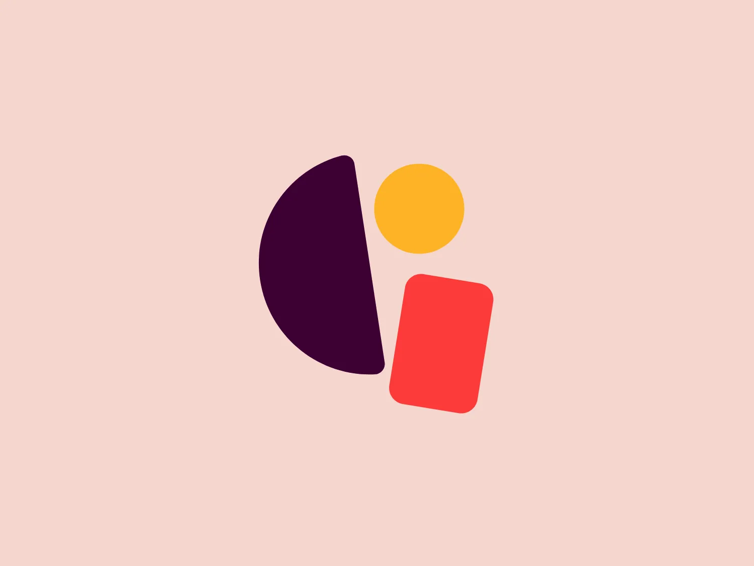
What catches our eye is the playful and balanced arrangement of the dark purple semi-circle, bright sun-like yellow circle, and coral red square, with the yellow circle acting as a focal point.
Letter
Type
Color
Style
This logo comprises a dark purple semi-circle, a bright sun-like yellow circle, and a coral red square arranged in a playful and balanced manner. The yellow circle acts as a focal point, bringing warmth and light to the design. The use of flat colors and geometric simplicity creates a modern and minimalistic aesthetic, making it suitable for a variety of contemporary branding purposes.
Gifted provides a convenient platform for purchasing and gifting digital gift cards from a wide range of popular brands and experiences. The marketplace offers a diverse selection of gift options, catering to varying preferences and interests.
No items found.
Similar logos
NEW

The Rossignol logo showcases a stylized white letter 'R' in the center of a bright red circular background. The 'R' includes a clean design with a striking slash through its stem, adding a modern flair. Smooth curves create a sleek look, and the red and white color scheme offers a bold and attention-grabbing contrast. The overall design aesthetic is minimalist and contemporary, making it versatile for various applications.
NEW

The Delivery Hero logo features a dynamic red comet shape with a stylized white star centered on its body. The comet tail metaphorically conveys speed, progress, or possibly a shooting star suggesting dreams and aspirations. The sharp edges of the star contrast with the smooth, curved form of the comet, giving the design a sense of forward motion. Its design is simple yet effective, easily scalable, and memorable. Considering the vibrancy of the red, a muted background that complements without competing would be ideal.
NEW

The Kuda Bank logo features a stylized letter 'K' mirrored and joined in the middle to form a symmetrical design that resembles a chevron or arrow pointing to the left. The 'K' shapes are composed of four solid stripes with sharp angles, creating a dynamic and modern look. The color of the logo is a deep, rich purple, giving it a sense of sophistication and regality. There are no additional embellishments, allowing the clean and bold geometry of the letterforms to stand out.
NEW

The Cornerstone logo features a simplistic and modern design, consisting of a stylized, abstract shape that somewhat resembles a flower or starburst within a circle. The primary element is a brilliant, solid red-orange color that gives the logo a vibrant and energetic feel. The inner white shape has softened edges which contrast smoothly with the circular boundary. Its symmetry and clean lines convey a sense of balance and professionalism. Considering the color palette of the logo, a soft, neutral background color would complement it well without competing for attention.
NEW

The ICICI Bank logo features a stylized, abstract design with a fluid, organic shape. The central element resembles a lowercase "i" with a dot hovering above what could be interpreted as an abstract human figure or a dynamic swirl. Its bold lines curve to create a sense of movement. The color scheme consists of a gradient transition from a deep, warm red to a rich, golden orange, giving the logo an energetic and inviting appearance. Noteworthy is the way the white space between the "i" and its dot creates a pathway, emphasizing the motion and adding an element of negative space to the design.
NEW

The logo for New Zealand Post showcases a stylized image integrated into a circular shape. The primary element resembles a path or a route with curves and lines that suggest motion or a journey. The design features white lines creating a single continuous path against a vibrant solid red background. The overall aesthetic is modern, minimalistic, and dynamic, enabling easy recognition and versatile application across various media. The smooth and rounded shapes contribute to a friendly and approachable feel.
NEW

The Haas F1 Team logo features a circular shape with a diagonal cut that adds a sense of dynamism and forward motion. Inside the circle, there is a stylized lightning bolt that also signifies energy and speed, set against a clean white background, creating a stark contrast that makes the design stand out. The bold red color for the icon and the modern design aesthetic suggest that the brand represents power, technology, or high-speed services.
NEW

The Commodore logo features a large, bold, blue letter "C" that encircles a smaller red shape resembling a right-pointing arrow or a play button symbol. The stark contrast between the blue and red hues creates a striking and modern aesthetic. The absence of additional elements or embellishments underscores a commitment to clarity and efficiency in the design, striking a balance between visual impact and straightforward symbolism.
NEW

The Beats logo showcases a stylized lowercase 'b' enclosed within a striking red circle. The modern, smooth curvature of the 'b' and its alignment with the outer circle convey a balanced and thoughtful design. This minimalist and contemporary logo emphasizes simplicity and recognizability, exuding a sleek and professional appearance.
NEW

The Breitling logo depicts a stylized, fluid letter "B" with elongated, curved strokes, giving it an elegant and dynamic appearance. The design is minimalist, using a bold golden yellow color that suggests luxury, quality, and sophistication. The overall aesthetic is modern and sleek, with a sense of movement and possibly creativity, hinted by the smooth lines that evoke a sense of continuity. Given the vibrancy of the golden hue, a subtle and light background would complement it well without competing for attention.