Arcade Studio

15
What catches our eye is the bold, vibrant color palette and the modern geometric composition of the Arcade Studio logo.

Arcade Studio Logo

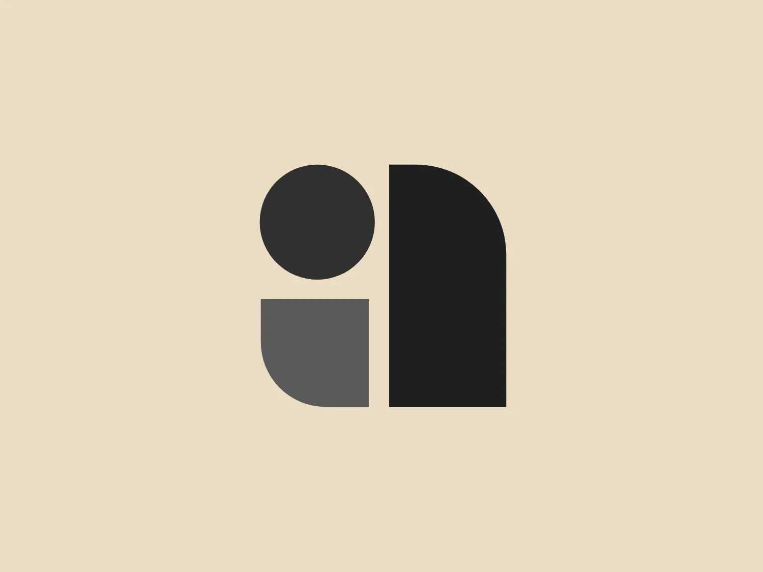
The Arcade Studio logo features a stylized composition of geometric shapes with a modern and minimalist design aesthetic. On the left, there is a bold red circle that sits above a half-circle or semi-oval with a flat top, colored in a warm shade of yellow. Adjacent to these shapes, on the right, stands a tall, rectangular form with a round top, presented in a deep shade of purple. The color palette is primary and vibrant, with the use of solid, saturated hues that create a striking contrast. The simplicity of the forms and the balance of the composition give the Arcade Studio logo an abstract and versatile appearance, making it suitable for various branding purposes.

About Arcade Studio

Arcade is a full-service production studio with a design-driven approach. The company's creative team specializes in animation and illustration, with a passion for bold colors, unique characters, and smooth animation.

Similar logos

The Angi logo showcases a sleek "A" in a vibrant coral red color. Its modern and minimalistic design includes a flowing curve that creates an engaging loop at the base, imparting a friendly and professional look. The bold typeface with smooth edges balances thick and thin strokes, exuding both weight and elegance. The logo's style and color suggest a preference for a complementary background that doesn't overshadow it.
The logo in the image displays a symmetrical design resembling an abstract butterfly or a pair of wings. It consists of multiple leaf-like shapes radiating from the center, creating a harmonious pattern. Vibrant colors such as pink, orange, yellow, green, light blue, and teal are used, outlined with a thin black border that enhances their individuality. The overall design aesthetic is lively and organic, suggesting a sense of growth or transformation. The black background makes the colors pop, giving the logo a bold and energetic appearance.
The Gearbest logo features a bold, black, stylized smile at its center, with the ends of the smile tapering to points. This simplistic and cheerful smile is prominently positioned against a vibrant yellow square background with rounded corners. The overall design aesthetic is modern and minimalistic, suggesting friendliness and positivity. The design's high contrast and simplicity would stand out well against a variety of backgrounds but would be particularly striking on a light, muted color to maintain its vibrancy without overwhelming its simplicity.
The Qmedics logo showcases a stylized letter Q in a 3D ribbon-like form with smooth, flowing curves. It incorporates warm red and pink tones transitioning to cooler purples and blues on the interior, creating a vibrant and energetic look. The modern, playful design uses gradients to convey depth and movement, evoking an aesthetic of creativity and dynamism.
The Assurex Global logo features an abstract, geometric design composed of triangular formations in two shades of yellow—bright and gold— outlined with a thin, light grey border. The sharp angles and contrast give it a modern, dynamic, and professional look.
The Akon Hidrolik logo exhibits a bold and minimalist design with a black square background. Within the square, a white geometric shape forms a stylized letter "a" with a red circle at the base, evoking the imagery of a needle's eye or a focal point. The overall aesthetic is modern and contemporary, utilizing primary colors and strong contrast to enhance its visual impact. Its simplicity renders it highly recognizable and versatile.
The Monday logo boasts a minimalist design with three simple geometric shapes, exuding a modern and playful aesthetic. It showcases two oblong shapes, one vibrant pink and the other bright yellow, slightly slanted and positioned in parallel, hinting at forward motion or connectivity. A small, solid green circle sits below them to the right, providing a visual anchor and adding a touch of contrast. The clean lines and bold, primary colors infuse the logo with a sense of approachability and energy.
The Logo for Tender Greens consists of two solid circles stacked vertically. The top circle is slightly smaller and has a small, quarter-circle notch at the top right, reminiscent of a stemmed fruit such as a cherry or an apple. Both circles and the stem-like feature share a bold, saturated red color, offering a striking contrast that would stand out on a lighter background. The design is simplistic with a flat, two-dimensional appearance and lacks additional detailing, which contributes to its modern and minimalist aesthetic.
The logo for Olelo showcases a stylized white speech bubble enclosed within a rounded purple rectangle. The speech bubble aligns to the right side and creates a seamless contour with the edge of the rectangle. This design choice has a clean and modern aesthetic and hints at communication, conversation, or messaging services. The color palette of white and purple offers a strong contrast that enhances visibility and brand recognition.
The logo for Lifetime is a simple yet bold design consisting of variations of circular shapes with a modern twist. The primary color of the logo is a bright red, creating a striking visual impact. The design features a large, solid red circle, from which a smaller circle and a swoosh-like shape have been subtracted, giving the appearance of a stylized letter "Q" or an abstract representation of a person. The negative space within the Lifetime logo is particularly effective in creating a dynamic and unique figure, promoting a sense of elegance and fluidity in the overall aesthetic.