Health Tree Foundation

15
We like the clean, modern 'b' logo design with organic and nature-inspired elements in a fresh turquoise color.

Health Tree Foundation Logo

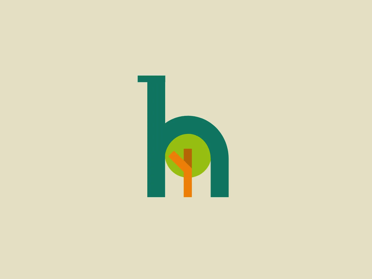
The Health Tree Foundation logo features a stylized lowercase 'b' with a modern and simplistic design. The main part of the 'b' is a rich turquoise color (#4ecdc4). Inside the circular part of the 'b,' there is an abstract design consisting of geometric shapes in shades of orange, yellow, and green that appear to represent a tree or nature-inspired elements. The overall design aesthetic is clean, organic, and contemporary, with a focus on sustainability and natural themes. The geometric shapes inside the 'b' add a dynamic and unique characteristic to the logo.

About Health Tree Foundation

The Health Tree Foundation is a charitable organization that delivers acute hospital and community services to a demographic of more than 400,000 individuals in North and North East Lincolnshire, as well as the East Riding of Yorkshire.

Similar logos

The Lazada logo features a stylized three-dimensional shape reminiscent of a cube with a portion of its structure removed or invisible, creating an open corner perspective. It consists of two visible faces, with the left face in a vibrant orange and the right face in a hot pink, employing a gradient that combines the two colors seamlessly at the edge where they meet. The use of color and shading gives the logo a luminous, dynamic look, evoking a sense of innovation and modernity. There are subtle highlights and shadows on the faces that suggest depth and dimensionality. The overall design aesthetic is minimalist, bold, and contemporary, with a playful twist on geometric representation.
The Matsuura logo features a stylized depiction of three overlapping, rounded shapes in a vibrant green color. The design exudes a modern and minimalist aesthetic with a nod to nature or growth themes, implying movement and connectivity. The shapes suggest leaves, pebbles, or abstract representations of increasing value/momentum.
The Cornerstone logo features a simplistic and modern design, consisting of a stylized, abstract shape that somewhat resembles a flower or starburst within a circle. The primary element is a brilliant, solid red-orange color that gives the logo a vibrant and energetic feel. The inner white shape has softened edges which contrast smoothly with the circular boundary. Its symmetry and clean lines convey a sense of balance and professionalism. Considering the color palette of the logo, a soft, neutral background color would complement it well without competing for attention.
The Chainalysis logo features a bold, minimalistic design with interlocking shapes. The primary shape is a circle, within which three curved elements intertwine in a trefoil knot-like configuration, suggesting motion and connectivity. The logo is a vibrant, solid orange color, conveying energy and creativity. The thick lines and smooth curves contribute to a modern and dynamic aesthetic, appearing abstract yet conveying a sense of unity and continuity.
The Prodigy logo showcases a contemporary, fluid lowercase 'p' in a striking orange color. The design features soft curves and a dynamic loop, along with a sharp cut in the descender, creating a modern and slightly abstract appearance. This clean and minimalistic logo exudes energy and approachability while the vibrant orange color conveys creativity and enthusiasm.
The Breitling logo depicts a stylized, fluid letter "B" with elongated, curved strokes, giving it an elegant and dynamic appearance. The design is minimalist, using a bold golden yellow color that suggests luxury, quality, and sophistication. The overall aesthetic is modern and sleek, with a sense of movement and possibly creativity, hinted by the smooth lines that evoke a sense of continuity. Given the vibrancy of the golden hue, a subtle and light background would complement it well without competing for attention.
The Banreservas logo showcases a capitalized letter "R" in a dark grey tone using a modern, bold sans-serif typeface. Below the "R," three curved swooshes flow to the left, colored in gradients of light blue, blue, and orange, creating a dynamic contrast. The design presents a clean, contemporary look that suggests energy, speed, or growth.
The Meralco logo features a stylized, angular lightning bolt in white, cutting dynamically across a vibrant, solid orange circle. The bolt itself has sharp edges and points, conveying a sense of energy and power. The simplicity of the design gives it a modern and impactful aesthetic, as the high-contrast color scheme makes the logo stand out boldly. The circular shape envelops the bolt, suggesting completeness and a global or universal aspect to the brand identity.
The image is a stylized logo that appears to represent the letter "B." The design consists of a bold, orange-colored main body with dynamic lines and curves, suggesting movement and energy. The logo has a modern and sleek aesthetic, with the lighter shades creating a gradient effect that adds depth to the design. The lines converge at the lower-left point of the "B," emphasizing speed and direction. This dynamic logo design would stand out nicely against a subtle and clean background.
The Heco Chain logo features a stylized representation of two interacting shapes, resembling puzzle pieces. The design includes two bold, curving forms with rounded edges, mirroring each other for a sleek and modern appearance. The rich, deep green color signifies professionalism and growth, while the white lines create a crisp contrast and a three-dimensional illusion. This logo has a clean, contemporary feel suitable for technology, environmental fields, or innovative services.