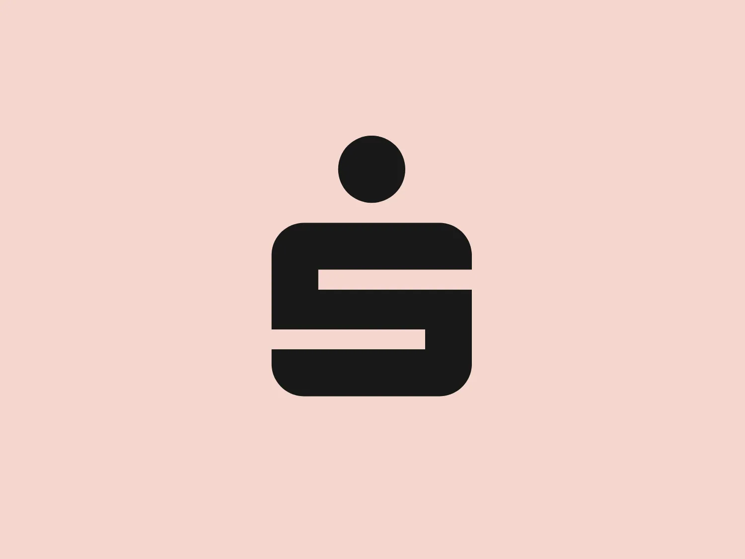
Sparkasse

15
Here's what we like: The bold and modern design of the red stylized letter 'S' with a dynamic and flowing movement creates a vibrant and energetic feel for Sparkasse's logo.

Letter

Type

Color

Red
195

Sparkasse Logo

The logo, for Sparkasse, depicts a bold and modern design featuring a red stylized letter 'S' nestled within an abstract square-like shape. The 'S' is crafted with three horizontal stripes that elegantly curve to form the letter, with the top and bottom stripes extending slightly beyond the central stripe to create a dynamic and flowing movement. The logo's vibrant red color exudes energy and passion, while its clean and simplistic design conveys strength and contemporary elegance.

About Sparkasse

Sparkasse is the term used for savings banks in German-speaking countries. These banks are independently operated and focused on serving customers in their respective regions. They are locally managed and prioritize their business activities within the local community.

Similar logos

The Angi logo showcases a sleek "A" in a vibrant coral red color. Its modern and minimalistic design includes a flowing curve that creates an engaging loop at the base, imparting a friendly and professional look. The bold typeface with smooth edges balances thick and thin strokes, exuding both weight and elegance. The logo's style and color suggest a preference for a complementary background that doesn't overshadow it.
The Qmedics logo showcases a stylized letter Q in a 3D ribbon-like form with smooth, flowing curves. It incorporates warm red and pink tones transitioning to cooler purples and blues on the interior, creating a vibrant and energetic look. The modern, playful design uses gradients to convey depth and movement, evoking an aesthetic of creativity and dynamism.
The Peru logo presents a simple and modern design featuring concentric spiral lines in a bold red color. The spiral's end curls outward on the top-left side, creating a minimalist and clean aesthetic that conveys motion and fluidity. The use of negative space within and around the spiral adds visual interest and sophistication to the design, while the color provides a strong contrast against a light background and conveys a sense of energy and passion.
The Logo for Tender Greens consists of two solid circles stacked vertically. The top circle is slightly smaller and has a small, quarter-circle notch at the top right, reminiscent of a stemmed fruit such as a cherry or an apple. Both circles and the stem-like feature share a bold, saturated red color, offering a striking contrast that would stand out on a lighter background. The design is simplistic with a flat, two-dimensional appearance and lacks additional detailing, which contributes to its modern and minimalist aesthetic.
The Matterport logo presents a stylized letter 'M' with a three-dimensional effect, consisting of various shades of pink and red. It features sharp angles and clean lines that give it a modern and geometric appearance. The clever use of gradient and shadowing creates an illusion of depth, making the 'M' appear to stand upright. The overall design aesthetic is contemporary and sleek, suitable for a brand aiming to convey innovation and sophistication.
The logo for Lifetime is a simple yet bold design consisting of variations of circular shapes with a modern twist. The primary color of the logo is a bright red, creating a striking visual impact. The design features a large, solid red circle, from which a smaller circle and a swoosh-like shape have been subtracted, giving the appearance of a stylized letter "Q" or an abstract representation of a person. The negative space within the Lifetime logo is particularly effective in creating a dynamic and unique figure, promoting a sense of elegance and fluidity in the overall aesthetic.
The Vifacto logo features a stylized representation of a heart composed of interconnected geometric shapes resembling angular, extended chevrons. The primary color of the logo is a vibrant and bold shade of red-orange, giving it an energetic and modern look. The design is minimalist and clean, with precise lines and angles that convey a sense of innovation and precision. It would fit well within a tech or design-oriented brand identity. The use of negative space within the shapes helps to create the heart silhouette, demonstrating a clever use of minimal elements to communicate a recognizable symbol of love or passion.
The Sunny Recruitment logo features a stylized, abstract mark composed of two swirling forms that intertwine, creating a dynamic and fluid motion. The shapes suggest a sense of continuity and interconnectivity. The color gradient transitions smoothly from a warm, vivid red at one end to a deep, soft orange at the other end, conveying energy and passion. The overall design aesthetic is modern, sleek, and appears to be easily recognizable. The use of negative space between the two forms creates a visual pause and adds a layer of sophistication to the design.
The Chatham Steel logo showcases a minimalistic design with a stylized circular shape and a two-tone color scheme. The left half features a vibrant red, while the right side displays a progression of black to gray segments, evoking a pie chart or a shutter in motion. The central white portion provides a focal point and ties the two sides together, conveying a sense of balance and dynamism. This design may symbolize growth, progress, or the integration of different elements, and could be enhanced by a soft, light background.
The Sedicii logo is a modern and stylized depiction of the letter "G." It is composed of bold, geometric shapes with sharp angles, creating a sense of movement and dynamism. The design is minimalistic, using a single, solid color - a vivid orange-red - to make a strong visual impact. The negative space within the shapes plays a crucial role in forming the letter, adding to the logo's clever and contemporary feel. It is sleek and would be easily recognizable even at a small scale.