Lifeworks NW

15
What we like: The modern, abstract design of Lifeworks NW's logo, with a solid red color and a stylized heart seamlessly integrated into a larger rectangle, exudes a contemporary and bold aesthetic.

Letter

Type

Color

Red
547

Lifeworks NW Logo

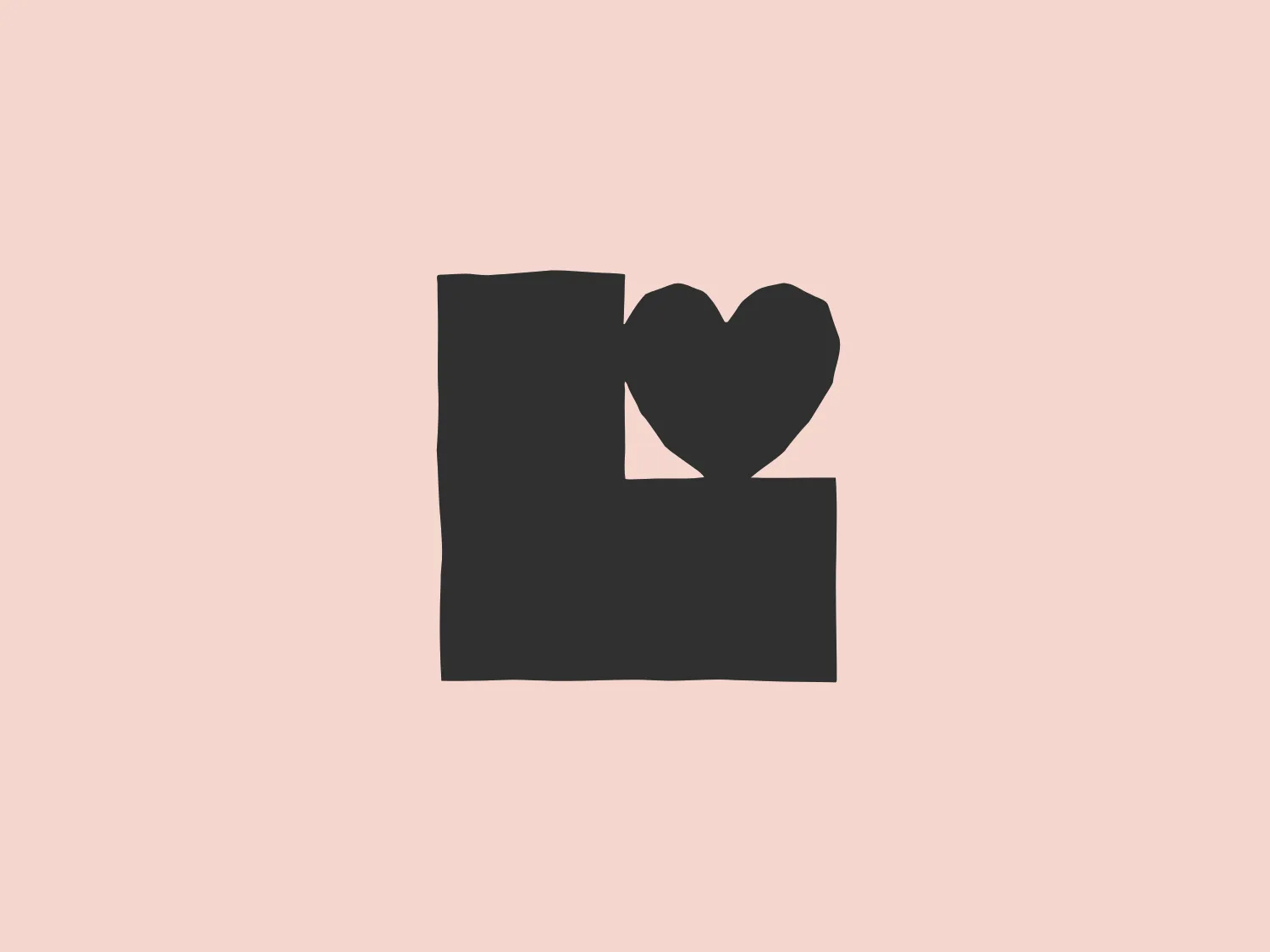
The Lifeworks NW logo is a modern, abstract design featuring a solid red color. The design is composed of two shapes: a larger rectangle with a notch removed from its upper right side and a stylized heart shape that fits seamlessly into this notch. The heart appears to be partly overlaid on the rectangle, suggesting a sense of unity or partnership. The aesthetic is clean and minimalist, conveying a contemporary feel that could be associated with various industries, from technology to healthcare. The solid color and bold shapes ensure that the logo is easily recognizable and could stand out well against a neutral background.

About Lifeworks NW

LifeWorks NW is dedicated to fostering a healthy community by delivering high-quality, culturally sensitive mental health and addiction services for individuals of all ages.

Similar logos

The Angi logo showcases a sleek "A" in a vibrant coral red color. Its modern and minimalistic design includes a flowing curve that creates an engaging loop at the base, imparting a friendly and professional look. The bold typeface with smooth edges balances thick and thin strokes, exuding both weight and elegance. The logo's style and color suggest a preference for a complementary background that doesn't overshadow it.
The Qmedics logo showcases a stylized letter Q in a 3D ribbon-like form with smooth, flowing curves. It incorporates warm red and pink tones transitioning to cooler purples and blues on the interior, creating a vibrant and energetic look. The modern, playful design uses gradients to convey depth and movement, evoking an aesthetic of creativity and dynamism.
The Akon Hidrolik logo exhibits a bold and minimalist design with a black square background. Within the square, a white geometric shape forms a stylized letter "a" with a red circle at the base, evoking the imagery of a needle's eye or a focal point. The overall aesthetic is modern and contemporary, utilizing primary colors and strong contrast to enhance its visual impact. Its simplicity renders it highly recognizable and versatile.
The Logo for Tender Greens consists of two solid circles stacked vertically. The top circle is slightly smaller and has a small, quarter-circle notch at the top right, reminiscent of a stemmed fruit such as a cherry or an apple. Both circles and the stem-like feature share a bold, saturated red color, offering a striking contrast that would stand out on a lighter background. The design is simplistic with a flat, two-dimensional appearance and lacks additional detailing, which contributes to its modern and minimalist aesthetic.
The logo for Lifetime is a simple yet bold design consisting of variations of circular shapes with a modern twist. The primary color of the logo is a bright red, creating a striking visual impact. The design features a large, solid red circle, from which a smaller circle and a swoosh-like shape have been subtracted, giving the appearance of a stylized letter "Q" or an abstract representation of a person. The negative space within the Lifetime logo is particularly effective in creating a dynamic and unique figure, promoting a sense of elegance and fluidity in the overall aesthetic.
The Peru logo presents a simple and modern design featuring concentric spiral lines in a bold red color. The spiral's end curls outward on the top-left side, creating a minimalist and clean aesthetic that conveys motion and fluidity. The use of negative space within and around the spiral adds visual interest and sophistication to the design, while the color provides a strong contrast against a light background and conveys a sense of energy and passion.
The logo for Loja Kildare is a modern, clean design consisting of a bold and stylized letter "K." It features a striking red color with clear cutouts that create dynamic white spaces, giving the impression of forward motion or pivoting. The design is minimalist, utilizing sharp angles to convey a sense of precision and professionalism. The simplicity of the logo makes it versatile for various applications, and the contrast between the red and the white spaces adds visual interest.
The Sunny Recruitment logo features a stylized, abstract mark composed of two swirling forms that intertwine, creating a dynamic and fluid motion. The shapes suggest a sense of continuity and interconnectivity. The color gradient transitions smoothly from a warm, vivid red at one end to a deep, soft orange at the other end, conveying energy and passion. The overall design aesthetic is modern, sleek, and appears to be easily recognizable. The use of negative space between the two forms creates a visual pause and adds a layer of sophistication to the design.
The Matterport logo presents a stylized letter 'M' with a three-dimensional effect, consisting of various shades of pink and red. It features sharp angles and clean lines that give it a modern and geometric appearance. The clever use of gradient and shadowing creates an illusion of depth, making the 'M' appear to stand upright. The overall design aesthetic is contemporary and sleek, suitable for a brand aiming to convey innovation and sophistication.
The Bandist logo depicts a modern and abstract interpretation of a lowercase letter 'b'. It features a bold and flowing red shape resembling a 'b', alongside a smaller, soft pink element that adds depth and contrast to the design. The angular cut in the red form instills a sense of precision and forward-thinking aesthetic. The vibrant color palette exudes energy and attention-grabbing qualities.