Pro7

15
We like the modern and minimalist design of the Pro7 logo, with its bold red colors and sleek geometric shapes that create a dynamic visual impact.

Letter

No items found.

Color

Red
976

Pro7 Logo

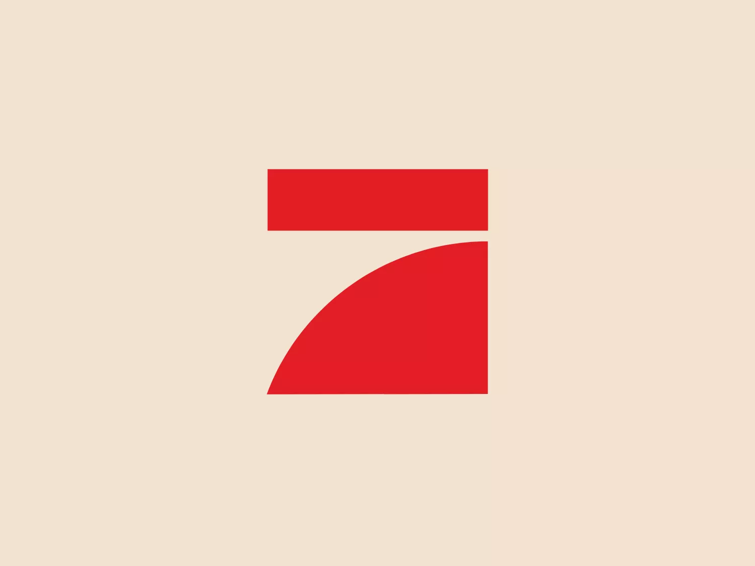
The Pro7 logo is modern and minimalist, featuring bold red colors and geometric shapes. It consists of a horizontal rectangle on top and a quarter-circle or pie slice shape below. The contrast between the straight lines of the rectangle and the curvature of the quarter-circle creates a dynamic visual impact. The use of flat colors without gradients or embellishments signifies a clean and contemporary design. The abstract nature of the logo allows for versatility across various industries or brands. To enhance visibility, a neutral yet complementary background color is recommended, ideally a lighter shade that does not detract from the vivid red.

About Pro7

ProSieben, also known as Pro7, is a prominent German free-to-air television network, positioned as the country's second-largest privately owned television company. It offers a diverse range of entertainment, news, and informative programming to a wide audience.

Similar logos

The Delivery Hero logo features a dynamic red comet shape with a stylized white star centered on its body. The comet tail metaphorically conveys speed, progress, or possibly a shooting star suggesting dreams and aspirations. The sharp edges of the star contrast with the smooth, curved form of the comet, giving the design a sense of forward motion. Its design is simple yet effective, easily scalable, and memorable. Considering the vibrancy of the red, a muted background that complements without competing would be ideal.
The Cornerstone logo features a simplistic and modern design, consisting of a stylized, abstract shape that somewhat resembles a flower or starburst within a circle. The primary element is a brilliant, solid red-orange color that gives the logo a vibrant and energetic feel. The inner white shape has softened edges which contrast smoothly with the circular boundary. Its symmetry and clean lines convey a sense of balance and professionalism. Considering the color palette of the logo, a soft, neutral background color would complement it well without competing for attention.
The Rossignol logo showcases a stylized white letter 'R' in the center of a bright red circular background. The 'R' includes a clean design with a striking slash through its stem, adding a modern flair. Smooth curves create a sleek look, and the red and white color scheme offers a bold and attention-grabbing contrast. The overall design aesthetic is minimalist and contemporary, making it versatile for various applications.
The ICICI Bank logo features a stylized, abstract design with a fluid, organic shape. The central element resembles a lowercase "i" with a dot hovering above what could be interpreted as an abstract human figure or a dynamic swirl. Its bold lines curve to create a sense of movement. The color scheme consists of a gradient transition from a deep, warm red to a rich, golden orange, giving the logo an energetic and inviting appearance. Noteworthy is the way the white space between the "i" and its dot creates a pathway, emphasizing the motion and adding an element of negative space to the design.
The logo for New Zealand Post showcases a stylized image integrated into a circular shape. The primary element resembles a path or a route with curves and lines that suggest motion or a journey. The design features white lines creating a single continuous path against a vibrant solid red background. The overall aesthetic is modern, minimalistic, and dynamic, enabling easy recognition and versatile application across various media. The smooth and rounded shapes contribute to a friendly and approachable feel.
The Commodore logo features a large, bold, blue letter "C" that encircles a smaller red shape resembling a right-pointing arrow or a play button symbol. The stark contrast between the blue and red hues creates a striking and modern aesthetic. The absence of additional elements or embellishments underscores a commitment to clarity and efficiency in the design, striking a balance between visual impact and straightforward symbolism.
The TV6 Lithuania logo features a stylized numeral "6" encapsulated within a circular form. It is crafted with a modern aesthetic, featuring smooth curves and a thick, consistent stroke width. The design consists of three colors: black, white, and a bold red. The red part emphasizes the inner loop of the "6," while black creates a striking contrast for the outer circular boundary. This design combines simplicity with a striking color contrast to produce a clean and recognizable brand image.
The Hero logo features an abstract design with a modern and minimalistic aesthetic. It consists of three geometric shapes: a solid red rectangle on the left, and two black right-angled triangles on the right, positioned to suggest movement or transformation. The color contrast between the red and black is striking, giving the Hero logo a bold and dynamic feel. The clean lines and absence of additional embellishment lend the design a sleek and contemporary look that would work well in a tech or innovative business sector.
The GoPlay logo is a bold and simple design consisting of a striking red letter "P". It features a modern sans-serif font with clean and smooth curvature, and the vertical line of the "P" extends below the baseline, giving it a unique and dynamic look. The minimalist design is versatile and contemporary, making it suitable for various branding contexts.
The Berkemann logo features a bold, red-colored symbol that combines a stylized lowercase "n" with a heart shape, creating a sense of continuity and fluidity. The color is a vivid, saturated shade of red, conveying passion or energy. The design is simple yet effective, with clean lines and curves, making it easily recognizable and scalable across different mediums. The heart integrated into the letter gives the logo a friendly and approachable aesthetic, suggesting a brand identity focused on community, care, or connection.