TV Azteca

15
The TV Azteca logo features a dynamic, flowing form with vibrant colors that create a playful and energetic feel.

Letter

Color

TV Azteca Logo

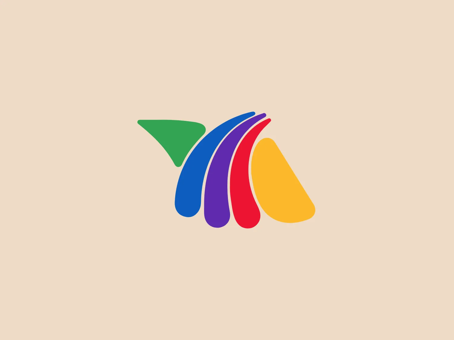
The TV Azteca logo features an abstract design composed of a collection of swooshes that resemble a dynamic, flowing form. Starting from the left, a solid green triangle points to a series of curves in blue, red, purple, and yellow, each color's swoosh overlapping the next, creating a sense of motion and harmony. The colors are vivid and create a playful, energetic feel. The curvaceous shapes suggest forward movement and could symbolize progress, change, or speed. The design has a modern and stylized aesthetic with a clean and minimalist appeal. Given the vibrant colors of the TV Azteca logo, a neutral background would enhance its visibility.

About TV Azteca

TV Azteca is a prominent Mexican multimedia conglomerate and the second-largest mass media company in Mexico, following Televisa. The company is a major producer of Spanish-language television content globally.

Similar logos

The Angi logo showcases a sleek "A" in a vibrant coral red color. Its modern and minimalistic design includes a flowing curve that creates an engaging loop at the base, imparting a friendly and professional look. The bold typeface with smooth edges balances thick and thin strokes, exuding both weight and elegance. The logo's style and color suggest a preference for a complementary background that doesn't overshadow it.
The Deliveroo logo features a stylized, geometric representation of a lowercase letter 'v' with rounded terminals and a playful, cut-in contour on the right side. This creates a sense of motion or a smiling face with two dots representing eyes. The bright, aqua-green color gives the logo a modern, minimalist, and friendly vibe, suggesting creativity and innovation.
The Basis London logo presents a modern and minimalist stylized combination of geometric shapes that form the letter 'B'. The design consists of intersecting straight lines and curves in a dark blue or navy color, creating an illusion of three-dimensional layering. The negative space within the circular element adds to the overall balance and visual interest of the design.
The Meeka Metals logo features three stylized mountain peaks within a square frame. The central and left peaks are vibrant orange (#F7DED6), while the right peak and the negative space forming the valley below are a deep navy blue (#D9E5F9), creating a striking contrast. The clean, sharp angles convey modernity and stability, while the geometric approach gives the design a bold character, symbolizing strength and reliability. The overall aesthetic blends adventure and professionalism, showcasing a sense of boldness and stability. Hexcode: #E4E2F8
The Unilever logo appears to consist of intricate and stylized illustrations forming a shield-like shape. The design features a collection of floral and organic patterns, ranging from leaves and flowers to abstract swirls, all densely packed to create a cohesive emblem. It is monochromatic, using a deep blue color which gives it a classic and professional appearance. The contrast between the negative space and the blue areas creates an engaging and dynamic visual effect, suggesting detail and craftsmanship. The logo has a symmetrical layout that adds to its balanced and harmonious look.
The logo in the image displays a symmetrical design resembling an abstract butterfly or a pair of wings. It consists of multiple leaf-like shapes radiating from the center, creating a harmonious pattern. Vibrant colors such as pink, orange, yellow, green, light blue, and teal are used, outlined with a thin black border that enhances their individuality. The overall design aesthetic is lively and organic, suggesting a sense of growth or transformation. The black background makes the colors pop, giving the logo a bold and energetic appearance.
The Afirme logo features an abstract design with three stylized, pointed shapes that resemble peaks or arrows, arranged in a dynamic and ascending pattern. The primary color used is a rich, flat green, without any gradients or shades, which conveys a sense of growth, vitality, or eco-friendliness. The overall aesthetic is modern and minimalist, with clean lines and sharp angles creating a sense of forward movement and progress. The simplicity of the design ensures versatility and readability across various mediums. For this logo, a light and subtle background would complement it well without overwhelming its simplicity.
The Kajabi logo consists of a bold, abstract geometric design forming a stylized letter 'K.' It is composed of two triangles in deep and light blue tones, creating a modern and energetic appearance with a dynamic aesthetic.
The Cimaco logo features a modern and abstract design with three concentric circles decreasing in thickness from the outermost to the inner circle. Inside the circles, there is a unique element that seems to be a combination of a dot and a small crescent shape, aligned off-center towards the upper-left quadrant, creating a dynamic and forward-moving appearance. This element interrupts the continuity of the circles on one side, suggesting connectivity or targeting. The color is a solid, deep shade of blue, which conveys professionalism and trustworthiness. Overall, the logo has a clean, tech-savvy look with a minimalist aesthetic. Considering the color and design of the Cimaco logo, a light and neutral background would complement it well.
The Gearbest logo features a bold, black, stylized smile at its center, with the ends of the smile tapering to points. This simplistic and cheerful smile is prominently positioned against a vibrant yellow square background with rounded corners. The overall design aesthetic is modern and minimalistic, suggesting friendliness and positivity. The design's high contrast and simplicity would stand out well against a variety of backgrounds but would be particularly striking on a light, muted color to maintain its vibrancy without overwhelming its simplicity.