Artrade

15
The intertwining shapes of the Artrade logo create a modern and vibrant visual identity. The contrast of purple and green is visually striking.

Artrade Logo

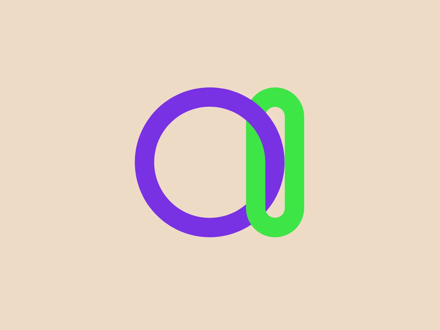
The logo for Artrade showcases two intertwined shapes with a modern and simplistic design aesthetic. On the left is a circle rendered in a vibrant purple, while on the right, a looped form in a bright green color connects to the circle, suggesting continuity or connection. The juxtaposition of the purple and green creates a striking contrast, which is visually pleasing. The subtle shadows where the shapes overlap add depth and a 3D effect to the logo. Given the color scheme of the Artrade logo, a light and neutral background would complement it well.

About Artrade

Artrade is a pioneering application that leverages Solana Blockchain to bring NFT technology to a wide audience. The platform enables users to access, showcase, store, purchase, and produce NFTs.

Similar logos

The Matsuura logo features a stylized depiction of three overlapping, rounded shapes in a vibrant green color. The design exudes a modern and minimalist aesthetic with a nod to nature or growth themes, implying movement and connectivity. The shapes suggest leaves, pebbles, or abstract representations of increasing value/momentum.
The Kuda Bank logo features a stylized letter 'K' mirrored and joined in the middle to form a symmetrical design that resembles a chevron or arrow pointing to the left. The 'K' shapes are composed of four solid stripes with sharp angles, creating a dynamic and modern look. The color of the logo is a deep, rich purple, giving it a sense of sophistication and regality. There are no additional embellishments, allowing the clean and bold geometry of the letterforms to stand out.
The BitX Capital logo showcases a stylized, abstract design with a dynamic feel. It comprises interlocking shapes resembling a three-dimensional impossible loop. The main elements consist of two intertwined ribbons with a gradation of green shades that provide a sense of depth and movement. The contrast between the lighter and darker greens enhances the interweaving effect. Overall, the logo presents a modern and clean appearance, suggesting innovation and connectivity.
The Holiday Inn logo features a stylized, abstract design that appears to be a pair of overlapping, slanted letter H's or a hash symbol (#) with a modern twist. It's composed of four bold, green lines with soft curves and slightly varied lengths, giving it a dynamic and contemporary feel. The use of negative space between the elements of the logo adds to its visual interest. The green color is vibrant and would stand well against a soft, pale background providing a contrast that is not too harsh.
The logo presents a stylized circular shape with a smaller circle connected to its upper right, resembling an abstract representation of a person or a molecule. The main circle has an even, hollow center, contributing to the minimalist design. The design is composed of a solid, deep purple color, giving it a professional and modern appearance. The logo for Fresco's simplicity makes it versatile and easily recognizable. The absence of additional elements ensures the focus remains on this unique, clean geometric form.
The Frontier Airlines logo is a modern, sleek design comprised of three bold, dark green, horizontal stripes that form an abstract letter "E". The upper and lower stripes are longer and angled slightly downward towards the right, while the center stripe is shorter, creating a sense of movement and dynamism. The negative space between the stripes reinforces the "E" shape. The color has a professional and serious tone, and the logo's simplicity gives it a timeless and versatile feel. It has a clean, geometric quality, and there are no additional embellishments, making it highly adaptable for various applications.
The Marberg logo features a stylized, geometric design made of three parallelograms arranged to create a sense of perspective and three-dimensionality. The shapes are aligned to give an impression of depth, with the largest at the front and the smallest at the back. It uses a solid, dark purplish color for the shapes, which adds to its modern and sophisticated aesthetic. The simplicity of the Marberg logo makes it versatile and easily recognizable.
The logo for Eldorado Gold features an abstract, circular design with three green curved shapes or leaves converging to suggest dynamic motion and organic growth. The curves are elegantly separated by white negative space giving the impression of a spinning globe or a plant in motion. The design evokes themes of nature, sustainability, and renewal, with the deep green color symbolizing growth, harmony, and freshness.
The Waymo logo depicts a stylized letter "W" with a modern and dynamic design. It is composed of three overlapping, geometric shapes that are rounded at the ends, suggesting fluidity and movement. The color palette includes a gradient ranging from a bright teal to a deeper blue-green, creating a sense of depth and vibrancy. The overall design aesthetic is clean, contemporary, and would likely appeal to a tech-savvy or forward-thinking audience. The fluid form and gradient give the Waymo logo a sense of innovation and approachability.
The Heco Chain logo features a stylized representation of two interacting shapes, resembling puzzle pieces. The design includes two bold, curving forms with rounded edges, mirroring each other for a sleek and modern appearance. The rich, deep green color signifies professionalism and growth, while the white lines create a crisp contrast and a three-dimensional illusion. This logo has a clean, contemporary feel suitable for technology, environmental fields, or innovative services.