Bezaranha

15
What catches our eye is the elegant and versatile design of the stylized lowercase 'b', with a fluid and modern loop or ribbon motif in a deep navy blue color, giving it a professional and trustworthy vibe.

Letter

Color

Navy
181
Blue
1490

Bezaranha Logo

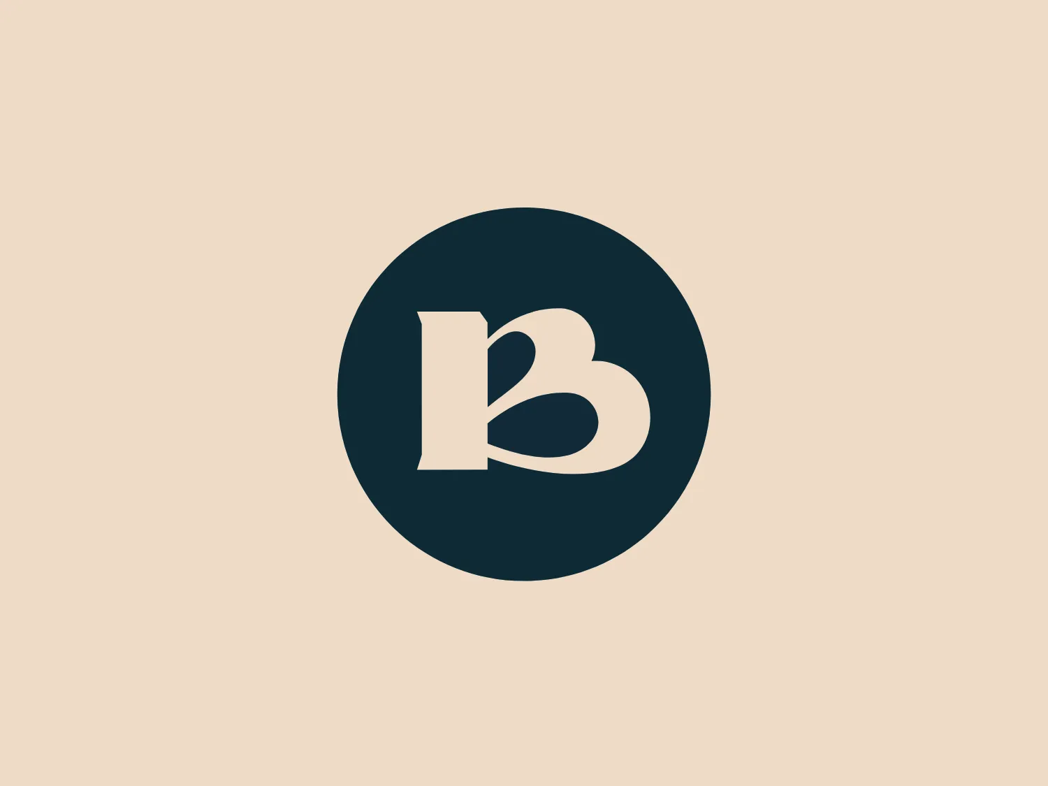
The Bezaranha logo features a stylized lowercase letter 'b' with a unique design resembling a loop or ribbon, giving it a sense of fluidity and modernity. The 'b' is centered within a solid circle. The logo uses a deep, navy blue color, presenting a professional and trustworthy appearance. The simplicity of the logo's design emphasizes its elegance and makes it versatile for various applications. The shape is smooth, suggesting accessibility and friendliness.

About Bezaranha

Bezaranha is a cultural program initiated by the municipalities in the Algarve region. The program aims to provide support and encouragement to the culture sector, particularly during the pandemic. The term "Bezaranha" originates from the Algarve and refers to a strong and annoying wind.

Similar logos

The Airbus Ventures logo features two overlapping geometric shapes forming an abstract mountain or a stylized letter "A." The deep navy blue color scheme exudes a professional and modern feel. The first shape is a right-angled triangle with its hypotenuse on the left and the smallest angle pointing downwards. The second shape follows the sloping right side of the triangle and curves inward to form a peak, creating an interlocking effect. This minimalistic design is bold and simple, making the logo versatile and easily recognizable.
The image depicts the Akku Vertrieb logo with a bold, geometric design primarily using a bright blue color. The logo resembles an abstract depiction of an uppercase 'A' without the crossbar. It consists of three parallelogram shapes that form a stylized 'A' with white lines creating separation between them, adding a dynamic and layered effect. The design is sharp, modern, and conveys a sense of stability and professionalism. The simplicity and use of negative space give it a clean and versatile look, suitable for various applications.
The Mobileye logo features a stylized letter 'n' with a distinct geometric design. It is comprised of bold, straight lines with sharp angles, creating a modern and minimalist aesthetic. The main component of the logo is a deep blue color, giving it a professional and trustworthy feel. The design is simple yet striking, with the use of negative space on the left side that could be interpreted as an abstract arrow or a partial square bracket, which adds an element of dynamism and forward-thinking to the overall design.
The Unilever logo appears to consist of intricate and stylized illustrations forming a shield-like shape. The design features a collection of floral and organic patterns, ranging from leaves and flowers to abstract swirls, all densely packed to create a cohesive emblem. It is monochromatic, using a deep blue color which gives it a classic and professional appearance. The contrast between the negative space and the blue areas creates an engaging and dynamic visual effect, suggesting detail and craftsmanship. The logo has a symmetrical layout that adds to its balanced and harmonious look.
The Commodore logo features a large, bold, blue letter "C" that encircles a smaller red shape resembling a right-pointing arrow or a play button symbol. The stark contrast between the blue and red hues creates a striking and modern aesthetic. The absence of additional elements or embellishments underscores a commitment to clarity and efficiency in the design, striking a balance between visual impact and straightforward symbolism.
The Carrefour logo features an abstract design consisting of three distinct shapes that converge into a single, cohesive figure. The leftmost shape is a flat, pointed triangle in a bold red color, while the central shape resembles a stylized letter 'C' or a crescent, colored in a deep blue, with negative spaces creating a circular cut-out in the middle and an arrow-like impression pointing right. The rightmost shape mirrors the left one, but is also in blue, creating a sense of balance. The design has a modern and dynamic feel with a color palette that evokes trust, energy, and professionalism. The shapes are arranged in a way that they appear to be in motion, suggesting forward movement or progress.
The Basis London logo presents a modern and minimalist stylized combination of geometric shapes that form the letter 'B'. The design consists of intersecting straight lines and curves in a dark blue or navy color, creating an illusion of three-dimensional layering. The negative space within the circular element adds to the overall balance and visual interest of the design.
The Telstra logo features a stylized uppercase letter "T" in bold, sans-serif font, and an abstract oval-like shape underneath. The vivid blue of the "T" exudes professionalism and trust, while the warm coral red of the shape adds a dynamic and energetic feel. The modern, simplistic aesthetic is characterized by clean lines and curves suggesting movement or stability. The red shape resembles a swoosh or pathway, implying progress or a journey.
The Banreservas logo showcases a capitalized letter "R" in a dark grey tone using a modern, bold sans-serif typeface. Below the "R," three curved swooshes flow to the left, colored in gradients of light blue, blue, and orange, creating a dynamic contrast. The design presents a clean, contemporary look that suggests energy, speed, or growth.
The Valvoline logo features a stylized letter 'V' composed of two diagonally opposite chevrons. The left chevron is filled with a vibrant red color, while the right chevron sports a deep blue hue. Both chevrons are set against a plain white background, which makes the contrasting colors pop and adds to the visual impact of the design. The logo boasts a modern and minimalist aesthetic, employing sharp lines and a bold color scheme to convey dynamism and innovation.