Enexis

15
What we like is the bold and striking letter 'E' split into two distinct colors, creating a dynamic and modern aesthetic.

Enexis Logo

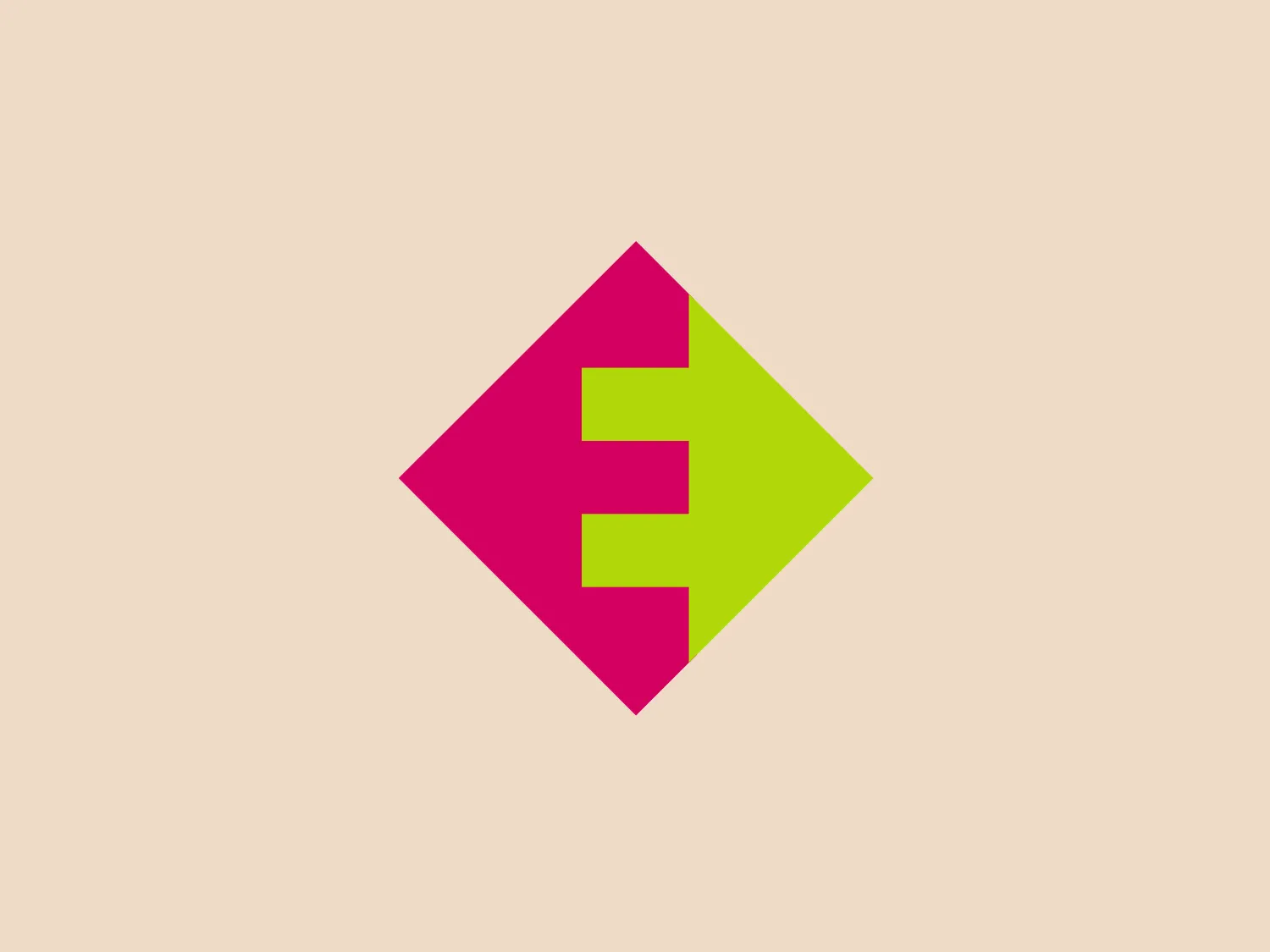
The Enexis logo showcases a bold, stylized letter 'E' that is split into two distinct colors: vivid magenta on the left and fluorescent lime green on the right. The modern, geometric sans-serif typeface of the 'E' is slightly italicized to the right, symbolizing motion or progress. Enclosed within a 45-degree rotated diamond shape, the overall design presents a contemporary and dynamic aesthetic, enhanced by the contrasting colors that create a striking and energetic appearance. This versatile design is suitable for various media applications.

About Enexis

Enexis is a Dutch company that operates as a regional network operator for the distribution of energy from suppliers to residential and commercial properties. With over a century of experience, Enexis has been a reliable provider of energy distribution services, ensuring uninterrupted supply round the clock.

Similar logos

The Matsuura logo features a stylized depiction of three overlapping, rounded shapes in a vibrant green color. The design exudes a modern and minimalist aesthetic with a nod to nature or growth themes, implying movement and connectivity. The shapes suggest leaves, pebbles, or abstract representations of increasing value/momentum.
The Holiday Inn logo features a stylized, abstract design that appears to be a pair of overlapping, slanted letter H's or a hash symbol (#) with a modern twist. It's composed of four bold, green lines with soft curves and slightly varied lengths, giving it a dynamic and contemporary feel. The use of negative space between the elements of the logo adds to its visual interest. The green color is vibrant and would stand well against a soft, pale background providing a contrast that is not too harsh.
The Frontier Airlines logo is a modern, sleek design comprised of three bold, dark green, horizontal stripes that form an abstract letter "E". The upper and lower stripes are longer and angled slightly downward towards the right, while the center stripe is shorter, creating a sense of movement and dynamism. The negative space between the stripes reinforces the "E" shape. The color has a professional and serious tone, and the logo's simplicity gives it a timeless and versatile feel. It has a clean, geometric quality, and there are no additional embellishments, making it highly adaptable for various applications.
The logo for Eldorado Gold features an abstract, circular design with three green curved shapes or leaves converging to suggest dynamic motion and organic growth. The curves are elegantly separated by white negative space giving the impression of a spinning globe or a plant in motion. The design evokes themes of nature, sustainability, and renewal, with the deep green color symbolizing growth, harmony, and freshness.
The Waymo logo depicts a stylized letter "W" with a modern and dynamic design. It is composed of three overlapping, geometric shapes that are rounded at the ends, suggesting fluidity and movement. The color palette includes a gradient ranging from a bright teal to a deeper blue-green, creating a sense of depth and vibrancy. The overall design aesthetic is clean, contemporary, and would likely appeal to a tech-savvy or forward-thinking audience. The fluid form and gradient give the Waymo logo a sense of innovation and approachability.
The Heco Chain logo features a stylized representation of two interacting shapes, resembling puzzle pieces. The design includes two bold, curving forms with rounded edges, mirroring each other for a sleek and modern appearance. The rich, deep green color signifies professionalism and growth, while the white lines create a crisp contrast and a three-dimensional illusion. This logo has a clean, contemporary feel suitable for technology, environmental fields, or innovative services.
The BitX Capital logo showcases a stylized, abstract design with a dynamic feel. It comprises interlocking shapes resembling a three-dimensional impossible loop. The main elements consist of two intertwined ribbons with a gradation of green shades that provide a sense of depth and movement. The contrast between the lighter and darker greens enhances the interweaving effect. Overall, the logo presents a modern and clean appearance, suggesting innovation and connectivity.
The Nedbank logo features a stylized, abstract design formed by a combination of geometric shapes, creating the impression of a letter or symbol. The use of dark green gives it a professional and sleek appearance. The design is characterized by sharp angles and overlaps that create depth, with negative space playing a critical role in defining its three-dimensional look. The overall aesthetic is modern and clean, suggesting innovation and strength.
The Boonli logo features a stylized, continuous loop resembling an abstract figure-eight or infinity symbol. It consists of two intertwined segments with a gradient color transition, starting from a rich magenta on one end, blending into a deep violet, and finishing with a vibrant orange on the other extremity. The colors give it a dynamic and modern feel, while the smooth curves suggest fluidity and connection. This design is sleek and minimalistic, with no additional embellishments, making it versatile and easily recognizable.
The ServiceNow logo is a stylized, vivid green circular shape with a subtle gradient that gives it a slightly three-dimensional effect. The core of the logo features a large, perfectly round cut-out in the center, making the entire form resemble a donut or a thick ring. The edges of the shape are smoothly rounded, contributing to a soft, modern aesthetic that is simple yet memorable due to its bold color and distinct silhouette. Given the vibrancy of the green, a neutral and light background would complement it well without competing for visual attention.