Channel 4

15
What catches our eye: The sleek and modern design of the number "4" with geometric shapes and vibrant gradient colors give this logo a dynamic and contemporary appeal.

Letter

No items found.

Color

Style

Channel 4 Logo

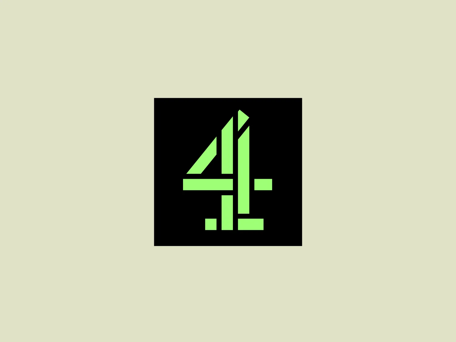
Channel 4 logo: The logo depicts a stylized number "4" within a square boundary. The numeral is composed of geometric shapes, featuring lines and angles that give it a modern and dynamic look. The primary elements are thick lines, with the negative space cleverly incorporated to define the number's structure. The color of the number is a vibrant lime green with a gradient that transitions to a darker shade at the edges, adding depth and dimensionality to the design. Overall, the aesthetic is sleek, bold, and contemporary, suitable for a brand seeking to convey innovation and forward-thinking.

About Channel 4

Channel 4 is a commercially-funded public service broadcaster based in the United Kingdom. It operates as a publicly-owned entity and does not rely on public funding. The channel is known for its innovative, experimental, and distinctive programming.

Similar logos

The Matsuura logo features a stylized depiction of three overlapping, rounded shapes in a vibrant green color. The design exudes a modern and minimalist aesthetic with a nod to nature or growth themes, implying movement and connectivity. The shapes suggest leaves, pebbles, or abstract representations of increasing value/momentum.
The BitX Capital logo showcases a stylized, abstract design with a dynamic feel. It comprises interlocking shapes resembling a three-dimensional impossible loop. The main elements consist of two intertwined ribbons with a gradation of green shades that provide a sense of depth and movement. The contrast between the lighter and darker greens enhances the interweaving effect. Overall, the logo presents a modern and clean appearance, suggesting innovation and connectivity.
The Holiday Inn logo features a stylized, abstract design that appears to be a pair of overlapping, slanted letter H's or a hash symbol (#) with a modern twist. It's composed of four bold, green lines with soft curves and slightly varied lengths, giving it a dynamic and contemporary feel. The use of negative space between the elements of the logo adds to its visual interest. The green color is vibrant and would stand well against a soft, pale background providing a contrast that is not too harsh.
The Subway logo features two bold, interlocking arrows forming an 'S' shape, with the top arrow colored in a striking green and the bottom in a vibrant yellow. The design is clean and modern, with a dynamic sense of movement implied by the arrows pointing in opposite directions. This creates a sense of exchange, circulation, or progression, which might suggest a company involved in logistics, technology, or finance. The flat color treatment and lack of additional embellishments give it a contemporary and straightforward aesthetic.
The logo for Eldorado Gold features an abstract, circular design with three green curved shapes or leaves converging to suggest dynamic motion and organic growth. The curves are elegantly separated by white negative space giving the impression of a spinning globe or a plant in motion. The design evokes themes of nature, sustainability, and renewal, with the deep green color symbolizing growth, harmony, and freshness.
The Bentley Motors logo features a stylized letter "B" with a modern and minimalist aesthetic. It is composed of two contrasting circular shapes, creating a bold and distinctive character. The design uses a dark green color that conveys a sense of growth, stability, and prosperity. Its simple yet striking design allows for versatile use across various media. To complement the dark green hue of the logo and to ensure it stands out, a light neutral background color from the provided options would be ideal.
The Frontier Airlines logo is a modern, sleek design comprised of three bold, dark green, horizontal stripes that form an abstract letter "E". The upper and lower stripes are longer and angled slightly downward towards the right, while the center stripe is shorter, creating a sense of movement and dynamism. The negative space between the stripes reinforces the "E" shape. The color has a professional and serious tone, and the logo's simplicity gives it a timeless and versatile feel. It has a clean, geometric quality, and there are no additional embellishments, making it highly adaptable for various applications.
The Nedbank logo features a stylized, abstract design formed by a combination of geometric shapes, creating the impression of a letter or symbol. The use of dark green gives it a professional and sleek appearance. The design is characterized by sharp angles and overlaps that create depth, with negative space playing a critical role in defining its three-dimensional look. The overall aesthetic is modern and clean, suggesting innovation and strength.
The Deliveroo logo features a stylized, geometric representation of a lowercase letter 'v' with rounded terminals and a playful, cut-in contour on the right side. This creates a sense of motion or a smiling face with two dots representing eyes. The bright, aqua-green color gives the logo a modern, minimalist, and friendly vibe, suggesting creativity and innovation.
The Heco Chain logo features a stylized representation of two interacting shapes, resembling puzzle pieces. The design includes two bold, curving forms with rounded edges, mirroring each other for a sleek and modern appearance. The rich, deep green color signifies professionalism and growth, while the white lines create a crisp contrast and a three-dimensional illusion. This logo has a clean, contemporary feel suitable for technology, environmental fields, or innovative services.