Steckley Gooderham

15
We like the minimalistic and elegant depiction of the swan, the fluid and curving lines, and the sophisticated monochromatic design.

Steckley Gooderham Logo

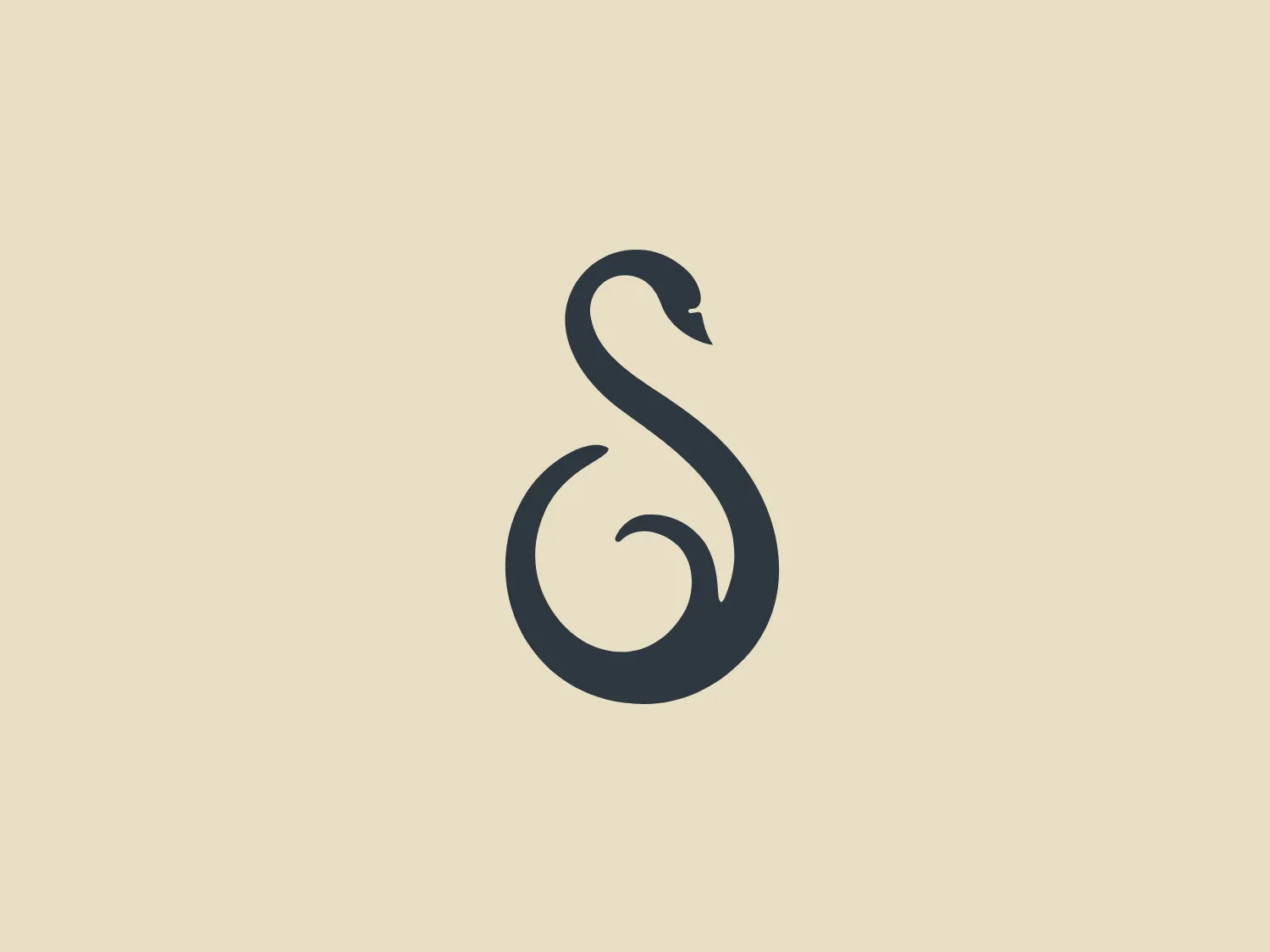
The logo presented is a stylized depiction of a swan, executed in a minimalistic and elegant fashion. Its form, created for Steckley Gooderham, is reduced to fluid, curving lines that create both the body and pronounced S-shaped neck of the bird, with a small space separating the beak from the neck line to define the head. The design is monochromatic, using a deep grey shade, which adds to its sophistication and modern appeal. It is a simple yet evocative design that communicates grace and simplicity.

About Steckley Gooderham

Established in 1923, Steckley-Gooderham Funeral Home is a family-owned and operated business that provides personalized funeral services to the Barrie community. The company is dedicated to adapting to evolving traditions and offers innovative options to support families in honoring their loved ones.

Similar logos

The Banreservas logo showcases a capitalized letter "R" in a dark grey tone using a modern, bold sans-serif typeface. Below the "R," three curved swooshes flow to the left, colored in gradients of light blue, blue, and orange, creating a dynamic contrast. The design presents a clean, contemporary look that suggests energy, speed, or growth.
The Le Monde logo features a stylized, abstract design that appears to be a representation of three vertical bars or pillars, with curvatures suggesting movement or fluidity. The design is monochromatic, utilizing varying shades of black and gray to create dimension and a sense of depth through shading and highlights. Its aesthetic leans towards modern and sleek, with clean lines and a minimalist approach that avoids any superfluous details. The use of negative space between the elements is cleverly managed to maintain the structure and integrity of each bar while imparting a dynamic and slightly futuristic look.
The logo for Zenith Bank is a stylized representation of the letter 'Z.' It features two main components with contrasting colors: a dark gray plane that forms the upper part of the 'Z' and a bold red plane creating the lower part. The logo has a sharp, modern look, characterized by its angular design and the use of negative space to enhance the division between the upper and lower sections. The absence of curves and the choice of a sans-serif style typeface give the design a strong, industrial feel. Its overall aesthetic is dynamic and suggests a sense of forward motion or progress.
The business name Ardent is featured in a modern and minimalist logo design, incorporating an impossible triangle, also known as a Penrose triangle. This optical illusion consists of a three-dimensional triangular figure with connected sides, defying the rules of Euclidean geometry. The monochromatic logo utilizes shades of grey to convey a metallic or reflective appearance, with gradients adding depth and sophistication. The combination of sharp angles and soft curves contributes to the sleek and contemporary aesthetic of the design.
The Standex logo features a stylized letter "E" created with three-dimensional rectangular blocks arranged at a slanted angle, effectively forming the shape of the letter. The solid dark gray color exudes a sleek and professional aura, while the minimalist and abstract design with clean lines and edges conveys stability and strength. The strategic use of negative space enhances its three-dimensional quality.
The reCAPTCHA logo features a sleek and modern design with an amalgamation of arrow-shaped components in various shades of blue and grey. The dynamic aesthetic suggests motion and transformation, enhanced by the use of gradients for depth and sophistication.
The Samco logo features a modern and minimalistic stylized letter 'S' composed of three interlocking shapes in dark navy and grey colors. The bold, geometric forms create a sense of movement and connectivity, with negative space mirroring the curves of the 'S' for enhanced dynamism. The gradient effect adds depth and a 3D effect.
The Pulsate logo features an abstract, organic shape resembling a speech bubble or thought bubble. It has a flat design with a two-tone color scheme, incorporating a deep, muted blue as the dominant color with a curved swoosh of a lighter, almost silver-grey tone at the bottom right that suggests a reflection or light source. The design is minimalist and modern, with a friendly and approachable feel, which could be suitable for a brand in the tech or communication sector. No text is included in the image provided.
The Qualcomm Snapdragon logo features a vibrant red, stylized letter 'S' against a silver or gray spherical background. The 'S' shape is smooth with sharp, flame-like tails, conveying a dynamic and energetic feel. The clean lines and modern aesthetic suggest a connection to technology, energy, or speed. The contrast between the red and grayscale background creates a striking visual, making the logo stand out.
The ThingWorx logo is a geometric design showcasing a stylized hexagon segmented into four diamonds. The two filled with deep slate gray color and the other two with vibrant lime green create a striking contrast, while the symmetrical and balanced design exudes stability. The sharp angles convey a modern and dynamic aesthetic, and the bright green could denote growth or eco-friendliness.