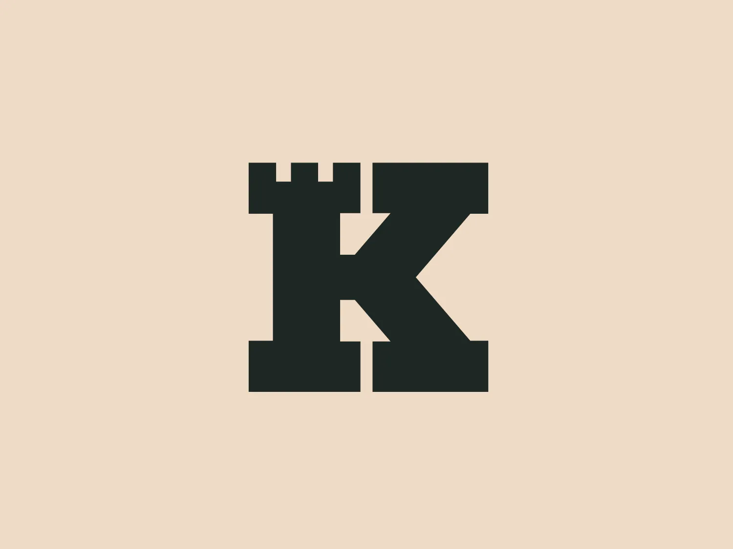
Keep Network


What we like is the seamless integration of the bold "K" with the castle turret, creating a strong and modern visual impact.
Letter
Type
Color
Style
The logo for Keep Network incorporates a bold, dark gray "K" seamlessly merged with the silhouette of a castle turret at the top left corner. The design utilizes sharp angles and straight lines, creating a sturdy, fortified appearance associated with medieval architecture. The merger of the letter with the castle element emphasizes stability and strength. The simplicity of the color and form gives it a modern, clean look that would stand out against a light, subtle background.
The Keep Network is a protocol designed to facilitate private data transfer and storage for public blockchain users and applications. It achieves this through off-chain containers known as "Keeps."
No items found.
Similar logos
NEW

The Banreservas logo showcases a capitalized letter "R" in a dark grey tone using a modern, bold sans-serif typeface. Below the "R," three curved swooshes flow to the left, colored in gradients of light blue, blue, and orange, creating a dynamic contrast. The design presents a clean, contemporary look that suggests energy, speed, or growth.
NEW

The logo for Zenith Bank is a stylized representation of the letter 'Z.' It features two main components with contrasting colors: a dark gray plane that forms the upper part of the 'Z' and a bold red plane creating the lower part. The logo has a sharp, modern look, characterized by its angular design and the use of negative space to enhance the division between the upper and lower sections. The absence of curves and the choice of a sans-serif style typeface give the design a strong, industrial feel. Its overall aesthetic is dynamic and suggests a sense of forward motion or progress.
NEW

The Le Monde logo features a stylized, abstract design that appears to be a representation of three vertical bars or pillars, with curvatures suggesting movement or fluidity. The design is monochromatic, utilizing varying shades of black and gray to create dimension and a sense of depth through shading and highlights. Its aesthetic leans towards modern and sleek, with clean lines and a minimalist approach that avoids any superfluous details. The use of negative space between the elements is cleverly managed to maintain the structure and integrity of each bar while imparting a dynamic and slightly futuristic look.
NEW

The Samco logo features a modern and minimalistic stylized letter 'S' composed of three interlocking shapes in dark navy and grey colors. The bold, geometric forms create a sense of movement and connectivity, with negative space mirroring the curves of the 'S' for enhanced dynamism. The gradient effect adds depth and a 3D effect.
NEW

The reCAPTCHA logo features a sleek and modern design with an amalgamation of arrow-shaped components in various shades of blue and grey. The dynamic aesthetic suggests motion and transformation, enhanced by the use of gradients for depth and sophistication.
NEW

The Pulsate logo features an abstract, organic shape resembling a speech bubble or thought bubble. It has a flat design with a two-tone color scheme, incorporating a deep, muted blue as the dominant color with a curved swoosh of a lighter, almost silver-grey tone at the bottom right that suggests a reflection or light source. The design is minimalist and modern, with a friendly and approachable feel, which could be suitable for a brand in the tech or communication sector. No text is included in the image provided.
NEW

The business name Ardent is featured in a modern and minimalist logo design, incorporating an impossible triangle, also known as a Penrose triangle. This optical illusion consists of a three-dimensional triangular figure with connected sides, defying the rules of Euclidean geometry. The monochromatic logo utilizes shades of grey to convey a metallic or reflective appearance, with gradients adding depth and sophistication. The combination of sharp angles and soft curves contributes to the sleek and contemporary aesthetic of the design.
NEW

The Standex logo features a stylized letter "E" created with three-dimensional rectangular blocks arranged at a slanted angle, effectively forming the shape of the letter. The solid dark gray color exudes a sleek and professional aura, while the minimalist and abstract design with clean lines and edges conveys stability and strength. The strategic use of negative space enhances its three-dimensional quality.
NEW

The Délifrance emblem showcases a stylized letter "D" with a contemporary design, featuring clean, curving lines that suggest fluidity and modernity. Its sleek, streamlined shape is bold and appears to be in a weighted sans-serif type, possibly resembling popular minimalist fonts. The color of the "D" is a solid, dark gray with smooth curves that thicken at the base, creating a visual anchor. The aspect that stands out is the asymmetry within the "D"; the right side extends with a tail-like feature that provides a unique characteristic to the letterform.
NEW

The ThingWorx logo is a geometric design showcasing a stylized hexagon segmented into four diamonds. The two filled with deep slate gray color and the other two with vibrant lime green create a striking contrast, while the symmetrical and balanced design exudes stability. The sharp angles convey a modern and dynamic aesthetic, and the bright green could denote growth or eco-friendliness.