Hilton Honors


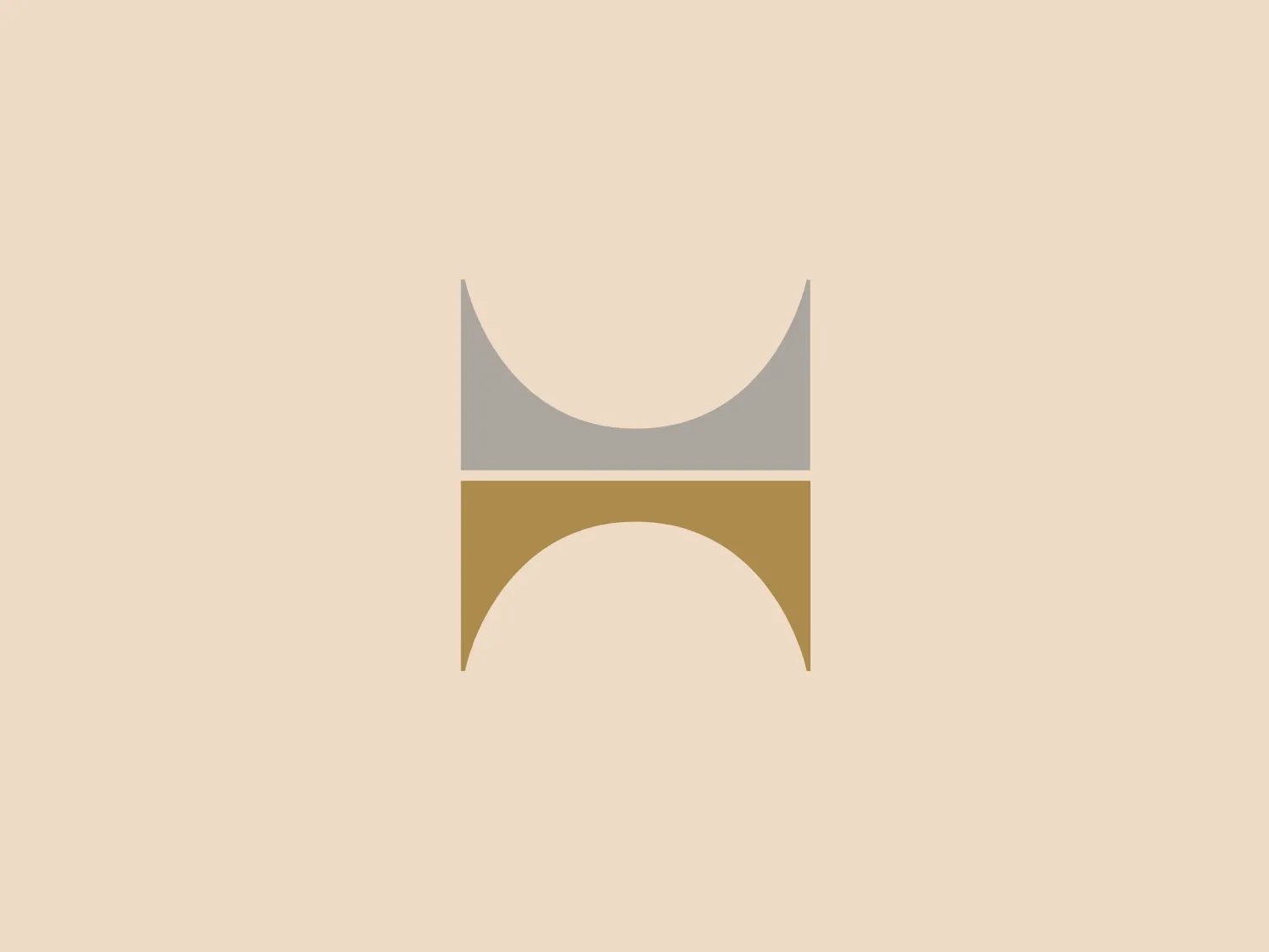
What catches our eye is the elegant and symmetrical emblem of the Hilton Honors logo, with a balanced use of contrasting gray and gold tones, creating a versatile and modern aesthetic.
Letter
Type
Color
Style
The Hilton Honors logo showcases a stylized, symmetrical emblem with two mirrored shapes facing each other, creating a central negative space that suggests a letter or symbol. Rendered in a cool gray tone on the left and a warm gold tone on the right, the logo achieves a sense of balance between contrasting elements. The soft, organic curvature of the shapes meets at a sharp point on the outer edges, contributing to a modern and dynamic aesthetic. The elegant simplicity of the design and the color scheme make it adaptable to various backgrounds.
The Hilton Honors program allows members to earn points through stays at any Hilton property, participating brands, and everyday purchases made with a Hilton Honors-affiliated credit card.
Similar logos
NEW

The ICICI Bank logo features a stylized, abstract design with a fluid, organic shape. The central element resembles a lowercase "i" with a dot hovering above what could be interpreted as an abstract human figure or a dynamic swirl. Its bold lines curve to create a sense of movement. The color scheme consists of a gradient transition from a deep, warm red to a rich, golden orange, giving the logo an energetic and inviting appearance. Noteworthy is the way the white space between the "i" and its dot creates a pathway, emphasizing the motion and adding an element of negative space to the design.
NEW

The Washington Commanders logo features three interconnected diamond shapes forming a stylized letter "W." The primary color is a deep maroon with a thick golden yellow border, creating a sharp contrast and a dynamic feel. The use of geometric shapes and bold colors conveys strength and modernity.
NEW

The business logo for Glow Bar is a stylized, modern design portraying the lowercase letter 'g'. The design is fluid and continuous, with a bold, looping structure. The logo is a warm, pale gold color, conveying luxury and elegance, with a glossy finish for a premium feel. A small, five-pointed star sits above the upper curve of the 'g,' suggesting excellence or a premium grade.
NEW

The Banreservas logo showcases a capitalized letter "R" in a dark grey tone using a modern, bold sans-serif typeface. Below the "R," three curved swooshes flow to the left, colored in gradients of light blue, blue, and orange, creating a dynamic contrast. The design presents a clean, contemporary look that suggests energy, speed, or growth.
NEW

The logo for Zenith Bank is a stylized representation of the letter 'Z.' It features two main components with contrasting colors: a dark gray plane that forms the upper part of the 'Z' and a bold red plane creating the lower part. The logo has a sharp, modern look, characterized by its angular design and the use of negative space to enhance the division between the upper and lower sections. The absence of curves and the choice of a sans-serif style typeface give the design a strong, industrial feel. Its overall aesthetic is dynamic and suggests a sense of forward motion or progress.
NEW

The Shangri-La Group logo features a stylized, abstract design consisting of smooth, curvilinear shapes. It is composed of golden yellow lines that form a central symbol reminiscent of a bird in flight or a leaf, enclosed within a perfect circle. The lines are bold and flowing, creating a sense of movement and harmony. The overall aesthetic is modern, minimalistic, and organic, suggesting elegance, freedom, or growth. The simplicity of the design allows for versatile use across various media.
NEW

The Le Monde logo features a stylized, abstract design that appears to be a representation of three vertical bars or pillars, with curvatures suggesting movement or fluidity. The design is monochromatic, utilizing varying shades of black and gray to create dimension and a sense of depth through shading and highlights. Its aesthetic leans towards modern and sleek, with clean lines and a minimalist approach that avoids any superfluous details. The use of negative space between the elements is cleverly managed to maintain the structure and integrity of each bar while imparting a dynamic and slightly futuristic look.
NEW

The Vanderbilt University logo is a stylized letter "V" with a modern and sleek design. It features sharp angles converging towards the bottom to form a precise and cutting-edge base. The logo is gold-toned, with a gradient transitioning from lighter to darker, giving it a luxurious and refined appearance.
NEW

The Farah logo features a cursive, stylized letter "f" that exudes elegance and sophistication. The solid, golden yellow color communicates warmth, optimism, and creativity while the balance between thick and thin strokes creates a dynamic contrast. The cohesive shape represents continuity and possibly unity, making it well-suited for brands aiming to convey luxury, artistry, or innovation.
NEW

The Calgary Flames logo features a stylized letter "C" in a bold red color with gold and white trim, giving it a three-dimensional appearance. Embedded into the form of the "C" is the profile of a fiery figure, suggestive of a flame with wispy edges in shades of red and orange that evoke a sense of dynamic movement and energy. The flame's outline doubles as the inner stroke of the letter, with small accents of white, enhancing the contrast and detail within the design. This logo exudes a bold and energetic aesthetic, appropriate for a dynamic and spirited brand or team. It has a modern and sleek look with a distinct sense of motion and liveliness.