White Rose Forest

15
What we like: The White Rose Forest logo embodies a sleek and minimalist tree design, evoking a sense of modernity and environmental consciousness.

White Rose Forest Logo

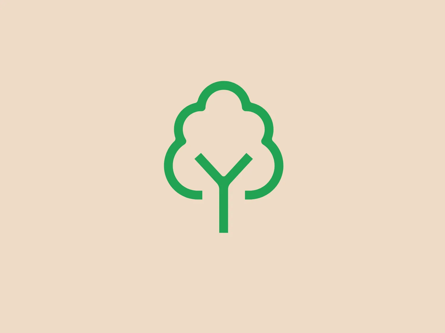
The White Rose Forest logo features a stylized tree with a simple and modern design, utilizing a clean, flat art style. The shapes forming the tree are smooth and geometric, with rounded edges. A singular green color (likely representing growth or environmental friendliness) is used throughout, consisting of a silhouette of the tree canopy in a cloud-like shape atop a straight trunk that bifurcates into a 'Y' shape, suggesting branches. The design is minimalistic, with no gradients or shading, giving it a contemporary and versatile look that would suit a variety of branding purposes. For the background of this logo, a soft and pale color that complements the green without overpowering it would be ideal.

About White Rose Forest

White Rose Forest is a community forest that operates in North and West Yorkshire. The organization collaborates with local authorities, landowners, businesses, and communities to enhance the natural environment by planting trees across the region.

Similar logos

The Matsuura logo features a stylized depiction of three overlapping, rounded shapes in a vibrant green color. The design exudes a modern and minimalist aesthetic with a nod to nature or growth themes, implying movement and connectivity. The shapes suggest leaves, pebbles, or abstract representations of increasing value/momentum.
The BitX Capital logo showcases a stylized, abstract design with a dynamic feel. It comprises interlocking shapes resembling a three-dimensional impossible loop. The main elements consist of two intertwined ribbons with a gradation of green shades that provide a sense of depth and movement. The contrast between the lighter and darker greens enhances the interweaving effect. Overall, the logo presents a modern and clean appearance, suggesting innovation and connectivity.
The Subway logo features two bold, interlocking arrows forming an 'S' shape, with the top arrow colored in a striking green and the bottom in a vibrant yellow. The design is clean and modern, with a dynamic sense of movement implied by the arrows pointing in opposite directions. This creates a sense of exchange, circulation, or progression, which might suggest a company involved in logistics, technology, or finance. The flat color treatment and lack of additional embellishments give it a contemporary and straightforward aesthetic.
The Holiday Inn logo features a stylized, abstract design that appears to be a pair of overlapping, slanted letter H's or a hash symbol (#) with a modern twist. It's composed of four bold, green lines with soft curves and slightly varied lengths, giving it a dynamic and contemporary feel. The use of negative space between the elements of the logo adds to its visual interest. The green color is vibrant and would stand well against a soft, pale background providing a contrast that is not too harsh.
The Frontier Airlines logo is a modern, sleek design comprised of three bold, dark green, horizontal stripes that form an abstract letter "E". The upper and lower stripes are longer and angled slightly downward towards the right, while the center stripe is shorter, creating a sense of movement and dynamism. The negative space between the stripes reinforces the "E" shape. The color has a professional and serious tone, and the logo's simplicity gives it a timeless and versatile feel. It has a clean, geometric quality, and there are no additional embellishments, making it highly adaptable for various applications.
The Bentley Motors logo features a stylized letter "B" with a modern and minimalist aesthetic. It is composed of two contrasting circular shapes, creating a bold and distinctive character. The design uses a dark green color that conveys a sense of growth, stability, and prosperity. Its simple yet striking design allows for versatile use across various media. To complement the dark green hue of the logo and to ensure it stands out, a light neutral background color from the provided options would be ideal.
The logo for Eldorado Gold features an abstract, circular design with three green curved shapes or leaves converging to suggest dynamic motion and organic growth. The curves are elegantly separated by white negative space giving the impression of a spinning globe or a plant in motion. The design evokes themes of nature, sustainability, and renewal, with the deep green color symbolizing growth, harmony, and freshness.
The Waymo logo depicts a stylized letter "W" with a modern and dynamic design. It is composed of three overlapping, geometric shapes that are rounded at the ends, suggesting fluidity and movement. The color palette includes a gradient ranging from a bright teal to a deeper blue-green, creating a sense of depth and vibrancy. The overall design aesthetic is clean, contemporary, and would likely appeal to a tech-savvy or forward-thinking audience. The fluid form and gradient give the Waymo logo a sense of innovation and approachability.
The Heco Chain logo features a stylized representation of two interacting shapes, resembling puzzle pieces. The design includes two bold, curving forms with rounded edges, mirroring each other for a sleek and modern appearance. The rich, deep green color signifies professionalism and growth, while the white lines create a crisp contrast and a three-dimensional illusion. This logo has a clean, contemporary feel suitable for technology, environmental fields, or innovative services.
The Carmignac logo is a modern and clean design featuring bold, dark green concentric circles. The stylized letter 'G' within the smallest circle looks like an arrow pointing to the right, suggesting movement or progress. The seamless integration of the arrow breaking the circle boundary signifies forward motion or direction. The use of green aligns with growth, freshness, and eco-friendliness, possibly reflecting the brand's values or industry. Its simplicity makes it a versatile and easily recognizable design.