Durrell

15
Something we like: The Durrell logo's stylized snake design in a bold, modern style with a continuous, flowing line and a vivid green color evokes nature, vitality, and growth.

Durrell Logo

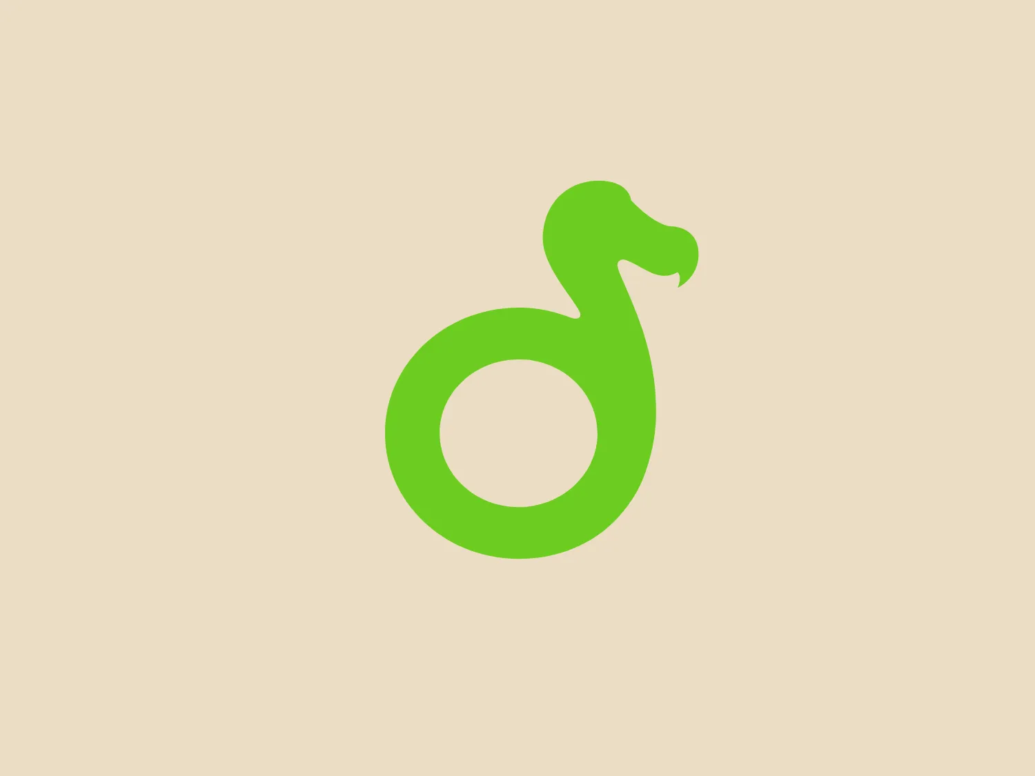
The Durrell logo features a stylized depiction of a snake in a bold, modern design. The snake's form is simplified into a continuous, flowing line that creates the shape of an "S" with a loop, hinting at the creature's slithery movement. The head of the snake is minimalistic, with a subtle notch to suggest the mouth and a smooth curve for the head, avoiding any intricate details. The entire logo is a vivid, flat shade of green, evoking a sense of nature, vitality, and growth. The design has a friendly and accessible aesthetic due to its smooth lines and lack of sharp edges. This simple and clean approach makes the logo versatile and scalable.

About Durrell

Durrell Wildlife Conservation Trust is a global organization comprised of conservationists dedicated to preventing the extinction of species and enhancing human connection with the natural world.

Similar logos

The Deliveroo logo features a stylized, geometric representation of a lowercase letter 'v' with rounded terminals and a playful, cut-in contour on the right side. This creates a sense of motion or a smiling face with two dots representing eyes. The bright, aqua-green color gives the logo a modern, minimalist, and friendly vibe, suggesting creativity and innovation.
The logo in the image displays a symmetrical design resembling an abstract butterfly or a pair of wings. It consists of multiple leaf-like shapes radiating from the center, creating a harmonious pattern. Vibrant colors such as pink, orange, yellow, green, light blue, and teal are used, outlined with a thin black border that enhances their individuality. The overall design aesthetic is lively and organic, suggesting a sense of growth or transformation. The black background makes the colors pop, giving the logo a bold and energetic appearance.
The Afirme logo features an abstract design with three stylized, pointed shapes that resemble peaks or arrows, arranged in a dynamic and ascending pattern. The primary color used is a rich, flat green, without any gradients or shades, which conveys a sense of growth, vitality, or eco-friendliness. The overall aesthetic is modern and minimalist, with clean lines and sharp angles creating a sense of forward movement and progress. The simplicity of the design ensures versatility and readability across various mediums. For this logo, a light and subtle background would complement it well without overwhelming its simplicity.
The image depicts a minimalist logo for Wildist, featuring three solid triangles arranged in ascending order from left to right, creating a simplified mountain range. The uniformly colored deep, dark green triangles stand out against a light background, projecting a modern and clean aesthetic. The use of geometric shapes and a monochromatic color scheme hints at nature, stability, and growth. The largest triangle on the right conveys a sense of hierarchy and progression.
The Monday logo boasts a minimalist design with three simple geometric shapes, exuding a modern and playful aesthetic. It showcases two oblong shapes, one vibrant pink and the other bright yellow, slightly slanted and positioned in parallel, hinting at forward motion or connectivity. A small, solid green circle sits below them to the right, providing a visual anchor and adding a touch of contrast. The clean lines and bold, primary colors infuse the logo with a sense of approachability and energy.
The Kadoo logo is a simplistic and modern design that consists of a symmetrical, abstract figure resembling a clover or a cross with rounded edges. It features four leaves or petals, each with a different color: green, blue, darker blue, and light blue, all with flat tones. The design gives off a feeling of balance and unity, with its smooth curves and junction at the center indicating connectivity or interaction. Given its clean lines and use of negative space, the logo exudes a contemporary feel that is versatile for various branding purposes.
The ProcureTech logo features a stylized lowercase "p" consisting of bold, continuous lines with rounded corners. The design is minimalist and modern, with a focus on clean geometry and symmetry. The color of the symbol is a vibrant, leafy green, giving it an energetic and fresh appearance. No additional elements or embellishments are present, emphasizing the brand's straightforward and sleek aesthetic.
The logo presented is a stylized letter "W" formed by the interconnection of three overlapping triangles with rounded corners, conveying a sense of unity and dynamic interaction. The triangles are filled with flat, bold colors—yellow on the left, green in the center, and blue on the right—creating a harmonious yet vibrant palette that suggests creativity and energy. The design aesthetic is modern, minimalistic, and playful, with a friendly and approachable vibe. The lack of borders or outlines and the use of clean, geometric shapes provide a sleek and contemporary feel.
The logo for Keap showcases a striking, stylized letter "K" in a vibrant green hue. Its modern and minimalistic design comprises two geometric shapes—a vertical rectangle and a diagonal parallelogram—that combine to create the distinct shape of the letter. The clean and uncluttered aesthetic evokes a sense of efficiency and innovation. A neutral backdrop that complements the green without overshadowing it is recommended.
The Matsuura logo features a stylized depiction of three overlapping, rounded shapes in a vibrant green color. The design exudes a modern and minimalist aesthetic with a nod to nature or growth themes, implying movement and connectivity. The shapes suggest leaves, pebbles, or abstract representations of increasing value/momentum.