XetaWave

15
Something we like about the XetaWave logo is its modern, abstract design that suggests movement and connectivity, with a sleek color gradient for a contemporary look.

XetaWave Logo

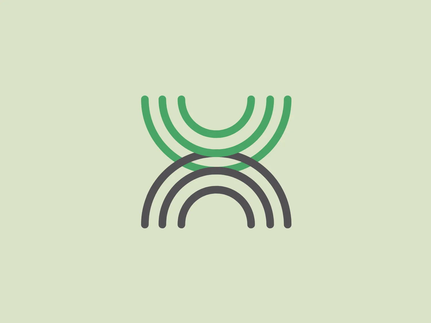
The XetaWave logo features a stylized, abstract design resembling a letter or a symbol. It consists of six curved horizontal lines, with the top three forming an open, rounded shape that points upwards, and the bottom three forming a similar shape that points downwards. The lines have varying thicknesses, creating a sense of depth and dimensionality. The top three lines are colored in shades of green, while the bottom three transition into grey, suggesting a gradient or a shift in perspective. The overall aesthetic is modern, minimalist, and implies movement or connectivity. The design is clean and would likely scale well across different mediums.

About XetaWave

XetaWave is a leading provider of wireless technology solutions known for their proven performance, functionality, and reliability. All products are 100% designed, manufactured, and tested in Colorado, USA.

Similar logos

The Matsuura logo features a stylized depiction of three overlapping, rounded shapes in a vibrant green color. The design exudes a modern and minimalist aesthetic with a nod to nature or growth themes, implying movement and connectivity. The shapes suggest leaves, pebbles, or abstract representations of increasing value/momentum.
The BitX Capital logo showcases a stylized, abstract design with a dynamic feel. It comprises interlocking shapes resembling a three-dimensional impossible loop. The main elements consist of two intertwined ribbons with a gradation of green shades that provide a sense of depth and movement. The contrast between the lighter and darker greens enhances the interweaving effect. Overall, the logo presents a modern and clean appearance, suggesting innovation and connectivity.
The Subway logo features two bold, interlocking arrows forming an 'S' shape, with the top arrow colored in a striking green and the bottom in a vibrant yellow. The design is clean and modern, with a dynamic sense of movement implied by the arrows pointing in opposite directions. This creates a sense of exchange, circulation, or progression, which might suggest a company involved in logistics, technology, or finance. The flat color treatment and lack of additional embellishments give it a contemporary and straightforward aesthetic.
The Holiday Inn logo features a stylized, abstract design that appears to be a pair of overlapping, slanted letter H's or a hash symbol (#) with a modern twist. It's composed of four bold, green lines with soft curves and slightly varied lengths, giving it a dynamic and contemporary feel. The use of negative space between the elements of the logo adds to its visual interest. The green color is vibrant and would stand well against a soft, pale background providing a contrast that is not too harsh.
The Frontier Airlines logo is a modern, sleek design comprised of three bold, dark green, horizontal stripes that form an abstract letter "E". The upper and lower stripes are longer and angled slightly downward towards the right, while the center stripe is shorter, creating a sense of movement and dynamism. The negative space between the stripes reinforces the "E" shape. The color has a professional and serious tone, and the logo's simplicity gives it a timeless and versatile feel. It has a clean, geometric quality, and there are no additional embellishments, making it highly adaptable for various applications.
The Bentley Motors logo features a stylized letter "B" with a modern and minimalist aesthetic. It is composed of two contrasting circular shapes, creating a bold and distinctive character. The design uses a dark green color that conveys a sense of growth, stability, and prosperity. Its simple yet striking design allows for versatile use across various media. To complement the dark green hue of the logo and to ensure it stands out, a light neutral background color from the provided options would be ideal.
The logo for Grammarly features a stylized white letter 'G,' designed in a modern sans-serif typeface with clean, smooth lines, centrally placed within a solid green circle. This design gives the logo a minimalist and contemporary feel. The negative space within the 'G' forms an arrow pointing to the top left, suggesting movement or direction. The vibrant green color and circular boundary create a bold and complete visual identity.
The Enterprise emblem is a stylized white design on a rich green square background. The abstract design resembles a loop or an orbit with an oval shape at its core, intersected by a horizontal line, suggesting movement or continuity. The overall aesthetic is modern, clean, and conveys a sense of dynamism and innovation. The use of negative space creates contrast against the green backdrop.
The Banreservas logo showcases a capitalized letter "R" in a dark grey tone using a modern, bold sans-serif typeface. Below the "R," three curved swooshes flow to the left, colored in gradients of light blue, blue, and orange, creating a dynamic contrast. The design presents a clean, contemporary look that suggests energy, speed, or growth.
The logo for Eldorado Gold features an abstract, circular design with three green curved shapes or leaves converging to suggest dynamic motion and organic growth. The curves are elegantly separated by white negative space giving the impression of a spinning globe or a plant in motion. The design evokes themes of nature, sustainability, and renewal, with the deep green color symbolizing growth, harmony, and freshness.