Gharabaghtsyan Shin


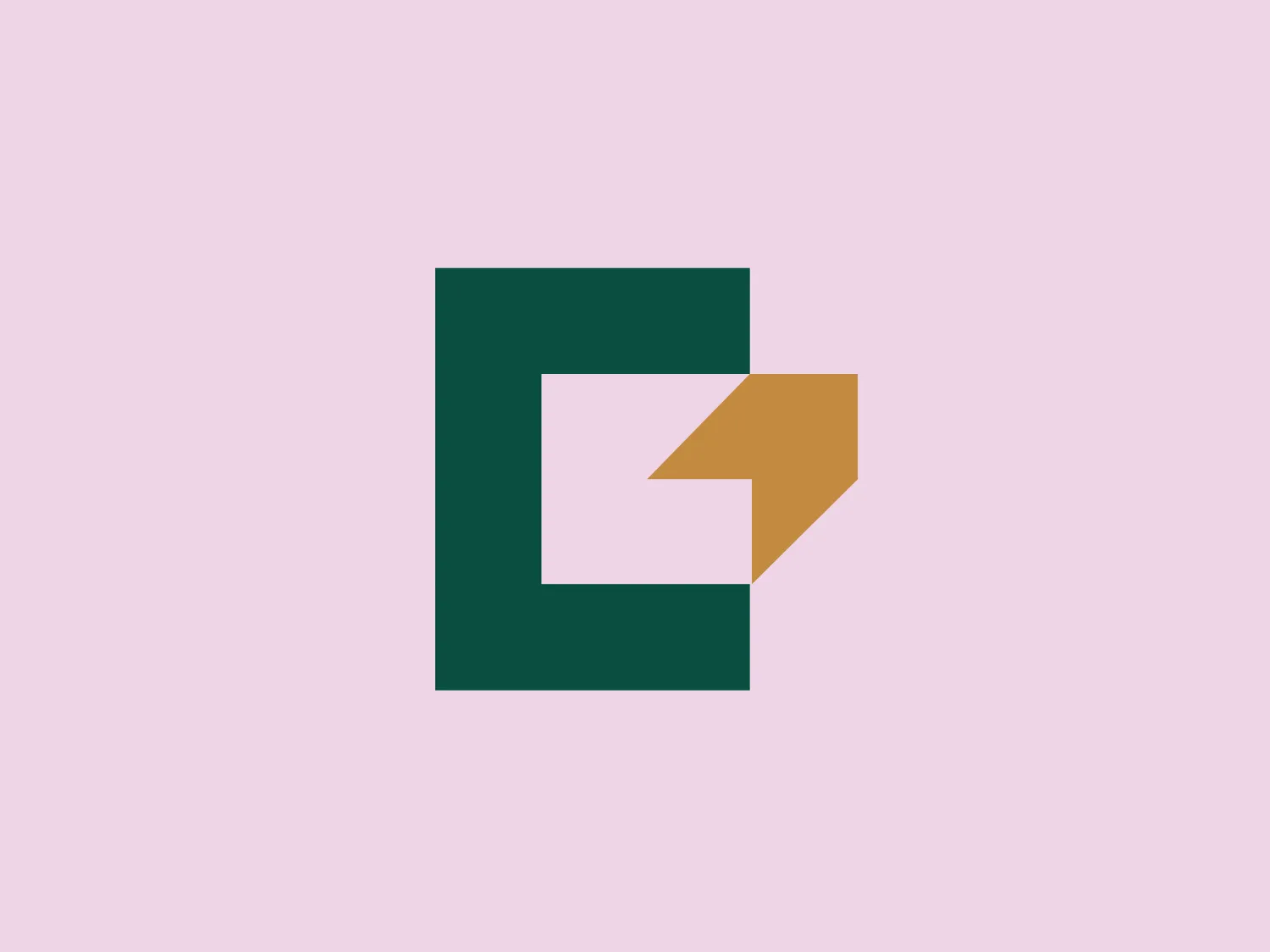
What catches our eye is the minimalistic and modern design of the Gharabaghtsyan Shin logo, with its contrasting dark green square and gold arrow creating a sense of motion and direction within a static framework.
Letter
Type
Color
Style
The logo of Gharabaghtsyan Shin consists of two primary geometric shapes: a dark green square and a gold arrow. The square provides a solid and stable backdrop, while the arrow, which is overlapping and slightly smaller than the square, points upwards and to the right, indicating progress or forward movement. The overall design aesthetic is minimalistic and modern, with a stark contrast between the dark green and the gold. The arrow's placement creates a sense of motion and direction within the static square, giving the logo a dynamic feel.
Founded in 2004, Gharabaghtsyan Shin is engaged in the areas of hydraulic engineering, public-industrial, residential, transport, energy, and communication infrastructure development.
Similar logos
NEW

The Matsuura logo features a stylized depiction of three overlapping, rounded shapes in a vibrant green color. The design exudes a modern and minimalist aesthetic with a nod to nature or growth themes, implying movement and connectivity. The shapes suggest leaves, pebbles, or abstract representations of increasing value/momentum.
NEW

The ICICI Bank logo features a stylized, abstract design with a fluid, organic shape. The central element resembles a lowercase "i" with a dot hovering above what could be interpreted as an abstract human figure or a dynamic swirl. Its bold lines curve to create a sense of movement. The color scheme consists of a gradient transition from a deep, warm red to a rich, golden orange, giving the logo an energetic and inviting appearance. Noteworthy is the way the white space between the "i" and its dot creates a pathway, emphasizing the motion and adding an element of negative space to the design.
NEW

The BitX Capital logo showcases a stylized, abstract design with a dynamic feel. It comprises interlocking shapes resembling a three-dimensional impossible loop. The main elements consist of two intertwined ribbons with a gradation of green shades that provide a sense of depth and movement. The contrast between the lighter and darker greens enhances the interweaving effect. Overall, the logo presents a modern and clean appearance, suggesting innovation and connectivity.
NEW

The Subway logo features two bold, interlocking arrows forming an 'S' shape, with the top arrow colored in a striking green and the bottom in a vibrant yellow. The design is clean and modern, with a dynamic sense of movement implied by the arrows pointing in opposite directions. This creates a sense of exchange, circulation, or progression, which might suggest a company involved in logistics, technology, or finance. The flat color treatment and lack of additional embellishments give it a contemporary and straightforward aesthetic.
NEW

The Holiday Inn logo features a stylized, abstract design that appears to be a pair of overlapping, slanted letter H's or a hash symbol (#) with a modern twist. It's composed of four bold, green lines with soft curves and slightly varied lengths, giving it a dynamic and contemporary feel. The use of negative space between the elements of the logo adds to its visual interest. The green color is vibrant and would stand well against a soft, pale background providing a contrast that is not too harsh.
NEW

The Washington Commanders logo features three interconnected diamond shapes forming a stylized letter "W." The primary color is a deep maroon with a thick golden yellow border, creating a sharp contrast and a dynamic feel. The use of geometric shapes and bold colors conveys strength and modernity.
NEW

The business logo for Glow Bar is a stylized, modern design portraying the lowercase letter 'g'. The design is fluid and continuous, with a bold, looping structure. The logo is a warm, pale gold color, conveying luxury and elegance, with a glossy finish for a premium feel. A small, five-pointed star sits above the upper curve of the 'g,' suggesting excellence or a premium grade.
NEW

The Frontier Airlines logo is a modern, sleek design comprised of three bold, dark green, horizontal stripes that form an abstract letter "E". The upper and lower stripes are longer and angled slightly downward towards the right, while the center stripe is shorter, creating a sense of movement and dynamism. The negative space between the stripes reinforces the "E" shape. The color has a professional and serious tone, and the logo's simplicity gives it a timeless and versatile feel. It has a clean, geometric quality, and there are no additional embellishments, making it highly adaptable for various applications.
NEW

The Bentley Motors logo features a stylized letter "B" with a modern and minimalist aesthetic. It is composed of two contrasting circular shapes, creating a bold and distinctive character. The design uses a dark green color that conveys a sense of growth, stability, and prosperity. Its simple yet striking design allows for versatile use across various media. To complement the dark green hue of the logo and to ensure it stands out, a light neutral background color from the provided options would be ideal.
NEW

The logo for Grammarly features a stylized white letter 'G,' designed in a modern sans-serif typeface with clean, smooth lines, centrally placed within a solid green circle. This design gives the logo a minimalist and contemporary feel. The negative space within the 'G' forms an arrow pointing to the top left, suggesting movement or direction. The vibrant green color and circular boundary create a bold and complete visual identity.