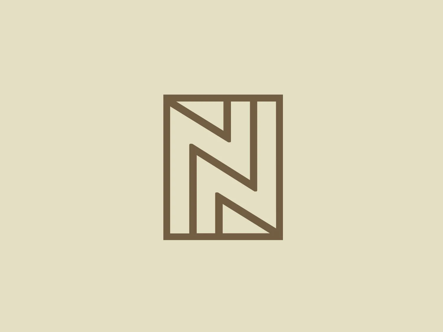
Nile


What we like: The stylized monogram with mirrored letter N's creates a sophisticated and balanced design, exuding luxury and exclusivity.
Letter
Type
Color
Style
The Nile logo is a stylized, modern monogram composed of two mirrored letter N's forming a symmetrical design. The single-color emblem, in a gold or light brown tone, exudes elegance and sophistication. Clean and straight lines with equal-thickness strokes create a balanced geometric appearance. The minimalistic design aims to convey a sense of luxury and exclusivity, with a background color that complements its simplicity and sophistication.
NILE is a Swiss fashion brand that embodies a naturally casual style with a focus on detail and fair fashion. The brand is known for its modern, creative, and distinctive designs, and is dedicated to sustainability.
Similar logos
NEW

The ICICI Bank logo features a stylized, abstract design with a fluid, organic shape. The central element resembles a lowercase "i" with a dot hovering above what could be interpreted as an abstract human figure or a dynamic swirl. Its bold lines curve to create a sense of movement. The color scheme consists of a gradient transition from a deep, warm red to a rich, golden orange, giving the logo an energetic and inviting appearance. Noteworthy is the way the white space between the "i" and its dot creates a pathway, emphasizing the motion and adding an element of negative space to the design.
NEW

The Washington Commanders logo features three interconnected diamond shapes forming a stylized letter "W." The primary color is a deep maroon with a thick golden yellow border, creating a sharp contrast and a dynamic feel. The use of geometric shapes and bold colors conveys strength and modernity.
NEW

The business logo for Glow Bar is a stylized, modern design portraying the lowercase letter 'g'. The design is fluid and continuous, with a bold, looping structure. The logo is a warm, pale gold color, conveying luxury and elegance, with a glossy finish for a premium feel. A small, five-pointed star sits above the upper curve of the 'g,' suggesting excellence or a premium grade.
NEW

The Shangri-La Group logo features a stylized, abstract design consisting of smooth, curvilinear shapes. It is composed of golden yellow lines that form a central symbol reminiscent of a bird in flight or a leaf, enclosed within a perfect circle. The lines are bold and flowing, creating a sense of movement and harmony. The overall aesthetic is modern, minimalistic, and organic, suggesting elegance, freedom, or growth. The simplicity of the design allows for versatile use across various media.
NEW

The Vanderbilt University logo is a stylized letter "V" with a modern and sleek design. It features sharp angles converging towards the bottom to form a precise and cutting-edge base. The logo is gold-toned, with a gradient transitioning from lighter to darker, giving it a luxurious and refined appearance.
NEW

The Farah logo features a cursive, stylized letter "f" that exudes elegance and sophistication. The solid, golden yellow color communicates warmth, optimism, and creativity while the balance between thick and thin strokes creates a dynamic contrast. The cohesive shape represents continuity and possibly unity, making it well-suited for brands aiming to convey luxury, artistry, or innovation.
NEW

The Motorola logo features a stylized letter 'M' in bright white, set against a circular vibrant blue backdrop. The 'M' has a modern geometric design with pointed vertices at the top and a wave-like link between the two legs of the letter at the bottom, resembling mountain peaks. The contrast and simplicity of the design give it a clean, crisp, and easily recognizable aesthetic. A light, neutral shade such as pale pinkish-tan is a suitable background color that complements its vibrant tone while ensuring the white 'M' stands out.
NEW

The Calgary Flames logo features a stylized letter "C" in a bold red color with gold and white trim, giving it a three-dimensional appearance. Embedded into the form of the "C" is the profile of a fiery figure, suggestive of a flame with wispy edges in shades of red and orange that evoke a sense of dynamic movement and energy. The flame's outline doubles as the inner stroke of the letter, with small accents of white, enhancing the contrast and detail within the design. This logo exudes a bold and energetic aesthetic, appropriate for a dynamic and spirited brand or team. It has a modern and sleek look with a distinct sense of motion and liveliness.
NEW

The Oberoi logo features a stylized bloom or sunburst, with a multitude of pointed petals or rays emanating from a central point. It utilizes a two-tone color scheme with shades of gold, giving it a warm, inviting look. The design is symmetrical, suggesting balance and harmony. The overall aesthetic is clean and modern, with a touch of elegance due to the refined curves of each petal and the gradient effect that provides a sense of depth. The simplicity of the design allows for versatility in its application.
NEW

The King School logo showcases a dark blue shield with a golden border, exuding a classic and regal aura. A stylized golden kettle with a bold letter "K" at the center represents a possible initial or emblematic symbol of the school. Below the kettle, three five-pointed stars line up horizontally, accompanied by two wavy lines suggesting steam or heat. The prominent display of the year "1865" at the bottom signifies an important founding date or historical reference. The elegant contrast between the golden elements and dark blue background, along with the traditional serif font used for the date, adds to the logo's timeless appeal.