Based on a True Story

15
Something we like: The Based on a True Story logo showcases an elegant and sophisticated monogram with bold golden color, exuding luxury and timeless appeal.

Letter

Color

Gold
157
Blue
1490

Based on a True Story Logo

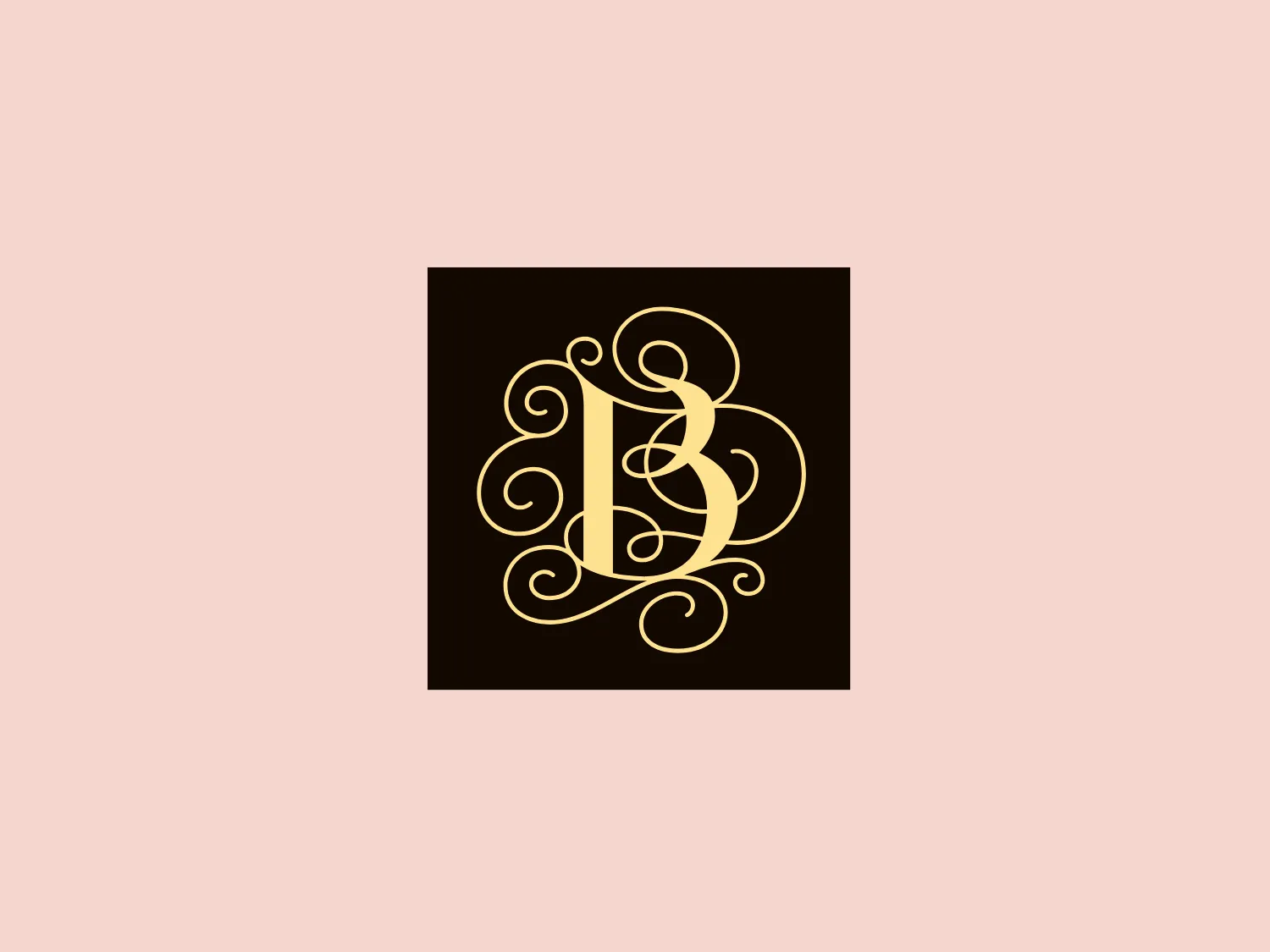
The Based on a True Story logo features an intricate monogram with swirls and curls, creating an elegant and sophisticated look. The monogram is composed of what appears to be two or more letters, possibly initials, intertwined in a symmetrical fashion. It uses a bold golden color that stands out vividly against a deep, solid background. The design has a classic and timeless feel, with the use of thin lines and loops suggesting a sense of luxury and exclusivity. The overall aesthetic is reminiscent of old-world craftsmanship and would be well-suited for a brand that values tradition and high-end quality.

About Based on a True Story

Based on a True Story specializes in meticulously planned and executed extraordinary experiences, offering unparalleled luxury, comfort, and service. They aim to provide travelers with the opportunity to embark on their own extraordinary journey and create remarkable, personalized stories.

Similar logos

The image depicts the Akku Vertrieb logo with a bold, geometric design primarily using a bright blue color. The logo resembles an abstract depiction of an uppercase 'A' without the crossbar. It consists of three parallelogram shapes that form a stylized 'A' with white lines creating separation between them, adding a dynamic and layered effect. The design is sharp, modern, and conveys a sense of stability and professionalism. The simplicity and use of negative space give it a clean and versatile look, suitable for various applications.
The Mobileye logo features a stylized letter 'n' with a distinct geometric design. It is comprised of bold, straight lines with sharp angles, creating a modern and minimalist aesthetic. The main component of the logo is a deep blue color, giving it a professional and trustworthy feel. The design is simple yet striking, with the use of negative space on the left side that could be interpreted as an abstract arrow or a partial square bracket, which adds an element of dynamism and forward-thinking to the overall design.
The ICICI Bank logo features a stylized, abstract design with a fluid, organic shape. The central element resembles a lowercase "i" with a dot hovering above what could be interpreted as an abstract human figure or a dynamic swirl. Its bold lines curve to create a sense of movement. The color scheme consists of a gradient transition from a deep, warm red to a rich, golden orange, giving the logo an energetic and inviting appearance. Noteworthy is the way the white space between the "i" and its dot creates a pathway, emphasizing the motion and adding an element of negative space to the design.
The Unilever logo appears to consist of intricate and stylized illustrations forming a shield-like shape. The design features a collection of floral and organic patterns, ranging from leaves and flowers to abstract swirls, all densely packed to create a cohesive emblem. It is monochromatic, using a deep blue color which gives it a classic and professional appearance. The contrast between the negative space and the blue areas creates an engaging and dynamic visual effect, suggesting detail and craftsmanship. The logo has a symmetrical layout that adds to its balanced and harmonious look.
The logo features a bold, uppercase letter 'T' centralized within an oval outline. The 'T' has a modern and sturdy design, presenting straight lines and squared edges that convey a sense of stability and strength. The color of both the 'T' and the oval border is a deep, navy blue, which adds to the professional and authoritative feel of the logo. The oval provides a sense of continuity and enclosure, framing the letter neatly and giving it prominence. There is an adequate amount of space between the 'T' and the oval border, highlighting the letter and making it the focal point. The simplicity of the design allows for versatility and clarity when displayed across various mediums.
The Commodore logo features a large, bold, blue letter "C" that encircles a smaller red shape resembling a right-pointing arrow or a play button symbol. The stark contrast between the blue and red hues creates a striking and modern aesthetic. The absence of additional elements or embellishments underscores a commitment to clarity and efficiency in the design, striking a balance between visual impact and straightforward symbolism.
The Shazam logo is a stylized representation of a dynamic and fluid shape reminiscent of a swirl or a spiral, contained within a circle. It consists of two interconnected, thick, curved lines creating a sense of motion and connectivity. The logo employs a duo-tone color scheme, with the main symbol in white standing out against a vibrant, deep blue background. The overall design aesthetic is modern, clean, and suggests either movement, digital technology, or a creative, abstract concept. Additionally, there is a gradient effect within the blue circle, giving it a more three-dimensional look and adding depth to the design.
The Norton Healthcare logo showcases a bold, uppercase 'N' in a deep, vivid blue color, comprised of four diagonal lines intersecting a vertical bar on the left. The design exudes a dynamic and modern aesthetic with sharp angles and clean lines, conveying speed, precision, and technological advancement. The intense blue color adds a professional and reliable feel to the overall appearance, while a neutral and light background would complement it well without detracting from its impact.
The Washington Commanders logo features three interconnected diamond shapes forming a stylized letter "W." The primary color is a deep maroon with a thick golden yellow border, creating a sharp contrast and a dynamic feel. The use of geometric shapes and bold colors conveys strength and modernity.
The business logo for Glow Bar is a stylized, modern design portraying the lowercase letter 'g'. The design is fluid and continuous, with a bold, looping structure. The logo is a warm, pale gold color, conveying luxury and elegance, with a glossy finish for a premium feel. A small, five-pointed star sits above the upper curve of the 'g,' suggesting excellence or a premium grade.