Korean Air

15
One thing we like about the Korean Air logo is its balanced and dynamic design, with a harmonious representation of duality and unity using the yin and yang symbol.

Letter

Color

Red
199
Blue
172

Korean Air Logo

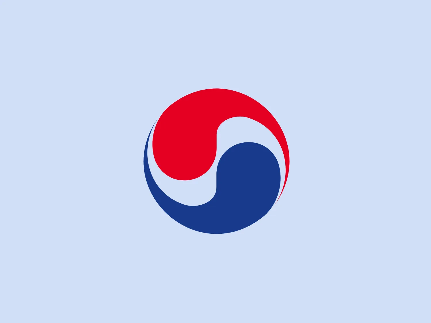
The Korean Air logo is represented by a circle composed of two mirroring teardrop shapes, creating a balanced and dynamic visual effect. One side is a deep blue, while the other is a bold red, symbolizing harmony and duality. The arrangement resembles the yin and yang symbol, representing complementarity and interconnectedness. The point where the colors meet forms a perfect S-curve, emphasizing flow and continuity. The logo exudes unity and simplicity with clean lines and no additional embellishments.

About Korean Air

Korean Air is the primary airline and flag carrier of South Korea, boasting the largest fleet size, extensive international destination network, and a significant number of international flights. The airline offers a wide range of services both within Korea and to numerous international locations.

No items found.

Similar logos

The Angi logo showcases a sleek "A" in a vibrant coral red color. Its modern and minimalistic design includes a flowing curve that creates an engaging loop at the base, imparting a friendly and professional look. The bold typeface with smooth edges balances thick and thin strokes, exuding both weight and elegance. The logo's style and color suggest a preference for a complementary background that doesn't overshadow it.
The Basis London logo presents a modern and minimalist stylized combination of geometric shapes that form the letter 'B'. The design consists of intersecting straight lines and curves in a dark blue or navy color, creating an illusion of three-dimensional layering. The negative space within the circular element adds to the overall balance and visual interest of the design.
The Meeka Metals logo features three stylized mountain peaks within a square frame. The central and left peaks are vibrant orange (#F7DED6), while the right peak and the negative space forming the valley below are a deep navy blue (#D9E5F9), creating a striking contrast. The clean, sharp angles convey modernity and stability, while the geometric approach gives the design a bold character, symbolizing strength and reliability. The overall aesthetic blends adventure and professionalism, showcasing a sense of boldness and stability. Hexcode: #E4E2F8
The Unilever logo appears to consist of intricate and stylized illustrations forming a shield-like shape. The design features a collection of floral and organic patterns, ranging from leaves and flowers to abstract swirls, all densely packed to create a cohesive emblem. It is monochromatic, using a deep blue color which gives it a classic and professional appearance. The contrast between the negative space and the blue areas creates an engaging and dynamic visual effect, suggesting detail and craftsmanship. The logo has a symmetrical layout that adds to its balanced and harmonious look.
The Cimaco logo features a modern and abstract design with three concentric circles decreasing in thickness from the outermost to the inner circle. Inside the circles, there is a unique element that seems to be a combination of a dot and a small crescent shape, aligned off-center towards the upper-left quadrant, creating a dynamic and forward-moving appearance. This element interrupts the continuity of the circles on one side, suggesting connectivity or targeting. The color is a solid, deep shade of blue, which conveys professionalism and trustworthiness. Overall, the logo has a clean, tech-savvy look with a minimalist aesthetic. Considering the color and design of the Cimaco logo, a light and neutral background would complement it well.
The Kajabi logo consists of a bold, abstract geometric design forming a stylized letter 'K.' It is composed of two triangles in deep and light blue tones, creating a modern and energetic appearance with a dynamic aesthetic.
The Qmedics logo showcases a stylized letter Q in a 3D ribbon-like form with smooth, flowing curves. It incorporates warm red and pink tones transitioning to cooler purples and blues on the interior, creating a vibrant and energetic look. The modern, playful design uses gradients to convey depth and movement, evoking an aesthetic of creativity and dynamism.
The logo in the image displays a symmetrical design resembling an abstract butterfly or a pair of wings. It consists of multiple leaf-like shapes radiating from the center, creating a harmonious pattern. Vibrant colors such as pink, orange, yellow, green, light blue, and teal are used, outlined with a thin black border that enhances their individuality. The overall design aesthetic is lively and organic, suggesting a sense of growth or transformation. The black background makes the colors pop, giving the logo a bold and energetic appearance.
The Universities Australia logo features a stylized, abstract design resembling a segmented fan or ascending bars arranged in a quarter-circle layout. The monochromatic color scheme, predominantly dark blue, exudes elegance and professionalism. The white spaces between segments add dynamism to the static image, creating a sense of movement. This logo would stand out against a light, slightly contrasting background or a soft, neutral background to avoid clashing.
The Peru logo presents a simple and modern design featuring concentric spiral lines in a bold red color. The spiral's end curls outward on the top-left side, creating a minimalist and clean aesthetic that conveys motion and fluidity. The use of negative space within and around the spiral adds visual interest and sophistication to the design, while the color provides a strong contrast against a light background and conveys a sense of energy and passion.