Jungo Lighting
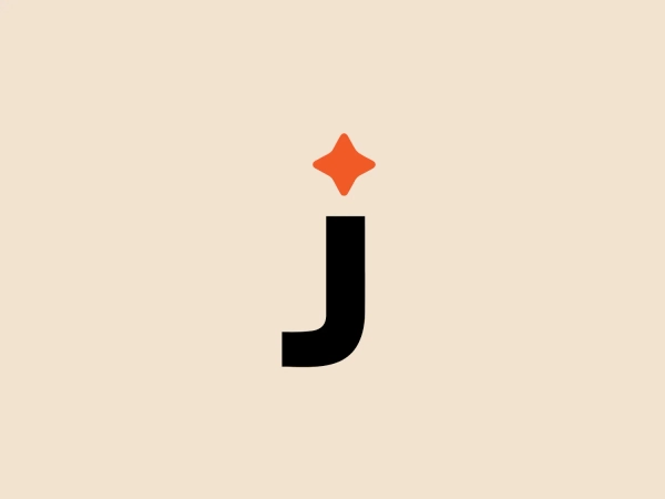


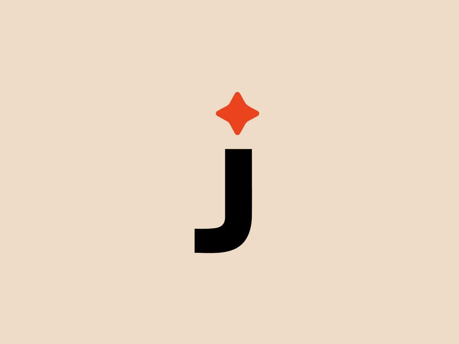
Something we like is the bold, sans-serif 'J' in Jungo Lighting's logo, with a unique twist due to the absence of the ascender, and the playful orange star adds a fun touch to the overall design.
Letter
Type
Color
Style
The Jungo Lighting logo features a bold, black letter 'J' in a modern sans-serif font, creating a strong and clear aesthetic. The absence of the ascender in the 'J' gives it a distinctive look. A small, bright orange star adorns the upper right corner, adding a playful touch and suggesting excellence. The minimalistic design, stark color contrast, and playful star create a memorable visual identity.
Jungo Lighting specializes in offering professional indoor and outdoor lighting fixtures and smart control solutions. Their products are designed to optimize performance, energy efficiency, and cost savings for a wide range of markets including commercial, industrial, retail, institutional, residential, and utility sectors.
No items found.
Similar logos
NEW

The Lazada logo features a stylized three-dimensional shape reminiscent of a cube with a portion of its structure removed or invisible, creating an open corner perspective. It consists of two visible faces, with the left face in a vibrant orange and the right face in a hot pink, employing a gradient that combines the two colors seamlessly at the edge where they meet. The use of color and shading gives the logo a luminous, dynamic look, evoking a sense of innovation and modernity. There are subtle highlights and shadows on the faces that suggest depth and dimensionality. The overall design aesthetic is minimalist, bold, and contemporary, with a playful twist on geometric representation.
NEW

The Leo Messi logo features a stylized, symmetrical emblem that conveys a sense of strength and modernity. Composed of bold, black shapes that resemble an abstract representation of an animal or a warrior's mask, it has pointed features that might be interpreted as ears or horns at the top and a V-like shape at the bottom that could resemble a beak or arrow tip. Its sharp angles and the use of negative space give it a fierce and edgy look, implying a sense of power and aggression.
NEW

The Browze logo features a continuous line that forms a sleek fusion of the letters 'V' and 'B'. The design exudes elegance and modernity with its fluid and organic structure. Presented in monochrome, the black against white creates a timeless and classic feel. Its minimalist aesthetic draws attention to the beauty of the line's curve and the use of negative space. The design's seamless flow may suggest connectivity or unity, and its simplicity allows for versatility and scalability.
NEW

The image shows a bold and minimalist black-and-white logo comprising an uppercase "N" centered within a three-dimensional cube for Notion. The "N" is stylized in a clean, sans-serif font that suggests modernity and strength. The cube is represented in a 3D perspective, creating an illusion of depth that makes the letter appear as though it's embossed on one of the cube's faces. The crisp lines and solid black color of the icon give it a strong visual presence, indicating a contemporary and professional brand identity. Since the logo uses a monochromatic palette, selecting a background that offers sufficient contrast while maintaining a modern feel would be ideal.
NEW

The Cornerstone logo features a simplistic and modern design, consisting of a stylized, abstract shape that somewhat resembles a flower or starburst within a circle. The primary element is a brilliant, solid red-orange color that gives the logo a vibrant and energetic feel. The inner white shape has softened edges which contrast smoothly with the circular boundary. Its symmetry and clean lines convey a sense of balance and professionalism. Considering the color palette of the logo, a soft, neutral background color would complement it well without competing for attention.
NEW

The Walt Disney logo presented is a stylized, abstract design consisting of curving and overlapping black lines. The shapes are organic and flowing, giving the impression of graceful movement or calligraphy. The upper section of the logo resembles a curved hook or a stylized letter 'D,' while the lower section features a loop that intersects with the vertical stroke of the design, possibly representing a lowercase 't.' The overall aesthetic is modern and artistic, with a minimalist approach using only black and whitespace. This design could be associated with luxury, elegance, or the creative arts due to its fluid and simplistic form.
NEW

The image showcases a bold and abstract Neufquatre Éditions logo, consisting of a stylized letter "N" with a dynamic, fluid shape. The design is minimalist and modern, using negative space effectively to create the impression of motion within the letter form. The logo is monochromatic, featuring a stark black against a clean white background. The simplicity of the design lends itself to versatility, while the curvature of the lines suggests creativity and innovation.
NEW

The image is a minimalist logo consisting of two overlaid geometric shapes. The primary shape is a larger parallelogram leaning to the right, while partially beneath it is a smaller parallelogram tilted in the opposite direction, creating a sense of dynamic asymmetry. Both shapes are solid black with clean, sharp edges that suggest precision and modernity. The striking simplicity of the design makes it versatile and easily recognizable. Given the strong contrast inherent in the shapes, and to complement the Andis' modern aesthetic, a subtle background color like a light pastel would be ideal.
NEW

The BETA Technologies logo features a bold, solid black letter "B" with a white lightning bolt cutting through its center, creating a modern and minimalist design. The stark contrast between the black and white elements emphasizes the strong visual impact of the logo. The lightning bolt infuses a sense of power and energy, suggesting dynamism and force. The classic, rounded attributes of the "B" combined with the edgy, contemporary feel of the lightning bolt create a striking visual identity for the business.
NEW

The Opel logo showcases a bold black lightning bolt that horizontally bisects a perfect circle. The design embodies a sleek and modern aesthetic with sharp angles and clean lines. The lightning bolt is stylized with a sharp zigzag pattern in the central region, creating dynamic movement within the static circle. The contrast between the round shape of the circle and the angular lightning gives the logo a striking look. This contrast would be showcased well against a subtle background that doesn't compete with the stark simplicity of the design.