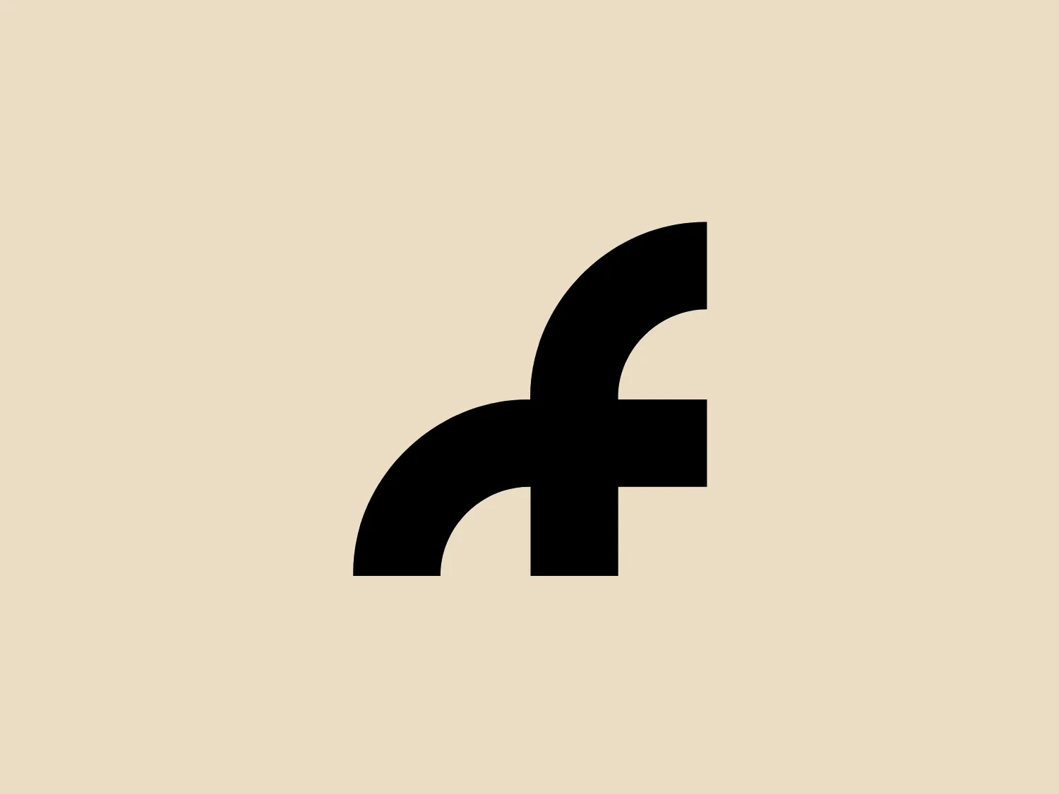
Far Out Magazine

15
We like the bold, minimalist design of the Far Out Magazine logo, with its striking black curved line and clean white background, creating a strong and modern brand identity.

Letter

Color

Far Out Magazine Logo

The logo for Far Out Magazine is a bold, abstract mark featuring a thick, black curved line with a straight segment cutting through it. The design is minimalist and modern, utilizing solid black against a plain white background, which accentuates the contrast and makes the logo stand out. The curved shape suggests movement or a fluid, dynamic nature, while the intersecting straight line adds an element of stability or intersection. Overall, the logo is both striking and simple, likely intended for easy brand recognition.

About Far Out Magazine

Far Out Magazine, based in the UK, is a publication celebrating independent culture. It is tailored to music enthusiasts with an appreciation for film, art, and travel. The magazine serves as a platform for independent artists to gain recognition alongside mainstream successes, with a mission to reshape how readers engage with information.

Similar logos

The Browze logo features a continuous line that forms a sleek fusion of the letters 'V' and 'B'. The design exudes elegance and modernity with its fluid and organic structure. Presented in monochrome, the black against white creates a timeless and classic feel. Its minimalist aesthetic draws attention to the beauty of the line's curve and the use of negative space. The design's seamless flow may suggest connectivity or unity, and its simplicity allows for versatility and scalability.
The BETA Technologies logo features a bold, solid black letter "B" with a white lightning bolt cutting through its center, creating a modern and minimalist design. The stark contrast between the black and white elements emphasizes the strong visual impact of the logo. The lightning bolt infuses a sense of power and energy, suggesting dynamism and force. The classic, rounded attributes of the "B" combined with the edgy, contemporary feel of the lightning bolt create a striking visual identity for the business.
The Walt Disney logo presented is a stylized, abstract design consisting of curving and overlapping black lines. The shapes are organic and flowing, giving the impression of graceful movement or calligraphy. The upper section of the logo resembles a curved hook or a stylized letter 'D,' while the lower section features a loop that intersects with the vertical stroke of the design, possibly representing a lowercase 't.' The overall aesthetic is modern and artistic, with a minimalist approach using only black and whitespace. This design could be associated with luxury, elegance, or the creative arts due to its fluid and simplistic form.
The image shows a bold and minimalist black-and-white logo comprising an uppercase "N" centered within a three-dimensional cube for Notion. The "N" is stylized in a clean, sans-serif font that suggests modernity and strength. The cube is represented in a 3D perspective, creating an illusion of depth that makes the letter appear as though it's embossed on one of the cube's faces. The crisp lines and solid black color of the icon give it a strong visual presence, indicating a contemporary and professional brand identity. Since the logo uses a monochromatic palette, selecting a background that offers sufficient contrast while maintaining a modern feel would be ideal.
The Leo Messi logo features a stylized, symmetrical emblem that conveys a sense of strength and modernity. Composed of bold, black shapes that resemble an abstract representation of an animal or a warrior's mask, it has pointed features that might be interpreted as ears or horns at the top and a V-like shape at the bottom that could resemble a beak or arrow tip. Its sharp angles and the use of negative space give it a fierce and edgy look, implying a sense of power and aggression.
The image is a minimalist logo consisting of two overlaid geometric shapes. The primary shape is a larger parallelogram leaning to the right, while partially beneath it is a smaller parallelogram tilted in the opposite direction, creating a sense of dynamic asymmetry. Both shapes are solid black with clean, sharp edges that suggest precision and modernity. The striking simplicity of the design makes it versatile and easily recognizable. Given the strong contrast inherent in the shapes, and to complement the Andis' modern aesthetic, a subtle background color like a light pastel would be ideal.
The logo presented is a stylized letterform that appears to represent the lowercase letter "g." It features a bold, modern design with smooth, flowing lines that curve around to form a distinctive, abstract shape. The main element of the Glossier logo is a solid black with clean edges, emphasizing its minimalist aesthetic. The logo's smooth curves and lack of additional embellishment suggest a sleek, contemporary brand identity.
The logo for Egloff Druck features a minimalist design with two juxtaposed shapes—a semicircle in a solid black color on the top and a semicircle in a bright blue color on the bottom—creating a balanced and geometrically harmonious look. The use of negative space between the two shapes forms a circular outline suggesting a complete shape split into two contrasting hues. The overall design aesthetic is modern and simplistic, with a stark contrast between the black and blue elements, which adds a dynamic and professional feel to the logo.
The image showcases a bold and abstract Neufquatre Éditions logo, consisting of a stylized letter "N" with a dynamic, fluid shape. The design is minimalist and modern, using negative space effectively to create the impression of motion within the letter form. The logo is monochromatic, featuring a stark black against a clean white background. The simplicity of the design lends itself to versatility, while the curvature of the lines suggests creativity and innovation.
The Opel logo showcases a bold black lightning bolt that horizontally bisects a perfect circle. The design embodies a sleek and modern aesthetic with sharp angles and clean lines. The lightning bolt is stylized with a sharp zigzag pattern in the central region, creating dynamic movement within the static circle. The contrast between the round shape of the circle and the angular lightning gives the logo a striking look. This contrast would be showcased well against a subtle background that doesn't compete with the stark simplicity of the design.