CoinEx

15
What catches our eye is the stylized letter C in the CoinEx logo, with intertwining shapes suggesting motion and fluidity. The vibrant aqua color conveys freshness and innovation, while the minimalist design ensures versatility.

CoinEx Logo

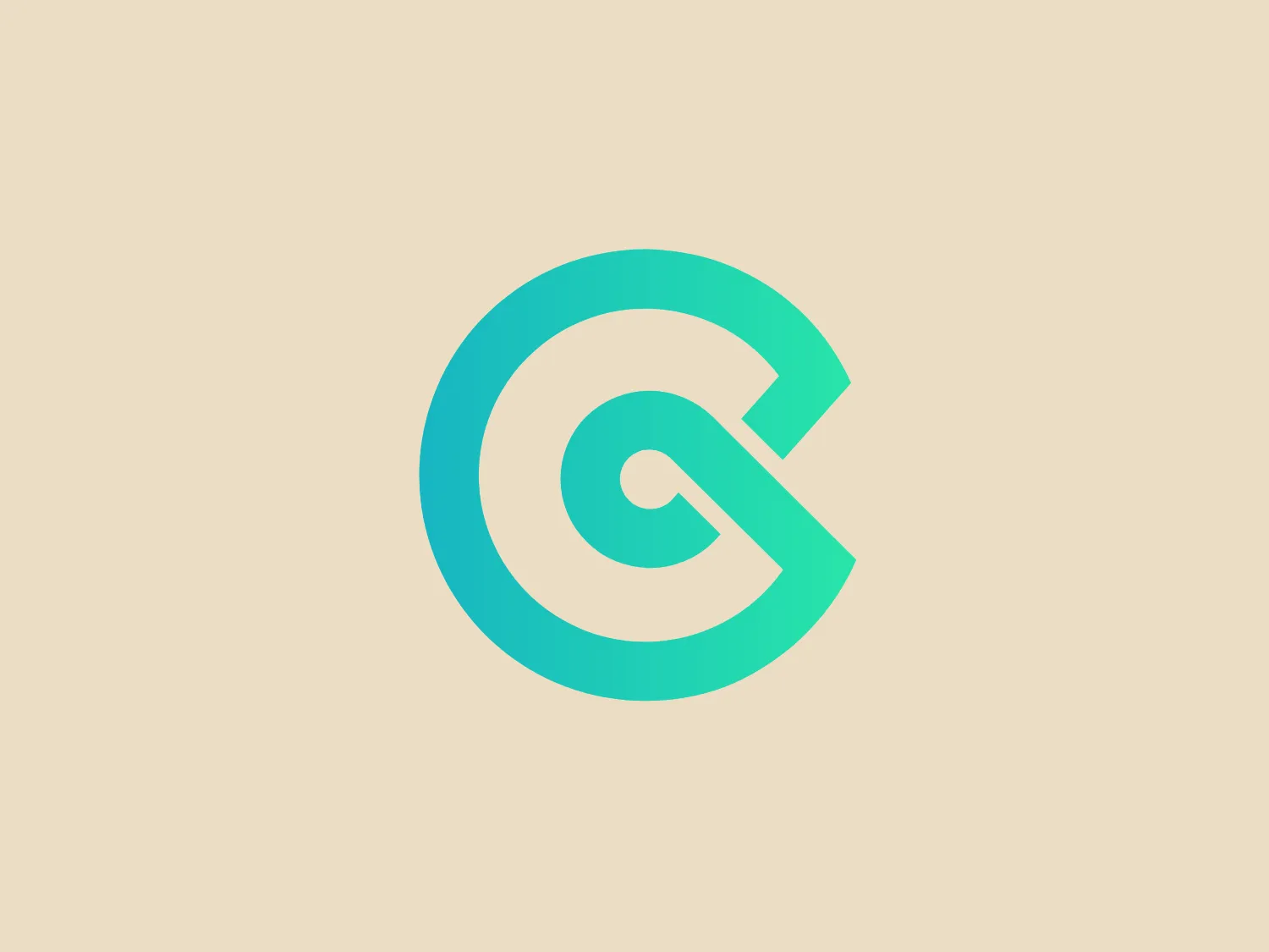
The CoinEx logo is a stylized letter C, comprised of two shapes that intertwine in a continuous loop, suggesting motion and fluidity. The dominant color is a vibrant aqua or teal, evoking freshness and innovation. The shapes themselves are smooth and rounded, promoting a sense of approachability and friendliness. The thin white gaps where the two forms meet add a visual break, enhancing the 3D illusion of the interlocking elements. The design is modern and minimalist, with the simplicity of the form allowing for versatility across various mediums. Considering the aqua tones of the logo, a neutral yet complementary background that would not compete for attention would be appropriate.

About CoinEx

CoinEx is a well-established global digital coin exchange service provider known for its professional approach. The platform is popular for providing a wide range of Stablecoins and offering privacy-friendly access to its users.

Similar logos

The Catarroja Dental logo features a stylized, abstract design comprising two primary shapes. On the left is a larger, aqua-colored shape resembling a backward "C" or crescent, while on the right, a smaller, circle in a muted gray color nestles into the curve of the aqua crescent. The design is clean and modern, with a flat color palette and no gradients or additional embellishments. The simplicity of the design suggests a minimalist and contemporary aesthetic. Considering the color scheme and design, a background color that would complement this logo by providing contrast while maintaining a soft and modern appearance could be one of the lighter, neutral tones.
The Pitmans Law logo features a modern and minimalistic design, comprising of a large aqua-colored circle partially overlaid with a smaller, centered circle that graduates in color from burnt orange to a lighter, sun-kissed hue. Between these two circles, a sliver of white space mimics the circular shape, giving the impression of a crescent moon or a solar eclipse. The design is flat with no gradients or shadows, giving it a contemporary and clean appearance that communicates a sense of innovation and simplicity.
The Hastings Nutrition logo features interconnected geometric shapes forming a sleek, modern and symmetrical mark. The design, resembling a stylized letter or symbol, is crafted from sharp lines and angles. Utilizing a gradient of aqua or teal shades, it exudes depth and dimension. With thick, consistent lines, the logo exudes a strong and stable presence. Despite its clean and minimalist appearance, the complex structure suggests connectivity or networking. Its boldness allows it to stand out against a simple, light background.
The Curebase logo consists of an arrangement of circles creating a swirling effect around a central, larger circle. The circles are filled with shades of aqua or teal, conveying depth and movement. The color palette and white space between elements give it a modern and clean aesthetic. The logo has a scientific and organic feel, evoking motion, atoms, or a stylized galaxy. The cool tones of the logo make it ideal for a background color that complements without competing.
The CrossFit Ground Up logo features a stylized letter "G" in bold black lines, complemented by a smaller aqua blue square shape that suggests a secondary element or an abstract letter "T." The design is modern and minimalistic, with a circular motion implied by the main shape of the "G." The lines of the "G" are thick and taper slightly at the ends, creating a dynamic and professional look. The blue square imparts a pop of color and visual interest, contrasting sharply with the black.
The 3DGlass logo features a stylized letter "D" with a distinctive cut-out that forms a contrasting shape within the letter. This suggests a sense of dynamic motion and transformation. The monochromatic design consists of a bright shade of turquoise or aqua, giving it a modern, sleek, and minimalistic aesthetic. The clean and smooth curvilinear form communicates innovation and fluidity, while the absence of additional embellishments and the use of negative space makes it appear sophisticated and versatile for various applications.
The logo for Uberfácil features a stylized power button symbol consisting of a vertical line that intersects a circle with a gap at the top, suggesting the universal icon for power or turning on. The design is minimalist and modern, with a sleek gradient of aqua to a lighter turquoise that adds depth and a tech-savvy feel. There are no additional embellishments, making it clean and easy to recognize. The circular shape conveys a sense of completeness and universality.
The Hinsdale Ortho logo is a modern, geometric design featuring a rounded square border with an abstract H-like figure in the center. The gradient transitions from deep blue to lighter aqua blue, symbolizing dynamism and innovation. The softened corners and central figure give the logo a friendly appearance, while the gradient adds depth and a futuristic feel. The design allows for versatile application across various media.
The Phigital logo presents a stylized letter "Q" with a speech bubble incorporated into its design. The primary shape is a bold, rounded "Q" that loops back into itself, creating a tail that extends from the bottom. Inside the loop, a white speech bubble with a tail points towards the center of the "Q," suggesting communication and dialogue. The logo is monochromatic, utilizing a bright, aqua blue color that gives it a modern and vibrant feel. The overall aesthetic is clean, simple, and highly symbolic, making it easily recognizable and suitable for a brand related to conversation, messaging, or social interaction.
The City of Pawtucket logo showcases a modern and dynamic design, with a stylized circular gear or cog in vibrant orange on the right side blending seamlessly into a bold blue 'P' or pillar shape on the left, symbolizing stability and structure. Two wavy aqua lines encircle the central design, suggesting motion or fluidity, possibly alluding to water or connectivity. The use of complementary colors results in a technical and industrial aesthetic with a touch of elegance and movement.