PiteraQ Logo
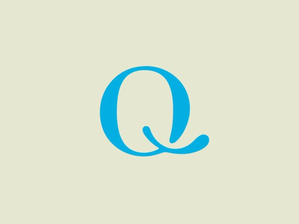
Blue Letter Q Circle Minimalistic
What catches our eye is the sleek and modern "PiteraQ" logo, featuring a stylized letter "Q" with a unique twist, using negative space for a minimalistic and contemporary look.
- Color
- Blue 1677
- Industry
- Beauty 27 Personal Care 21
- Letter
- Letter Q 152
- Location
-
 Italy 76
About the PiteraQ logo
The image depicts a straightforward and modern logo design for PiteraQ, consisting of a stylized letter "Q" with a unique twist. It appears as a continuous line forming an almost complete circle, with a short line cutting through the bottom right. The logo uses a light teal color, exuding a fresh and clean aesthetic. Its simplicity and the use of negative space give it a minimalistic character that's both contemporary and easily recognizable. The encompassing circle and inner space could symbolically suggest inclusivity or a holistic approach.
About PiteraQ
PITERAQ is a makeup company that prioritizes using natural ingredients, with over 98% of their products containing these elements. This commitment allows them to ensure a high level of respect for nature in the creation of their cosmetics.