Q Meieriene Logo
Blue Letter Q Abstract Circle
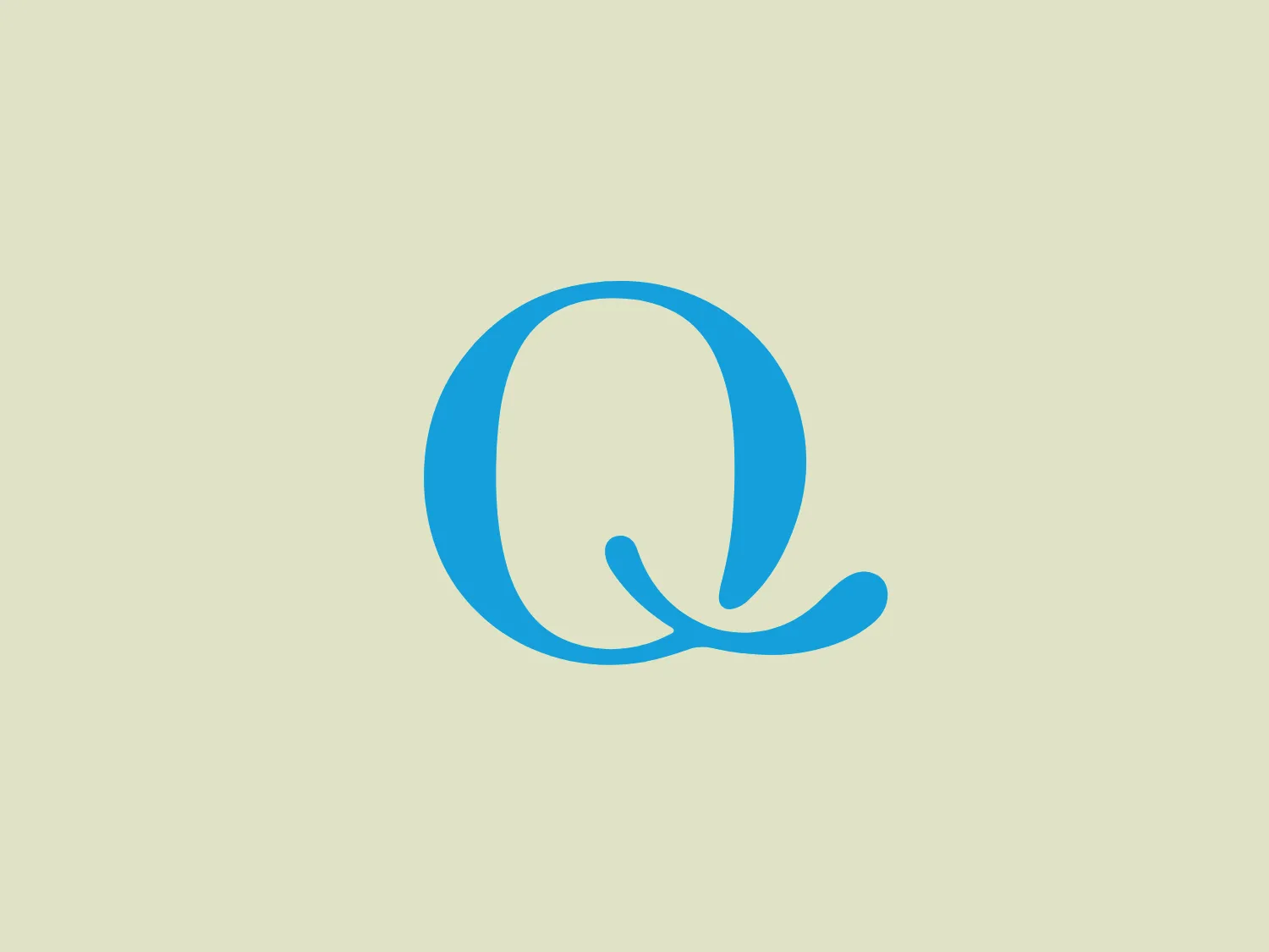
What catches our eye is the sleek and modern 'Q' logo design with its minimalistic and balanced composition, emphasizing simplicity and professionalism.
- Color
- Blue 1645
- Industry
- Food 135 Beverage 116
- Letter
- Letter Q 152
- Location
-
 Norway 33
About the Q Meieriene logo
The Q Meieriene logo features a stylized letter 'Q' composed of two distinct shapes—a bold circle and an elongated tail that curves underneath it. The design is minimalistic with smooth, flowing lines, emphasizing a sense of simplicity and modernity. The color of the logo is a bright and calming shade of blue, which suggests trustworthiness and professionalism. The negative space within the circle aligns with the tail, creating a harmonious and balanced look. The Q Meieriene logo is sleek, making it adaptable for various branding applications.
About Q Meieriene
Q Meieriene is a dairy products company owned by the Kavli Group. Established in 2000, the company operates two dairies: Jæren Gårdsmeieri in Jæren and Gausdalmeieriet in Gausdal.