Kaila Logo
Grey Red Letter K Abstract Minimalist
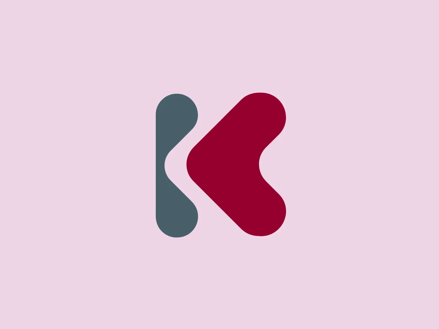
We like the minimalist and abstract design of the Kaila logo, with the interaction of two shapes and clever use of negative space.
- Letter
- Letter K 185
- Location
-
 Spain 122
Use this logo
Credit (optional) Kaila logo via LogoFav
The Kaila logo is a trademark of its owner, shown here for design reference only. Request removal
Kaila logo colors
The Kaila logo colors are red (#A80B3B) and grey (#58727D).
Measured from the Kaila logo file, largest area first. Tap a code to copy it.
About the Kaila logo
The Kaila logo is a minimalist and abstract design consisting of two shapes interacting with each other. One shape on the left side resembles the letter "K" in cool-toned, dark grey, while the shape on the right is a warm, saturated red, suggesting an abstracted arrow or a stylized letter "K." The two forms align at their tips, giving the impression of forward motion or progress. The use of negative space between the forms adds to the dynamic and contemporary feel of the design.
About Kaila
Kaila, created by Zabala Innovation, is a digital platform designed to promote open innovation by simplifying the establishment and administration of innovation ecosystems in Europe.