Anderson Craft Ales Logo
Green Letter A Organic Minimalist
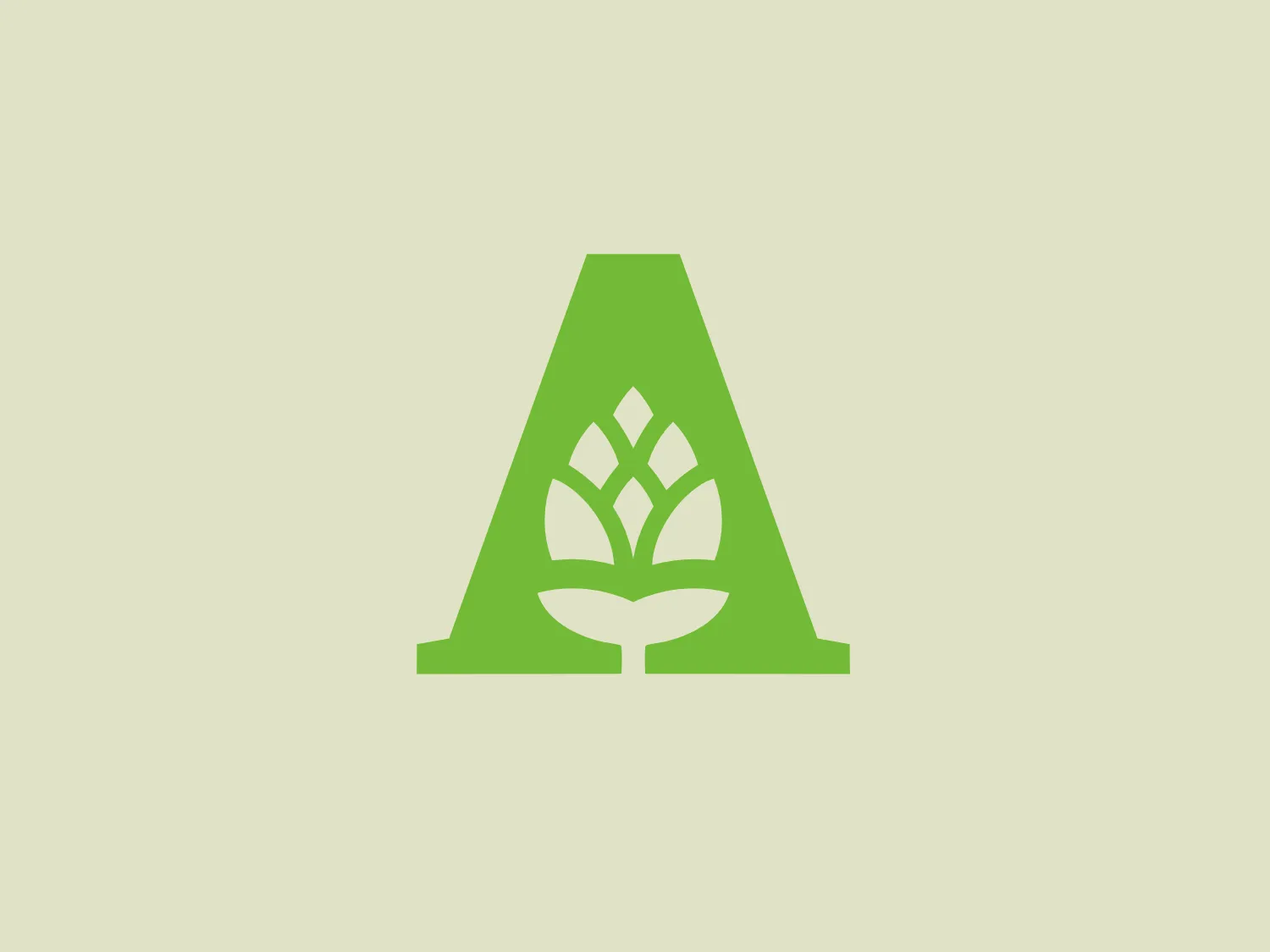
Something we like: The Anderson Craft Ales logo cleverly combines a bold letter "A" with a tree icon in the negative space, creating a modern and eco-friendly aesthetic.
- Style
- Alphabet 4648 Serif 214 Uppercase 3999 Letterform 1464 Abstract 2213 Geometric 1452 Organic 114 Minimalist 650
- Color
- Green 788
- Industry
- Food 136 Beverage 116
- Letter
- Letter A 353
- Location
-
 Canada 197
About the Anderson Craft Ales logo
The Anderson Craft Ales logo showcases a stylized capital letter 'A' in a bright, leafy green color, conveying a feeling of growth and eco-friendliness. Within the negative space of the 'A', there is a white tree or plant icon, with leaves fanning out above a simple base that can be interpreted as either the trunk of a tree or a sprouting seed. This distinctive design combines geometric sharpness with organic motifs, resulting in a clean and modern aesthetic that suggests a focus on sustainability and nature. Perfect for eco-conscious brands that prefer a minimalist approach.
About Anderson Craft Ales
Anderson Craft Ales is a family-owned and operated brewery based in London, Ontario. Known for its successful presence in the craft beer industry, the brewery takes pride in its regional brewing operations.