Gaming NET Logo
Black Letter M Abstract Geometric
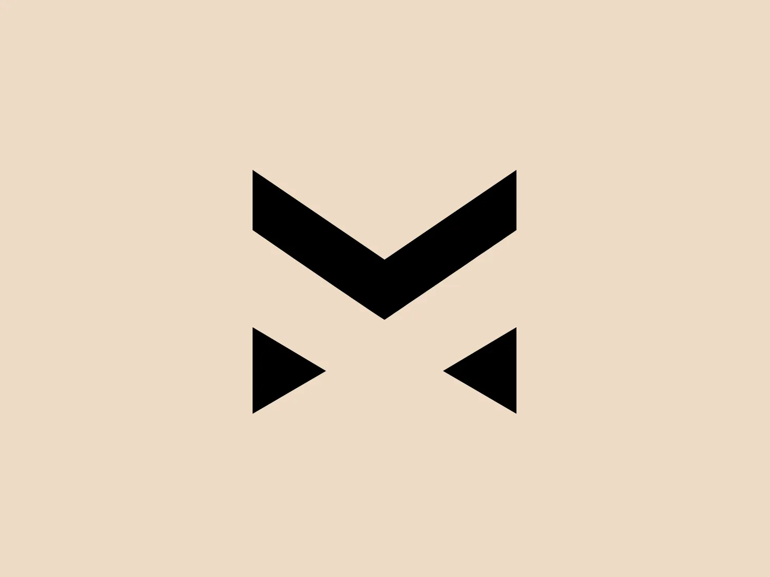
We like the abstract, geometric design and bold, black chevron that gives a sense of direction and movement in the Gaming NET logo.
- Color
- Black 957
- Industry
- Technology 688
- Letter
- Letter M 302
- Location
-
 United Kingdom 368
About the Gaming NET logo
The Gaming NET logo is an abstract, geometric figure primarily composed of sharp angles and straight lines. It features a bold, black chevron or "V" shape at the top, pointing downward, with its open end aligned above two smaller, separated black triangles pointing outward to the left and right, giving a sense of direction or movement. The overall design aesthetic is minimalistic, modern, and likely to represent forward-thinking or directionality due to the pointed shapes.
About Gaming NET
Gaming.net is a prominent source of information on emerging technologies such as esports and VR. The platform is dedicated to providing in-depth analysis and news on the latest games and the underlying technology.