Eatertainment Logo
Black Letter E Geometric Rounded
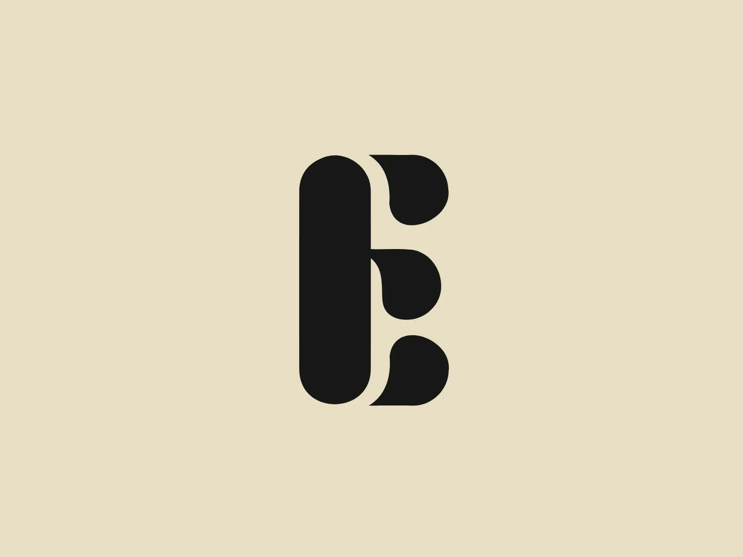
What we like is the modern and clean appearance of the stylized letter "E" in the Eatertainment logo, created from bold, rounded, interlocked geometric shapes.
- Color
- Black 969
- Industry
- Food 136 Beverage 116
- Letter
- Letter E 231
- Location
-
 Canada 198
About the Eatertainment logo
The Eatertainment logo features a stylized letter "E" comprised of bold, rounded, and interlocked geometric shapes, giving it a modern and clean appearance. The logo colors are monochromatic, with the use of black to create a strong contrast and visual impact. Its overall aesthetic is minimalistic and contemporary, with an emphasis on negative space which cleverly forms the distinct segments of the letter. The effect is both elegant and easily recognizable.
About Eatertainment
Eatertainment Hospitality Inc is a prominent restaurant and catering company based in Toronto, Canada. Established in 1981, the family-owned business has garnered multiple awards for its exceptional services in the hospitality industry.