Brewing August Logo
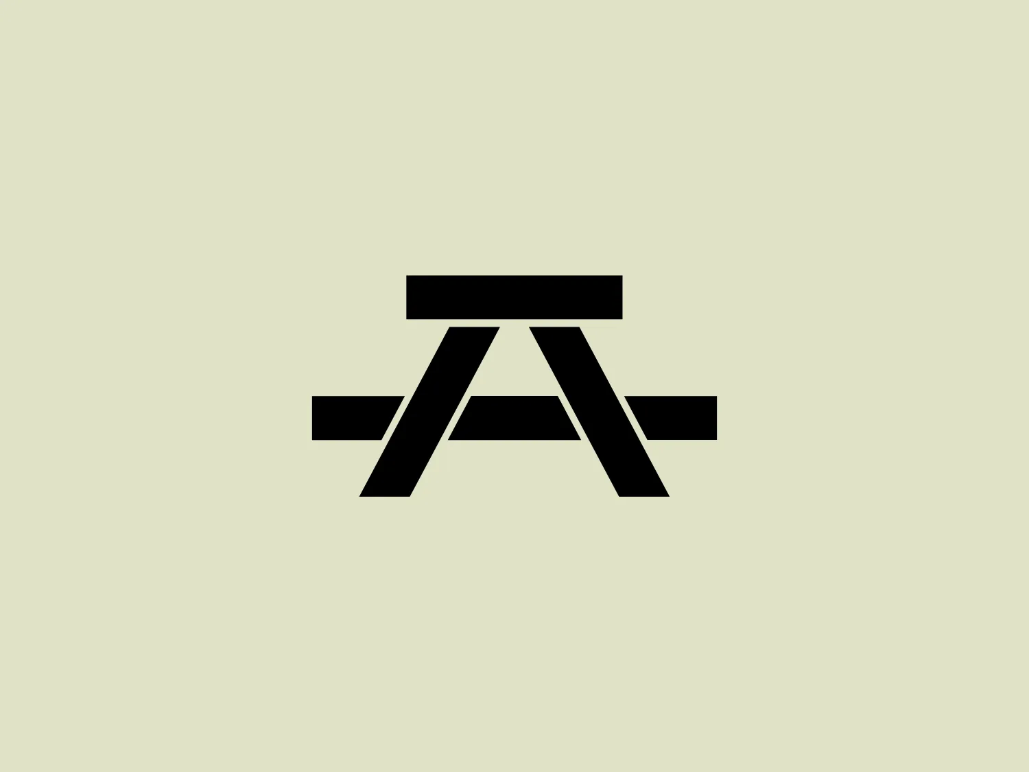
Black Letter A Geometric Stylized
We like the bold and geometric letterforms of the logo, creating a sense of sophistication and sleekness.
- Color
- Black 990
- Industry
- Food 137 Beverage 116
- Letter
- Letter A 355
- Location
-
 Canada 201
About the Brewing August logo
This bold, geometric logo showcases stylized letterforms, with a capital letter "A" featuring a horizontal bar intersecting the upper third and two slanted, parallel lines extending outward from the base of the "A" on both sides. The solid black color against a plain white background conveys sophistication and sleekness, making it stand out and creating a sense of stability and balance. The minimalist design allows for versatile use with a lighter and subtle background.
About Brewing August
Brewing August is a Vancouver-based craft beer brand rooted in community inspiration and the essence of good people, places, and times. The brewery focuses on utilizing quality ingredients to achieve a great taste, embodying the positive vibes and spirit of August.